The photographer is looking for generalized feedback about the aesthetic and technical qualities of their image.
Description
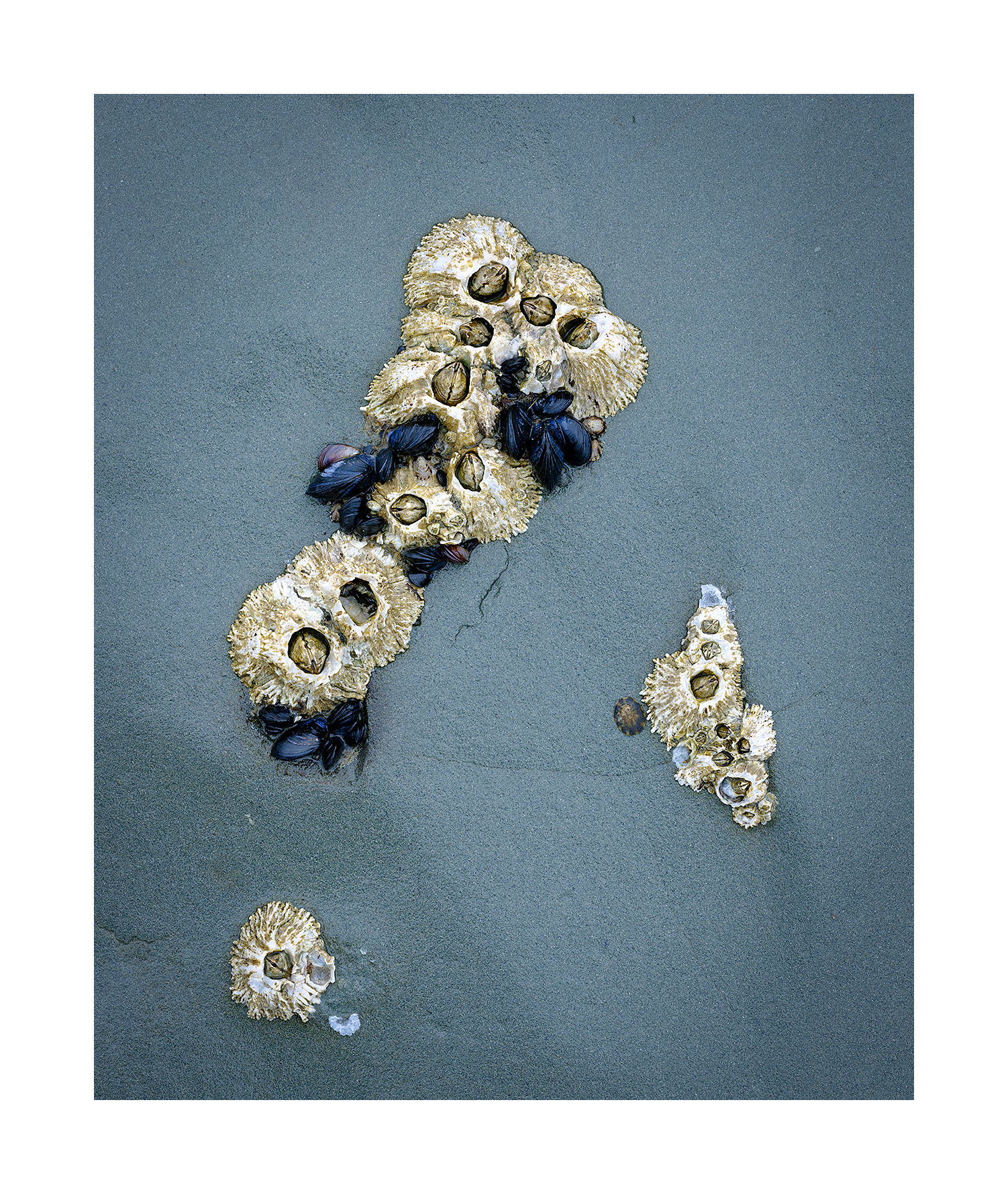
This is the high intertidal, which is exposed for such a long time each day that there is space between the critters. Let’s see. I see barnacles, mussels, and a lone limpet by the looks of it. There quite a few of these there but this one seemed the best of the lot due to the space around the islands.
Specific Feedback
Is this boring? I printed it up and so far it doesn’t impress me much. But in the field I got real excited over it. I just liked the graphic quality of it. The separation between the elements.
Technical Details
GFX50R, 120mm macro, f/11, focus stacked
Critique Template
Use of the template is optional, but it can help spark ideas.
I think some of your other tidal images are more striking, but this one has a nice design. The processing looks spot-on. Interesting critters lurking there.
Igor, you might consider downsizing the white frame. At least to me, it distracts from the image.
Boring!? What are you high right now? This is such an elegant and striking photograph. I love the muted, near perfectly toned stone they are on as a canvas of sorts. The placement of the barnacles is just sublime. I love the lone one in the LLC, but even more I love how the limpet and the other barnacles on the right have nestled into that small depression that the subtle shadow reveals. It has a great flow, wonderful texture vs no texture contrast makes the subjects just jump off the screen/paper, and that overall cool tone from the rock just makes this such a calming photo to look at. Your in-field instincts were right, don’t listen to your in-home voice.
Is it boring, ie. dull and uninteresting? No. Is it exciting? No. But it is very beautiful and very interesting. I love the composition of the elements and the color palette. I don’t see barnacles, mussels, etc. I see beautiful, design, shapes and patterns. I love it. Different strokes I guess. To be quite honest, I found your last two images kinda boring, not up to your usual standards. JMHO
As with many of your images though, viewing it full size and slowing down to study it closer the image begins to “open up” with character and interest and the answer becomes no. It’s one of those images where the tiny details matter, including the texture of the rock. You just can’t appreciate that when viewed small and fast.
I think this would be especially strong as part of a series. I’d love to see it printed gallery size hanging from a wall under good light.
Far from boring Igor. The color scheme looks good and I really enjoy photos like this one. Textures present and the overall image almost wants me to believe that the two lower barnacle clusters have fallen away from the top group. And we know that’s not true but also provides some intrigue as well. Awesome…Jim
This is an interesting subject which I’ve commented on several times. I make the thickness of the frame by what feels right. Sometimes I try to analyze why it felt right or wrong. I’ve concluded that images with a lot of negative space or minimalistic images look good with wide frames. That type of frame enhances the subject. One the other hand grand landscapes require small frames. A wide frame diminishes the spectacle of a grand landscape, makes it less grand. That’s what I’ve come up with.
As for why have a frame. It’s part of the composition. Its borders define shapes in the image. The the matt is part of the print to my way of thinking.
Boring? Absolutely not - but then I usually don’t find photographs boring… this one is actually a bit of a unique find. Wonderfully crafted and composed; simple, yet very pleasing. I’m also really enjoying the color contrasts here with the blues and the tans.
Speaking of color, mentally my mind expects a more brownish, less-cool sand. Clearly though, the color of sand is not universal… ie., the black sands of… or the white sands of… so not a critique on the color - just an observation. A trust me, I love this as presented.
Vingette? not working for me. Because the sand in the LLC is a few shades darker, the application of a vignette, in this case, doesn’t come across evenly and actually takes away from the overall presention. IMHO.
Excellent observation. Your observation was corroborated by the print made this morning. One thing though. That’s not sand. It’s rock. Barnacles don’t attach to sand, nor do mussels. The rock was grey. I chose to make it blue because I got tired of an image I made 2 years ago that preserved the natural grey colors. Who knows, I may grow tired of this as well.
I just printed it on rag paper and am loving it. However, I’m wondering how I can preserve the non reflective look when hung in a frame under glass. It seems to me that the glass reflection will destroy all the trouble I went to to print on rag. Anyone have suggestions?
Hi Igor,
I actually prefer the original image without the vignette. For my tastes the vignette makes the LLC just a little to dark. I could see where someone taking a very cursory look might find it boring, but if they slow down and take the time to look around this intimate landscape they would find a lot of details, textures and colors to savor. On a side note; I always display my prints behind non glare plexiglass. I like the presentation it makes and I think it does a fantastic job with the glare.
Ed, I’ve been reading on this. The literature states that non glare plexiglass diffuses the light and renders the print less sharp to the viewer than without the plexiglass. Has this been your experience?
Igor, I am quite happy with the end result. I really don’t notice a lack of sharpness, but I am not a pixel peeper either. I print on Canon 13" x 19" Pro Luster photo paper and just enjoy the look behind the non glare plexiglass. Even if there is a slight loss of sharpness I much prefer that to the glare on regular glass or plexi. One thing to note is that you have to be sure to turn the correct side of the plexi out or you will have glare. Good luck!
I almost always prefer a vignette like that, but not here. The original has more “pop” for me, and the frame already boxes the eye into the image nicely.
Dang, how embarassing! For a brief moment I wondered how/why these shelled creatures were sitting in/on open sand… but, oh well, looks like sand so I’ll stick with it. In fact, the texture/detail on the “rock” is such that I think it actually looks like sand… but now I finally get it. duh.
Re: having print under glass… I was thinking the same as Ed, but also agree with you that non-glare stuff may take away from the details… Perhaps the only solution is to not have it framed under glass. Print directly on some other medium - maybe canvas? but that would lose the detail also. Acrylic or metal might be too much and certainly not give you the look that you like with the rag. = dilemma…
Thank you all for commenting on this image. I learned a lot in making this one. It’s likely turned me in a different direction in printing. My favorite part of the image is the island on the right.
Dear Igor,
It is not a loud image, but it is not boring at all, on the contrary. I have lived with the image on my computer screen for some days, and it remains interesting because of its subtlety. The sand is like a background with a neutral tonality (Z6); the limpets (Z7) and blue mussels (Z3) are lighter and darker. These are tight tonalities. The delicacy of the texture of the sand reinforces this feature of subtlety. The almost blue-violet color of the sand complements the orange-yellow color of the limpets, adding to the subtle coherence of the image. Finally, the group of limpets suggests a triangle, which is in tension with the group of small circles created by each of the limpets. To me, the vignette reduces the aesthetic value of the image, because it interferes with the natural depressions in the sand. Thank you for sharing this image.