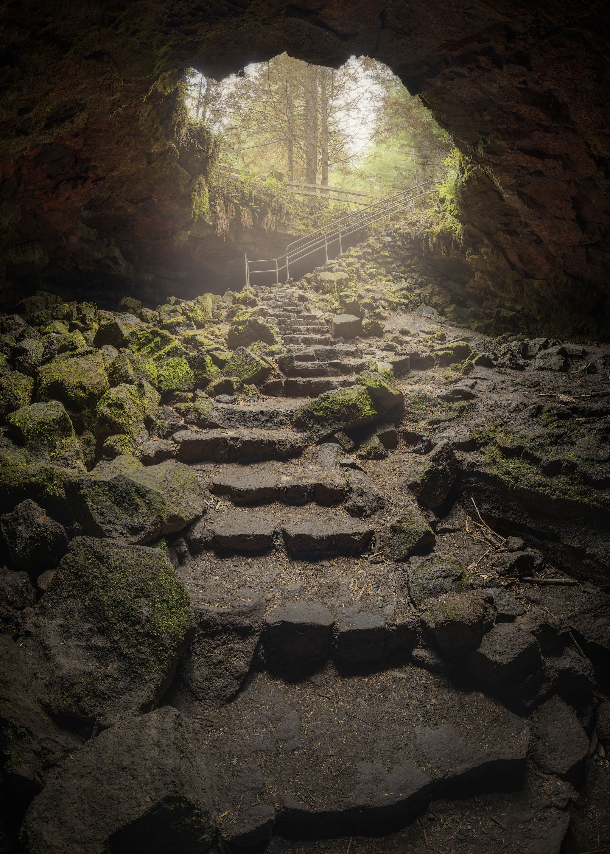
Hey all! Here’s a new/old piece I’ve been sinking my teeth into. Would love some feedback on the overall color and maybe some tips on how to deal with the color cast in this image.
This version is too warm, so I know that already. The color of the rock inside this cave was like a magenta/blueish neutral color, and as I worked the WB and the HSL to fit the scene, it always ended up accentuating this weird neutral color.
I’ve tried removing the cast a few ways, but because there isn’t much actual color in the rock, it really makes the image quite anemic. This version is pushing too warm to compensate.
It very well might just be my monitor needing a ReCal. Or I’m Crazy…
I will try and post an additional version that exemplifies this.
I’m not convinced it’s too warm. The opening of the cave does have a bit of a yellow cast that you might be able to tame a little.
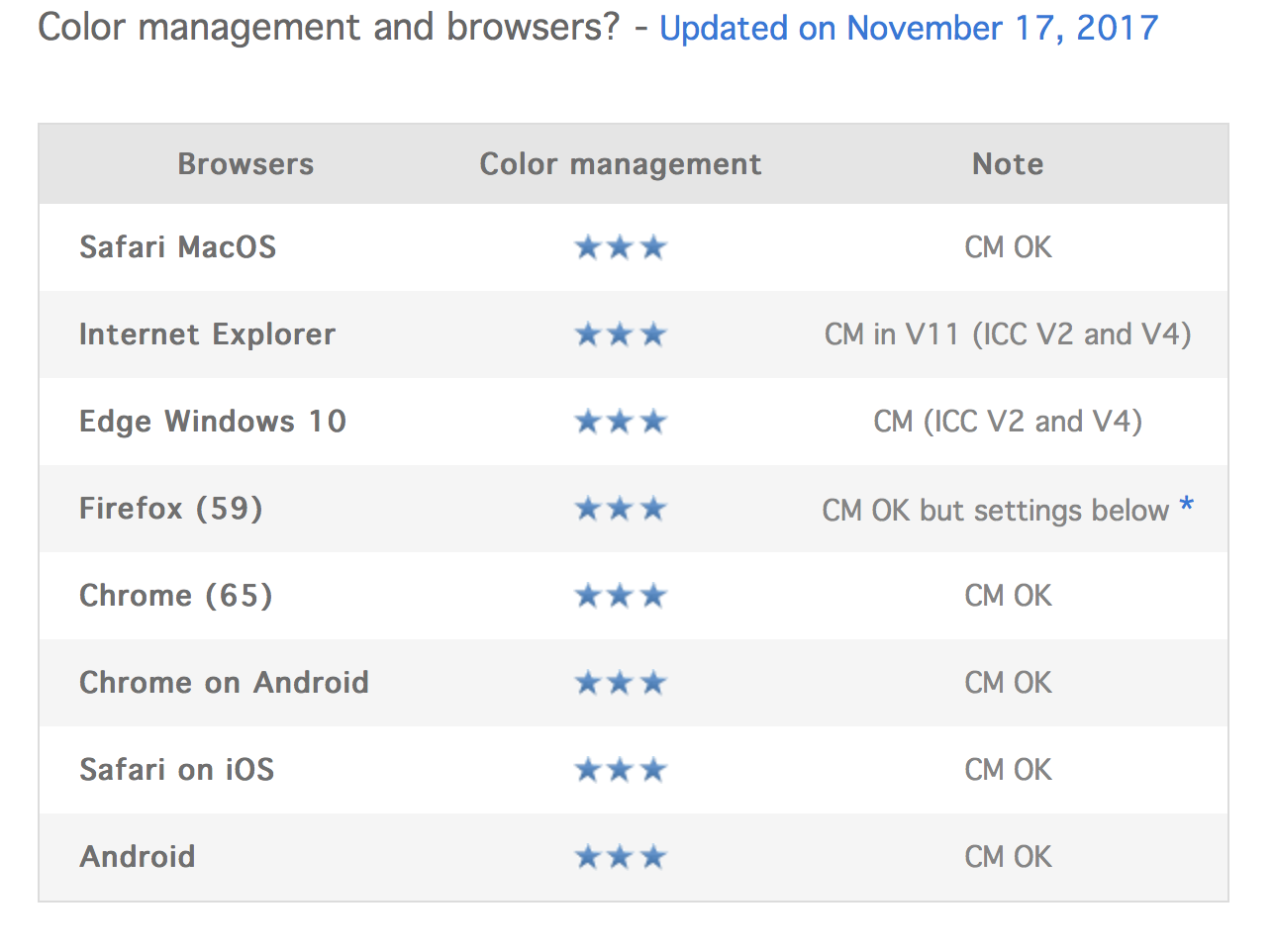
I downloaded the image to see what might work and the first thing I noticed is the file does not have a color profile. Images for web display should have a color profile of sRGB embedded in them to make sure they render correctly on web browsers.
Cool - yeah I think there is still a tinge of something going on in my neutrals, but overall it not looking to bad on the phone.
Also to get technical about color space -
Windows/Mac and most browsers are not color managed and will not respect an embedded color space (I think Firefox does?) So typically, I convert to sRGB at the very end and soft proof within photoshop (my working space is prophotorgb) so I’m not typically concerned about embedding that (change my mind?)
So - if you have a wide gamut monitor, images look pretty bad in file explorer, on web browsers, ect. but look correct in PS/LR ect.
Here’s some recent info on color management on the web. At one point, it was true that most browsers were not color managed. That’s not true any longer.
Fact filled article on why you should embed an sRGB profile in images that are to be displayed on a web browser so others will see the image as close as possible to what you see on your screen:
Here’s a quote from the article:
If you want your photos to be displayed correctly on all current devices - “sRGB” computer monitors, wide gamut screens, tablets, smartphones - and unlike an old habit, it is thus compulsory nowadays to incorporate an ICC profile to each image shared on the web. It will only be read by web browsers on computer screens but this way, your images will be displayed well even on wide gamut screens. However and because of tablets and smartphones, you need to keep on saving your photos in sRGB because it is the only color space that will be displayed correctly in their browsers because they still can’t read ICC profiles except Safari on iOS (2018).
Jordan, the image is very dramatic, I love your composition, and your processing of the contrast in this image is spot on to my taste. Both sets of stairs make for a great leading line. The deeper shadows do seem too warm to me and could be cooled down, but the portions of the image with direct light look good to me.
I actually viewed this image after critiquing your alligator rock/seastack image. There does seem to some odd things going on with your color in both images. Maybe it’s the profile issue Keith mentioned (and he is correct BTW), or maybe you need to recalibrate. It might be the processing, both images were too warm overall, and both could benefit from cooler shadows.
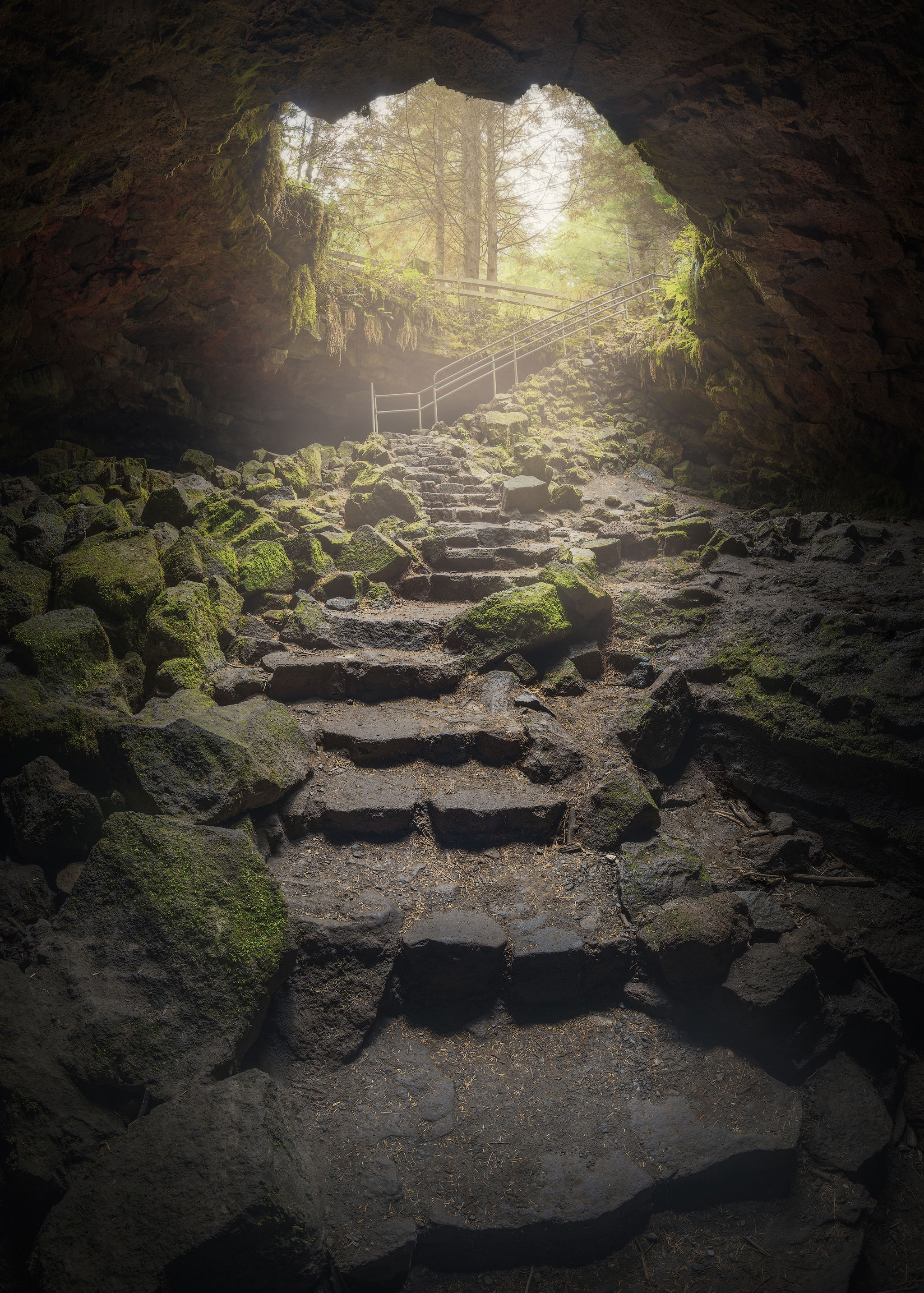
Man thanks for all the feedback! And thanks to Keith - I found I didn’t have the profile embedded while exporting through TKActions!
Here’s another take. Still not 100% on it yet. I tried cooling off the shadows using a darks mask and a cooling photo filter. Let me know what you think!