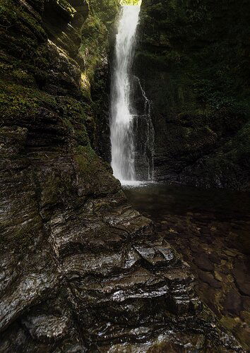
This is a fairly well photographed waterfall in the Lake District but usually shot from the lower part of the falls. On this visit the water level was pretty low so I was able to move up to the upper falls and find a more unique composition.
The theory was for the gorge wall to lead the eye to the waterfall placed dead centre. I liked how the light was hitting the left wall and w
ith lots of spray I was hoping for a rainbow but no such luck. The rest of the gorge was pretty dark which I have tried to retain in post.
Any help gratefully received.
Many thanks
Chris.
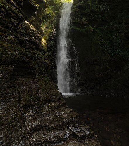
UPDATED. This is the updated image using the suggested tweaks (crop, recover waterfall detail, reduce waterfall and foreground highlights and add some glow to the upper light)
My immediate thought was that the rock wall competes with the importance of the waterfall in the image. I don’t know the this area so its difficult to make suggestions on composition, but if you could remove some of the rock on the bottom so it is not a 50/50 split with the waterfall it might improve the balance. Technically sound otherwise.
1 Like
Chris,
I think you did a remarkable job handling the light and dynamic range. Sure, the notch and top of falls are pretty bright, but relative to the darkness of the wall on the right and the beams of light going left, you’ve done well in processing, me thinks.
I do wish the top of the falls had some more detail, which I supposed you could manufacture from another section of the falls. You can do that with a duplicated bg layer, drop the opacity of that layer to like 20% and then paint using the Healing brush, copied from another part of the falls, in to the washed out part of the falls.)
It’s good that there is some greenery in the notch. The tops of waterfalls are one of the most awkward elements I think.
I agree with Patricia about the prominence of the foreground rock; it takes away from the falls and the light going on up top. I think crop would balance things nicely as she suggested.
Overall, well handled.
Lon
1 Like
This is awesome, Chris!
I dig the comp a lot and that light is amazing… Great job capturing that.
I’m curious about your gear and settings?
My preference would be a slightly longer shutter and a little less on the exposure overall, to retain the detail in the water highlights. It usually takes me a few shots to get an exposure that’s not clipping the highest of highlights. That might take a bracketed shot for shadows though. Most likely will require an ND, too.
A few things I’d do in post is add a little blur to the light on the upper wall, not much, probably through dodging with a little warmth. I’d also drop the highlights on the foreground rock and bump up the mids… Depending on what they look like after that, I might add a little green through a dodge burn layer or bump up the saturation in that area.
1 Like
Thank you very much for taking the time to look, assess and reply. I really appreciate the feedback. I’ve made some amendments based on your suggestions and the updated image can be found above.
Let me know your thoughts!
Chris, I think @Patricia_Brundage gave you some great suggestions, and I think your rework is a much stronger image once you incorporated them. The crop especially completely changes the look of the image for the better. I also agree with @Lon_Overacker in that I often struggle with how much of the top of the waterfall to include in an image. This one looks a little tight at the top edge of the frame, but in my own experience, including more above the top of the falls often introduces showing too much white sky, or other stuff that is a distraction. I suspect you faced that here too. I also tried a “scroll crop” to remove some from the top, but I don’t think that works well either, it also feels too tight.
In your original post, the image was really about the rock wall, and the falls was a secondary element (the cropped rework switches that around nicely). I think the shape and texture in the rock wall has its own appeal, other than it was very dark. But it made me think of an alternate approach to harvest another image from this scene. B&W can do a good job making this about the rock and it’s texture.
1 Like


