The photographer is looking for generalized feedback about the aesthetic and technical qualities of their image.
Description
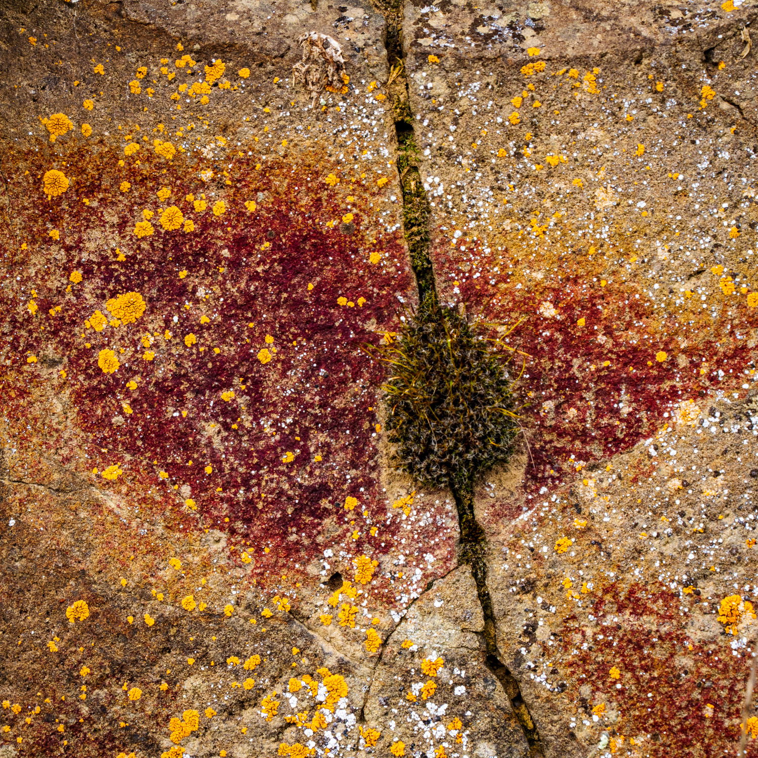
This is a shot from the canyon wall along the John Day River in eastern Oregon. The landscape at a large scale is fairly monotone and the weather can be windy and dusty. But as you hike along the canyon wall and look closely, there are myriad colors and shapes everywhere. I am attracted to reds and greens, and in this shot I like how the strong vertical line is intersected by the softer curved horizontal lines.
Specific Feedback
The strong, contrasting colors immediately draw the eye to the center of this photo. Do you feel the lines complement the strong colors and serve to help appreciate the image in full. Any comments on the square crop? I’ve been doing a lot of square crops lately. On this image it just felt right to me.
Technical Details
Camera Settings: 1/125 f/11 ISO 320
Lens: Tamron 25-200 at 76mm
Techniques: no special techniques
Processing: LR desktop; processed for exposure and color; cropped to 1x1
Hi Joyce,
This is lovely. Like you, I really enjoy the complementary colors, and the palette is quite nice with the olive green, rust, and burnt oranges. All tertiary and still complementary.
I especially like the shape of the moss along the crack, as it looks almost like a leaf or a tree, and distorts our sense of scale, if only momentarily. If I were to recommend anything, it might be to crop off the very top where the less lichen covered stone has a shallow u-shape. But really, it’s lovely as is.
ML
Welcome, Joyce. I really like the strong lichen colors in this image. Like @Marylynne_Diggs I’d be inclined to crop to avoid the curve at the top. It’s so regular, that before I read your description, I thought this was on concrete somewhere and the curve was the edge of an area that had been covered by something like a trash can. If you want to maintain the square crop, I don’t think it would hurt to just shrink the field of view down a trifle.
I suspect that the moss color is accurate, but if you wanted to, I could see shifting the green and or increasing the luminosity of it a bit to make it pop more.
A great abstract Joyce. It looks like the “spur” is 3-d and the rest like a Pollock painting. Beautiful contrasting colours and arrangement of the natural markings of this rock.
Joyce: A really good find and a solid capture and comp. I’m OK with or without the curve at the top. All the myriad tiny details are a delight to explore. I also took the liberty of tagging this for this week’s Weekly Challenge. It is certainly an ideal entrant. >=))>
Thank for tagging it Bill. I must have misunderstood. I thought I got a message saying it would be automatically tagged. I’m new here, still learning the processes.
Joyce, welcome to NPN and the Weekly Challenge. You’ve lots of interesting colors and textures here, with the mossy crack helping move the viewer’s eyes through the frame. I like the tonal and textural changes in the rock and the lichen as they add interest, making a nice mosaic of color. The semi-circle at the top looks like there’s something up there that preventing the lichen from growing.
It looks like an abstract painting. I think the lines are fine–the curved line at the tip complements the curved line on the bottom and works well compositionally. And if the square crop feels right, then go with the square crop! It looks a little out of focus to me, but I’m not sure if that’s because of the compression that happens when you import images into this site. On the whole, I really like how you turned lichen into art