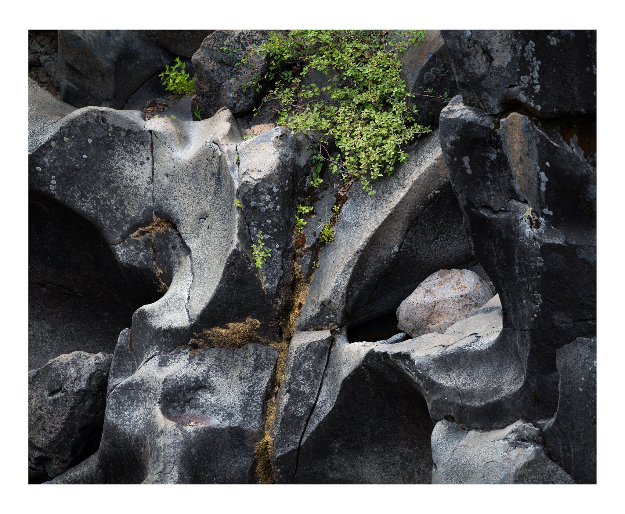
The main things that caught my eye were the shapes and cold colors of the eroded rock, broken by the warm tones of the shrub and moss.
What technical feedback would you like if any? What artistic feedback would you like if any?
Any critique welcome. The right side focus isn’t so great - is that too annoying? Overall too busy?
EDIT: The rework is closer to the raw file as far as the amount of shadows. I lightened it for the first post, but per Stephen’s comment, I do think going back to the darker look helps the shapes pop out more (which was what I saw in the first place).
Pertinent technical details or techniques:
(If this is a composite, etc. please be honest with your techniques to help others learn)
Single frame, a73r, 100-400@202mm, f/8, 1/100s, ISO 500, hand held.
Yes, Bonnie, some great muscular shapes here. A very nice composition; I think the image would “pop” more with the blacks and shadows a tad deeper and if the greens were little more saturated.
This is nice Bonnie. The shape and texture of the basalt give the image a nice flow and keep my eye engaged throughout the frame. While I don’t know what is out of the frame on the top I do find myself wishing for a bit more room on the top so that the vegetation is not cut off on the top of the frame.
Stephen, the original did have deeper shadows, which I lightened for fear of it getting too dark. I went back and turned off the layers where I brought up the shadows/exposure, and I do think that makes the shapes pop out more. Will post that rework.
Brian, there isn’t anything more at the top. I deliberately cut it off there. My feeling was to have the shrubs flowing down into the frame.
What a wonderful nature abstract! Quite a bit of a mind-bender actually. At first glance I had a momentary thought that the bottom third was a reflection! Clearly it’s not, but to me I see an implied line about 1/3 the way up from the bottom.
Love the shapes of the rocks and the shadows and light play a big role - and for that I prefer your slightly darker rework. This would really go full mind-bender without the vegetation, but I like color to break up the monochromatic look.
Just a wonderful little scene. Great eye to frame and capture this.
Bonnie - I don’t find this busy at all and I like what you did with the rework. It gives the scene a richer ambiance. As Lon said, this is a wonderful nature abstract.
Very nice image. It’s interesting how much livelier the plants are in the rework than the original, even though they are exactly the same. I don’t think I would have gone as dark as you did in the rework.
The rocks remind me of bones for some reason. Hip bone. Eye sockets (with a bit of hair up top).
Really nice abstract Bonnie. The rework elevates this several notches, nicely done. I agree with @Igor_Doncov, the rocks do look like hip bones and eye sockets. Very cool…
Where these rocks sculpted by water, or is this some kind of volcanic rock ?
Thanks, @Ed_McGuirk & @Igor_Doncov! I, too, thought the main rocks looked like hip bones or eye sockets. This is basalt (a volcanic rock), sculpted by the McCloud River.
Hmmm. Honestly, my reaction to this image is just the opposite of my reaction to your McCloud image posted a week or so ago. In that image, my comment was something to the effect of it had lots of info but retained a simple, uncrowded look. This image just kind of scrambles my mind and the split in the middle just scrambles it even more. I love certain elements of it, certain shapes or textures, but overall, it’s not one of favorites of yours.