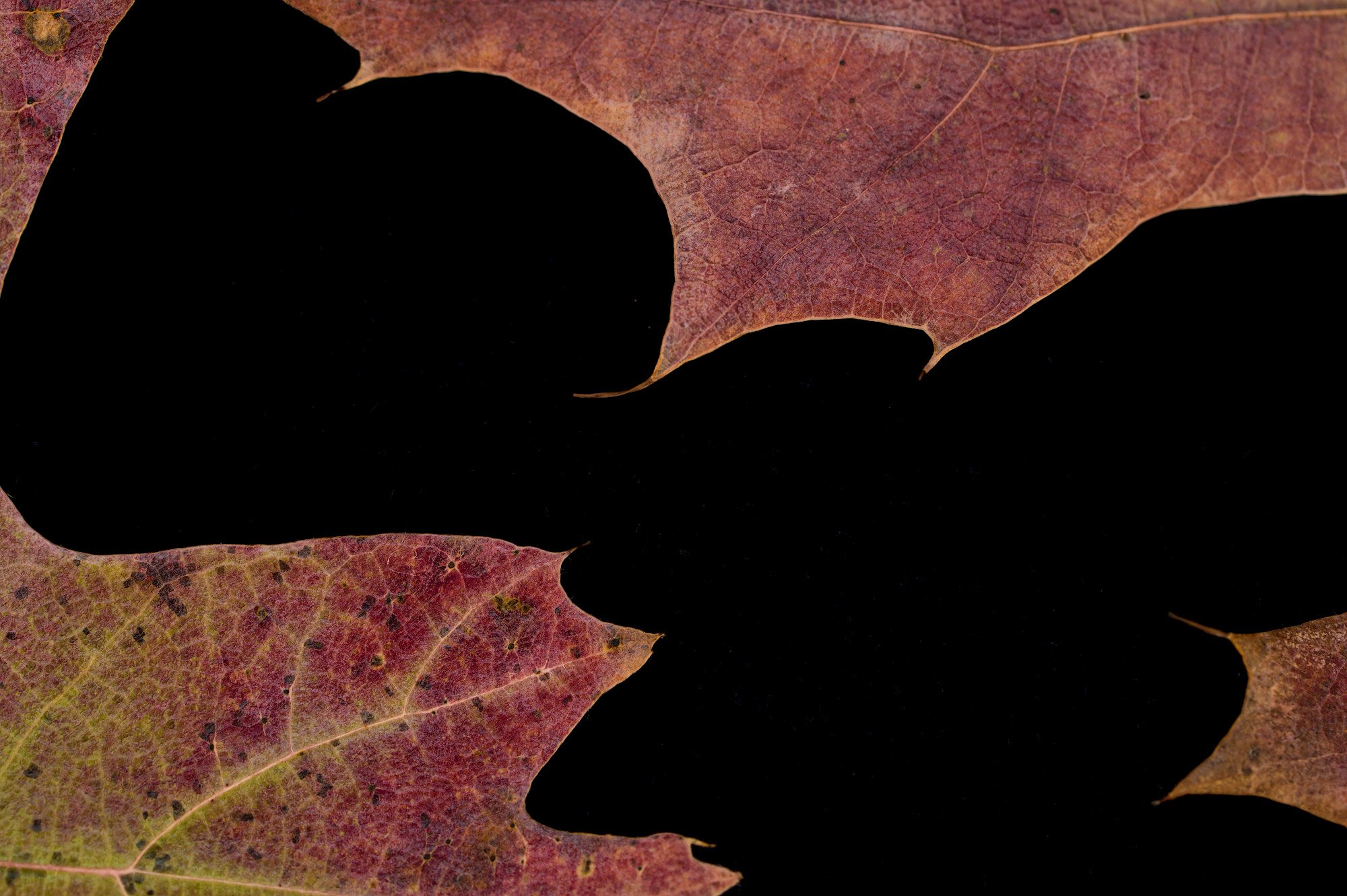
Nothing fancy here, just a studio shot, stacked - 2 images.
I am wondering if this works as an abstract? For me, at least, it has a bit of a face/vase feel to it.
Curious how you see it, feel it. Any thoughts and comments would be great.
Nikon Z6ii, f/14, 6 sec., iso 160, tripod, remote release
1 Like
Hi Linda, what an interesting abstract image. My mind played a trick on me. At first glance all I could see were the shapes created by the dark areas of the image. Then I noticed the leaves and their positioning. Quite a fun image to look at. I don’t see a face in the image. I do think the arrangement of the leaves could use some refinement especially on the upper left edge. This looks like a fun scene to play with in the studio. Nice work!
2 Likes
Very interesting! In the thumbnail, I saw the black shape as the subject, but in the larger view the lower leaf became prominent. I wonder about toning down its details to keep me toggling back and forth between face and vase. (That image drives me nuts!)
It would be fun (and very time-consuming) to try to arrange leaves with more recognizable shapes in the black.
1 Like

Thank you, @Alfredo_Mora and @Diane_Miller. Yes, I did get lost for several days playing with this idea. Moving the leaves and playing with many types of leaves. I did take a minute, Diane, to blur the leaves and played, some more, with color variations. Truly fun stuff!
I liked the original but the rework is even better.
1 Like
Thanks, @Igor_Doncov. I agree with you about the rework. Just experimenting with different colors gave the image a whole different feel. Appreciate your thoughts.
This is really interesting! I like everything about this except I don’t think the piece of leaf in the top left corner is helping, I wish the blackness continued off that edge instead so it would feel more shaped and open. I think it needs to be consistent with the right side where the blackness goes off the edge in those two spots. This would be a very easy clone job to get rid of it.
1 Like
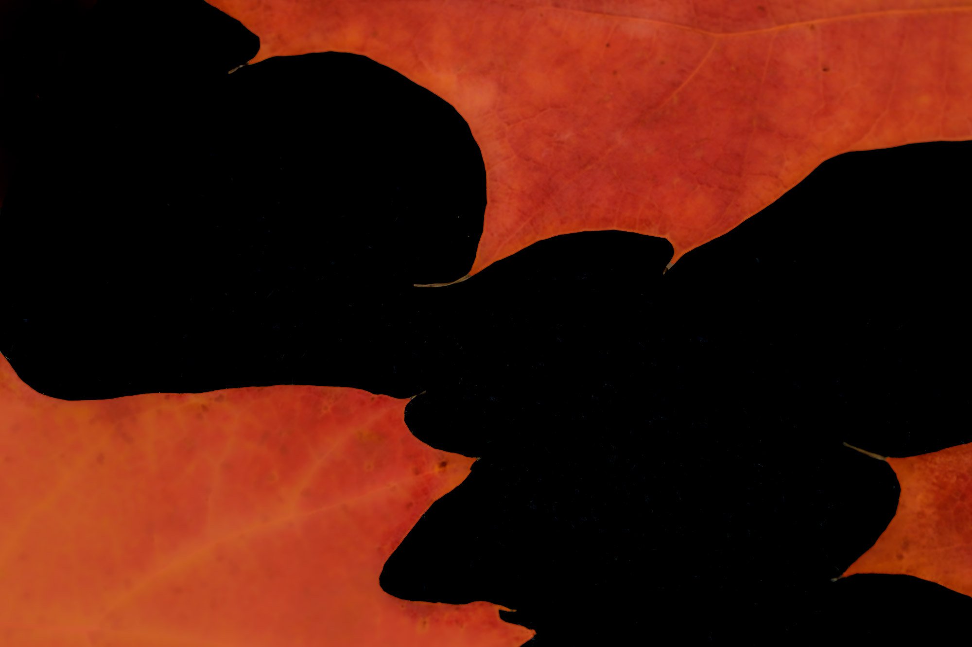
Thanks, @Eric_Bennett. I appreciate you taking the time to look and your comments. In the “just for the fun of it” category, I did clone out the ULC. Clearly this gives the image a whole new interpretation, which I’m quite enjoying. Makes me wish, again, there were more hours in the day! Thanks again.
1 Like
I’m grateful you invested these few hours in these images. They are fun and fascinating. I love the way my mind flips back and forth between dark and light, a wonderful way to disrupt seeing…all for the better. Onward Linda, onward!
Linda, this looks great in all of your interpretations. Clearly lots of fun and experimentation. As a big fan of subtlety, I especially like the mix of black against sharp edges and real leaf colors in the original. You can push the drama there somewhat by increasing the saturation
Oh, very striking! I feel the crop without that ULC leaf has more energy - my eye isn’t stopped at that corner. But the original color does it for me because of the definition of the edges of the leaves. There is a faint lighter line around the edges, which accentuates them. On the other hand, softening the details of the veining is good, too. So many options!
Thanks so much, @Mark_Seaver and @Bonnie_Lampley , glad to hear you’re enjoying the photo as much as I did making it. Yes, I agree there are certainly many ways to manipulate this type of image. . . just need to get more time in my day to do it! Thanks again.