The photographer has shared comprehensive information about their intent and creative vision for this image. Please examine the details and offer feedback on how they can most effectively realize their vision.
Self Critique
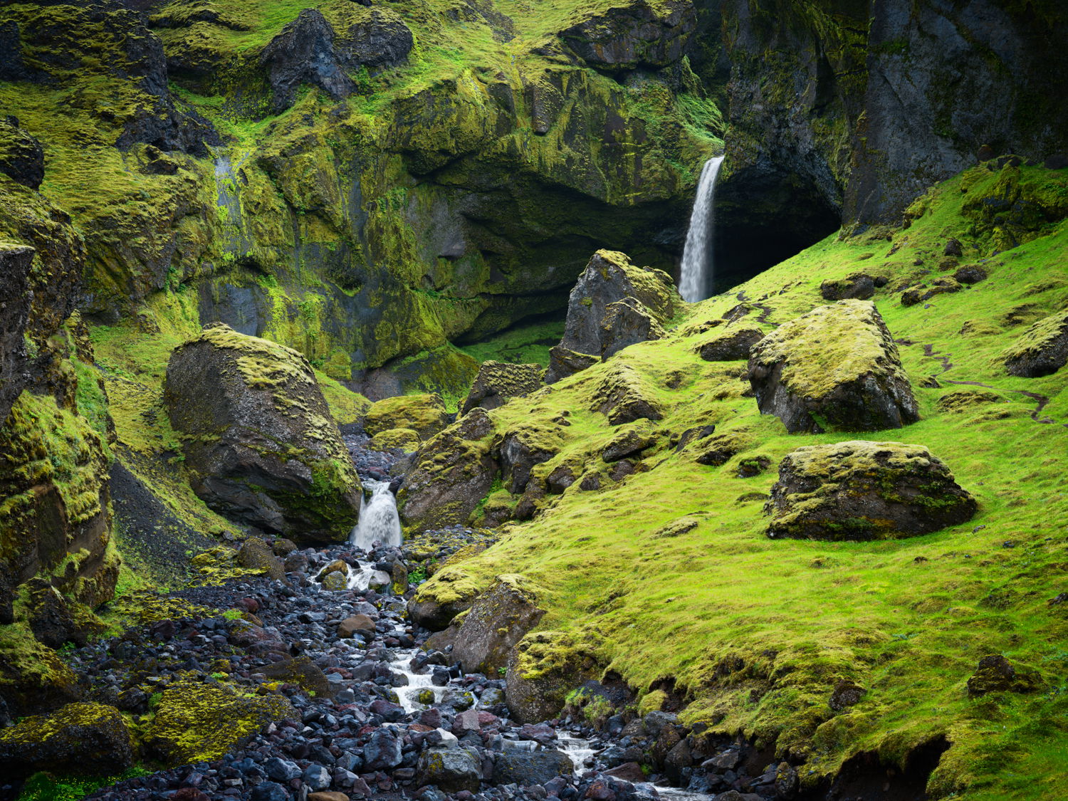
I think this image is successful in capturing the mystery of Thórsmörk. This is a very special region in Iceland and I’ve always been fascinated by the mossy landscapes hidden within. The part I’m struggling with is primarily the lighting. Does your eye get drawn to the waterfall successfully or somewhere else? Of course the moss is very bright so I think this makes it tricky because darkening the moss also makes it more saturated!
Creative direction
I want people to feel the mystery within this valley. To me Thórsmörk is the closest thing to being in a book of Norse mythology in all of Iceland.
Specific Feedback
I would like feedback on the balance of light in the image and compositional tweaks if any.
Technical Details
This image is fairly straightforward. The only thing I did to help out a little was blend a darker more textured exposure for the water to bring back the details that were blown out previously.
Description
I was driving through Thórsmörk and saw this waterfall off in the distance. It was at that moment I knew I needed to capture an image that embodied its beauty and wonder. This was my attempt at such a photo.
Critique Template
Use of the template is optional, but it can help spark ideas.
I do think the waterfalls and cascades get a little lost because of the dominance of the bright greens and yellows.
You could darken those colors and then reduce the saturation of them. If you have Photo Shop, create a B&W adjustment layer and then set its Blending Mode to Luminosity. You can then adjust the brightness or darkness of the greens and yellows independently.
Next, create a Saturation adjustment layer. You can then adjust the green or yellow saturation to taste. If the saturation is too much, try setting the blending Mode to ‘Soft Light’ for a more mellow effect.
You could also adjust the saturation of the blues using the same layer. I say this because the blue in the foreground rocks is a tad too blue.
The detail across the board is very nice and you did a great job with the waterfalls. With some adjustments, this would make a nice print.
-P
That is a cool place! The way the waterfall is flowing over that dark recess is mysterious. The composition is nice - the stream in the foreground leads our eye back to the waterfall. Those are strong enough elements that my eye goes to them, even though the mossy areas are positively fluorescent.
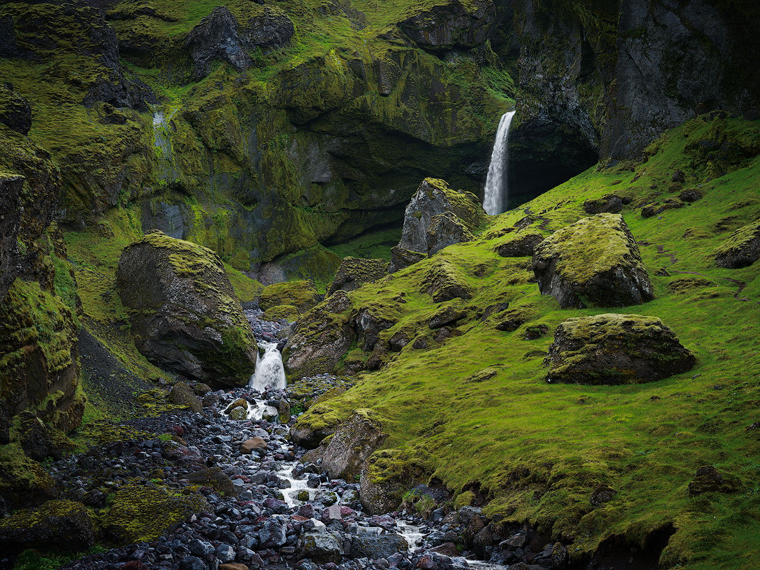
I think if you want a more mysterious look, you’d have to tame those greens. For me, their brightness doesn’t convey mystery. You’re correct that if you darken them, the saturation increases - perhaps darkening and desaturating together. I took a crack at it, and maybe went too far, but you get the idea. I darkened and desaturated everything except the waterfall and stream (also desaturated the blues, as Preston suggested). I did all this in ACR, tweaking various tones and colors in various ways, using the color and exposure tools.
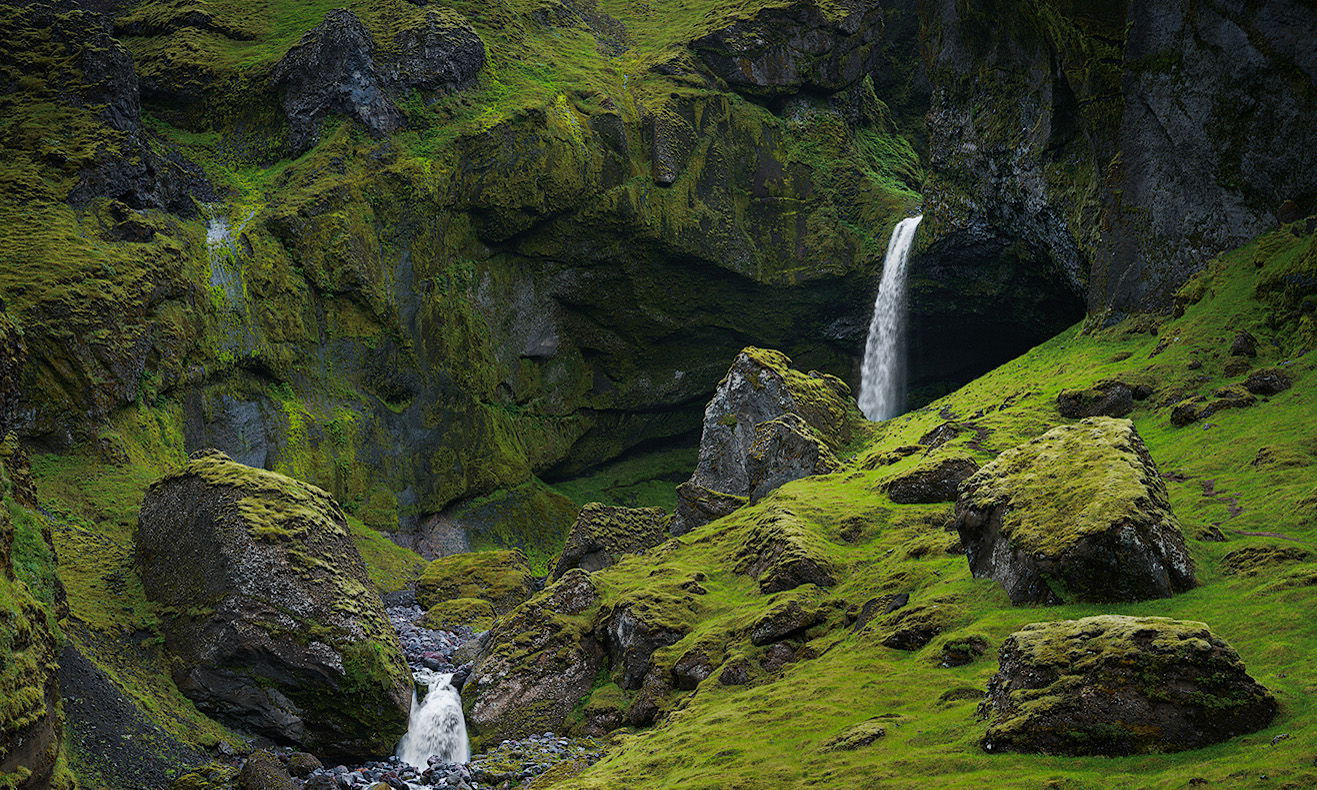
Hi, a grand photo that benefits from the changes previously mentioned. Perhaps you could also consider adjusting the crop to further emphasize the waterfalls and the cavern behind the main waterfall by removing areas of green.
@wisemufin, I like @Bonnie_Lampley’s work on the greens., as well as the reduction of the blues. Her edits have given a very nice balance to the scene.
Regarding @Rob_Sykes crop, I think it’s a bit too tight at the bottom. I prefer the original framing.
-P
Love Bonnies version of the processing together with the original crop it brings the picture to life in a lovely subtle way retaining it’s aim of mystery. I probably would reduce the green sat of the grass even just a fraction more.