Actually, I don’t agree with Bonnie on this. Or more correctly, I partially disagree. I didn’t comment on that because I was hoping this conversation would die down but since it hasn’t I will explain. I feel that the image should speak for itself. The poster should not have to explain what it’s trying to say. When you explain an image you are influencing the viewer and you are likely to get a biased comment. I don’t like a poster telling me what he/she thinks of her image. I feel that’s the job of the viewer.
Once again, I am not offended by the criticism. I have stated what I think is helpful criticism and what is not. I have also stated that that is my conclusion based on experience. A b&w critique of a color image is an alternative. To then comment that the color image in the original is deficient due to properties in b&w that are not in color is absurd. You have apples and oranges and then you state why don’t the apples look like oranges. That’s what set me off.
I am sorry if I offended you with my radical crop. Frankly, that proves to me that I am right. Radical suggestions are usually not beneficial as critiques. I did, however, fully understand your image and its intent. I actually stated why I made that suggestion. I thought the centered composition that was bilaterally symmetrical was not the best way to show that subject. The crop I offered provided the same isolation as the original you had in mind. So I did understand your motive and I offered a crop that I thought would improve that motive. Some people like more criticism and others are seeking affirmation of what they have created. It’s hard for the viewer to know what level to provide.
Regarding my image. I have stated that it’s simply a work of beauty. I don’t have anything to add as guidance. I took the image because I thought it was beautiful. You just respond to it as you feel. It’s not a complicated image.
Bonnie’s images, I feel, are perhaps the most complicated that are posted at NPN. They could, in my opinion. provide more guidance about their intent or sometimes what they are even about. But for me, part of their attractions is their mystery, their ambiguity. I have stated that on many occasions. So even there I am happy with the way things are.
Finally, I want to reiterate my view on critiquing. I try to understand what the image is trying to say and provide suggestions on how to say it better. That’s all.
And yes, to be honest, it is beginning to feel like ‘piling on’.
Point taken. I do find it difficult to verbalize what my photos are “about”. Like you, I see a scene that catches my eye, that I find beautiful or interesting, and point my camera that way. There’s undoubtedly a reason I “see” a particular scene, but trying to describe it after the fact is not easy. And I’m guilty of saying “any comments welcome” myself (rather often - ha ha).
Igor, I believe your reaction to a suggestion was a bit over the top. If you do not want suggestions of major changes to your images then you need to include that in the description when you post the image to let others know what you want to get out of the critique. Some people get great value out of suggestions for major changes.
How are we supposed to know what you want from this? The guidelines for critque are intentionally vague so there is flexibility for all suggestions. Not everyone believes an image should speak for itself and a variety of critiques can be valuable to many members.
From the definition above, it’s obvious that an image posted in an NPN image critique gallery becomes the subject of critical evaluation and review. By understanding that a critique is based on the viewer’s personal opinion, posting an image for critique amounts to nothing more than taking a poll of everyone’s opinion. Most assuredly, some will find the image pleasing “as is” while others will object to certain technical or aesthetic aspects of the image.
One of the worst mistakes that can be made by the person posting an image is to debate a critique. After all, the viewer offering the critique has taken the time at the poster’s request to share their thoughts on what pleases or displeases them about the image and to offer their advice on what they believe can be done to improve it. The nature of the process almost guarantees that there will be comments made about the image that the poster (or other viewers) will whole-heartedly disagree with. But to debate the validity of a specific critique is ludicrous; if the person who posts the image is not prepared to accept the results (both good and bad) of the “poll,” they should not post it in the first place! However, it is appropriate to ask a viewer to clarify his or her comments if those comments are not entirely clear, providing the viewer has asked for their additional time and effort in a congenial, non-argumentative manner. In all cases, critique should not be taken personally, but rather at face value, nor should the critique of a photographic image be misconstrued as an indictment of one’s lack of ability.
When an image is posted for critique, the person who posts it should be prepared to take all comments, both good and bad, and to do so in a respectful and appreciative manner.
A cornerstone of critiques on NPN is that they should not be debated. It’s your responsibility to pick and choose what agree with and do not agree with. The simple way to avoid these types of critiques in the first place is to be clear on what you do not want out of a critique in your original post.
I’m not attacking you here Igor, I’m trying to help so you can see this from a different perspective. Also, I don’t want to see people stop commenting on your images because they’re afraid they might offend you. I know many people will see this thread and decide that they don’t want to engage with you because they might get the third degree for making the wrong suggestion. I don’t want to see that, you’re a valuable member and I feel this all could be solved with better communication of what you want from a critique.
Good point. And I am definitely guilty of this in my responses here. Although this was more of a critique on critiquing that took place than an unhappiness of what was said. Somehow I saw a difference. It turned into more of a discussion of what were good critiques and poor critiques in my opinion. I really have no objection of people not liking my work. I have even posted comments myself of how I don’t like my work. But it is clear that either people (including you) didn’t get my point or I made my point poorly or I was deluding myself that I really had a point (in that this was just about “being offended”).
I actually had the same fear. This whole thread took an unexpected and unpleasant turn. I honestly wanted a critique which nobody besides Bonnie gave. The upper right quadrant feels dark to me and I expected to get a comment about that but it never came. I didn’t say it because I wanted others to independently see it and comment on it and rather than me lead them into what I think is the problem but have them see it. I feel that is the only valid way to get an unbiased opinion. It’s not my critique but their critique. I think that’s why virtually all posters enter “Any” into the section of what they want as a critique.
Also, I had never read the above quoted guidelines on critiquing on NPN so that was helpful.
I’m not sure I agree with this but I can absolutely see why you would write this. The direction that this critique took certainly supports that. It didn’t have to go this way but it did. What was intended to be a discussion turned into an argument where even personal grievances were brought up.
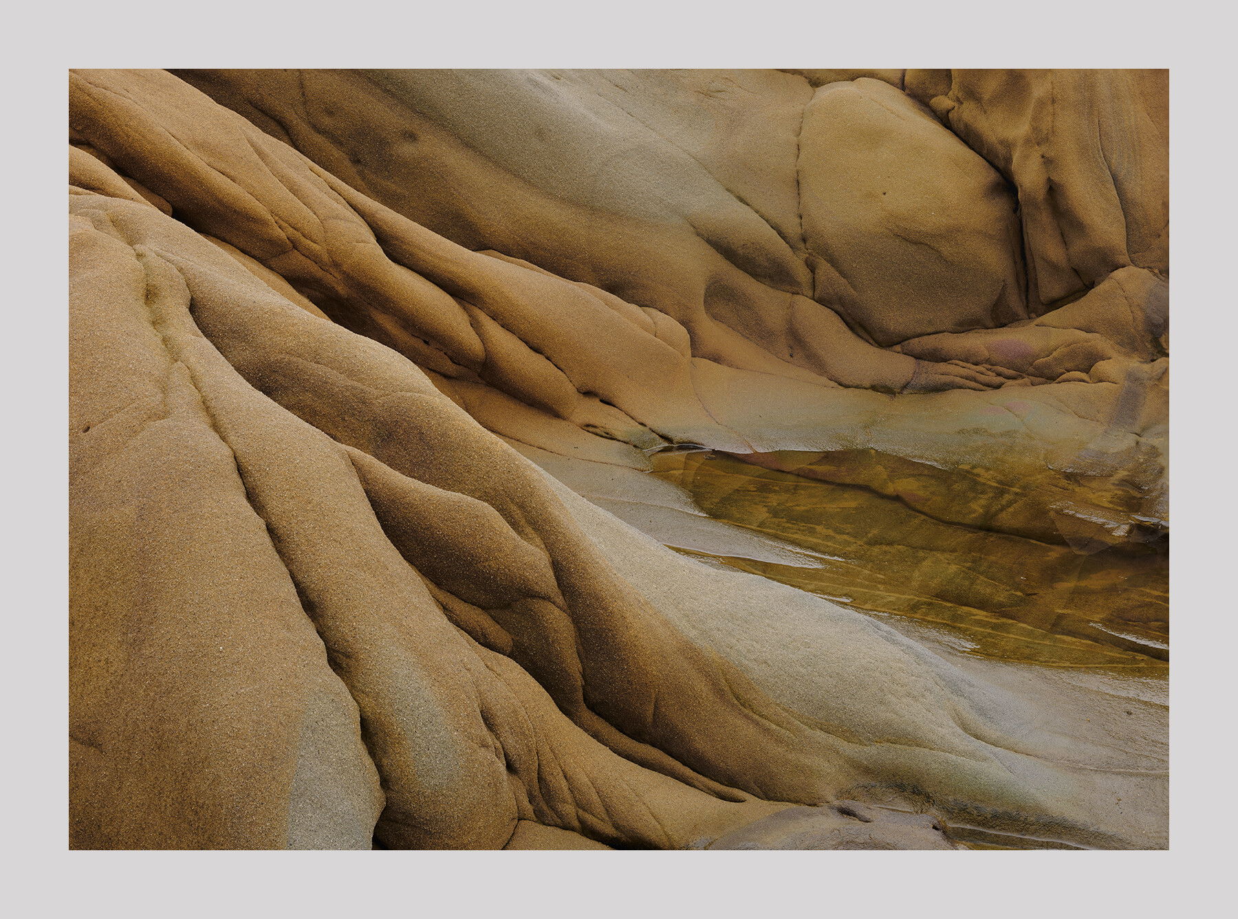
Putting the debate aside, I’ll first say that I prefer the original post over the lighter version but the differences are minimal. Even though the sandstone depicted in the image is very course, this image has a softness that I believe is intentional that is created by the use of the curving and twisting lines you’ve captured. It’s almost like the sandstone was melted.
I believe the left side of the image has more appeal than the right side because of those flowing lines, the same direction of the lines and the softness of the lines and I see a potential portrait crop of just the left side of the image removing the pool of water and the URC which doesn’t have the same same flow as the rest of the image but I also love that line that flows from the ULC to the BRC and is my favorite part of this image, so this is just an observation that might not hold up. Including the water also gives this image a sense of place where if you crop it out it is more of an abstract. Would love to see what your other composition is and look forward to you posting that one.
There is one spot right along the top middle edge of the frame where there is a dark indentation that grabs my eye. I wouldn’t crop it out but if you are so inclined, you might clone it out.
I can’t believe you actually found this same spot after 2 years. Incredible determination. I can certainly see why you came back to it. By the way, the colors look warm and inviting and add to the soft melted look I referred to above but I can also imagine this would look great with other color combinations as well.
Thank you for taking this thread from this nightmarish merry-go-round.
Here is the original image that I thought had great potential and decided to reshoot it. The light conditions were better and there was less water. I think I improved on it but you can decide. This image is slightly blurry but it’s not apparent on the web. It was shot with the D810. The compositions are not identical because I just shot how I felt rather than making a duplicate. Feel free to compare and say whatever you like. I am not looking for specific comments.
Your analysis of the image corresponds with mine. I liked that long flowing diagonals from one corner to the other and that was the main thrust of the composition. Now that I look at this image more closely I think the former composition may have been stronger as I positioned myself to avoid that upper right quadrant. Below the lower edge there was bright reflective water so I could not have duplicated the previous composition had I wanted to.
I actually prefer your older version. It has more of a gently flowing, rounded feel. That may be from including more of the larger folds near the bottom (I get more of feeling of their flowing down) and/or because the shadows aren’t so strong. And I don’t see any softness; you must have higher standards than I do.
I rather like this older image. I really like the blues and greys that are in rich contrast to the orange in the image from two years ago and I also much prefer the upper right quadrant from that older image but I prefer the newer image’s bottom third of the frame. and the left side slightly better in the newer image. Thanks for sharing the old version.
I have to agree that the older version has a stronger, a better composition. There is no question about that. I am glad I pulled it out of the archives because I didn’t bother to even compare the two. It’s amazing what a difference a change of several inches can make to a composition. What is amazing is how really different these two images really are even though all the components are readily recognizable. In my opinion the composition of the older image is stronger but the colors are better and the quality of the tones are richer in subtlety(half tones, I believe, is what they call them) in the newer image. Incidentally, I don’t believe any color cast was applied to the new version. Only the white balance was changed.
As a rookie to NPN, this has been an interesting post to follow in many ways. I am somewhat saved to chime in with the pros on this one but here goes. Igor, I am learning and I appreciate all of these images. Personally, I like the photo you first posted on this thread. I think the colors are rich and warm, something I would want on a wall. I also enjoy this composition. For whatever reason this photograph holds my attention and makes me want to study it longer. For instance, I look under the round rock and see an arm, hand and fingers. I can see images within images in this particular photo. The only thing I noticed that distracted me a tiny bit was the reddish orange circular shapes (like above the fingers on the hand I mentioned). Maybe those are naturally occurring. I think this is a great photo from a rookie point of view.
Good point. I will take care of it. It is natural but that does not mean it’s good. When the white balance was warmed that shape became really noticeable and bothersome. In the raw file it’s not that apparent.
Don’t be shy about posting your opinions. Many rookies, in my opinion, offer very sophisticated advice. Even the education level seems to make little difference.
Here’s my latest rework. I took the red out of the rock (mostly orange) to simplify the color scheme. I also dodged the upper right area a considerable amount. I also removed the spot David mentioned.
Significantly improved upper right corner that was a bit of an eye grabber and the colors are more harmonious but I prefer a little bit more of the orange/reds that were removed. Maybe 30%. Just a thought.
I reworked it to add some reds back in without the spot. I think I went overboard with the recovery of tones. It became out of balance with the left. So I brought back some of the darkness. The final version is at the top. Thanks for taking the high road and providing some constructive criticism.