Critique Style Requested: Standard
The photographer is looking for generalized feedback about the aesthetic and technical qualities of their image.
Description
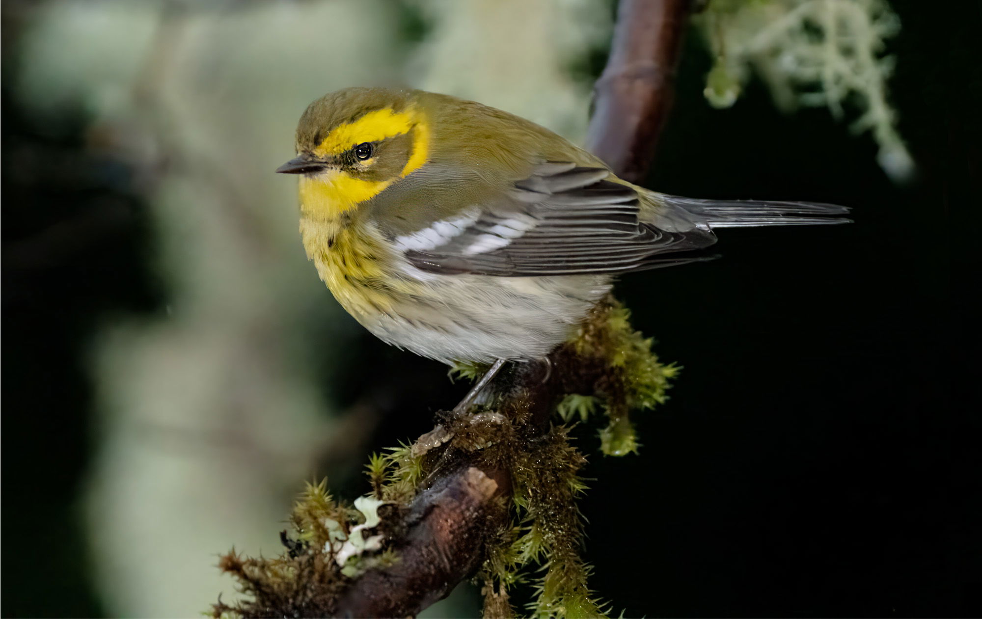
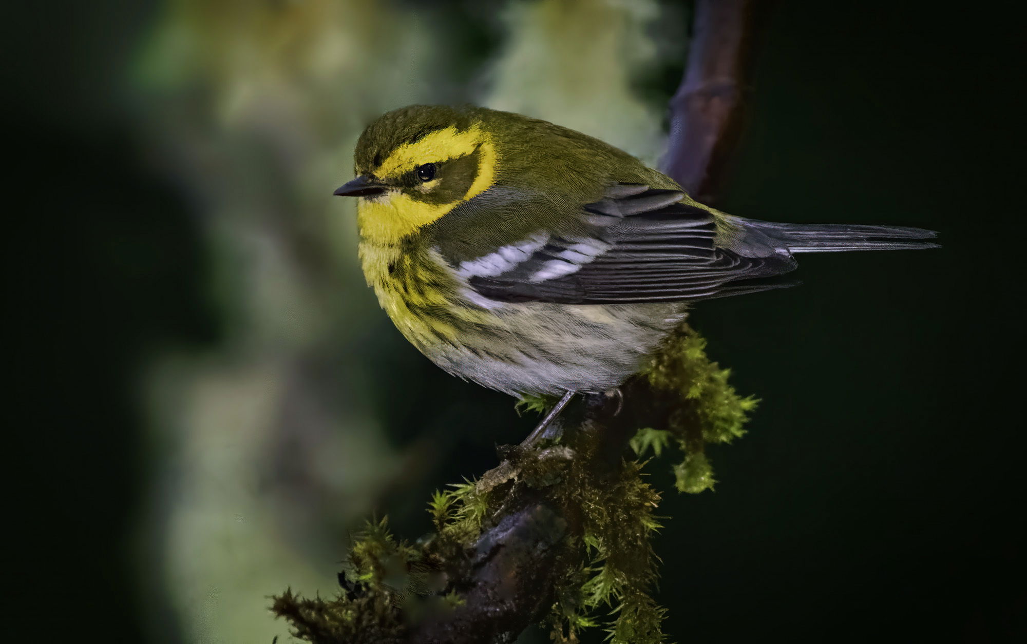
warblers are rare around my house. I’ve seen perhaps three or four different species over 25 years. So I consider this to be just luck.
Specific Feedback
anything with helpful
Technical Details
lost in space
probably shot with D500, ISO 12,800, 500 or 600 mm telephoto, 1000th of a second,fill flash
Critique Template
Use of the template is optional, but it can help spark ideas.
- Vision and Purpose:
- Conceptual:
- Emotional Impact and Mood:
- Composition:
- Balance and Visual Weight:
- Depth and Dimension:
- Color:
- Lighting:
- Processing:
- Technical:
1 Like
Nice shot of this warbler, David. I really like the pose and head turn. I do see Sandy’s point on the tiny bit of bright lichen. Were you able to find the raw image for this file? I’ll bet modern processing tools would make this really stellar. Still a fine image of this bird.
Nice catch David. Beautiful warbler and I like the pose with that head turn. I like the overall setting with the mossy perch. Bird does seem tad bit soft to me.
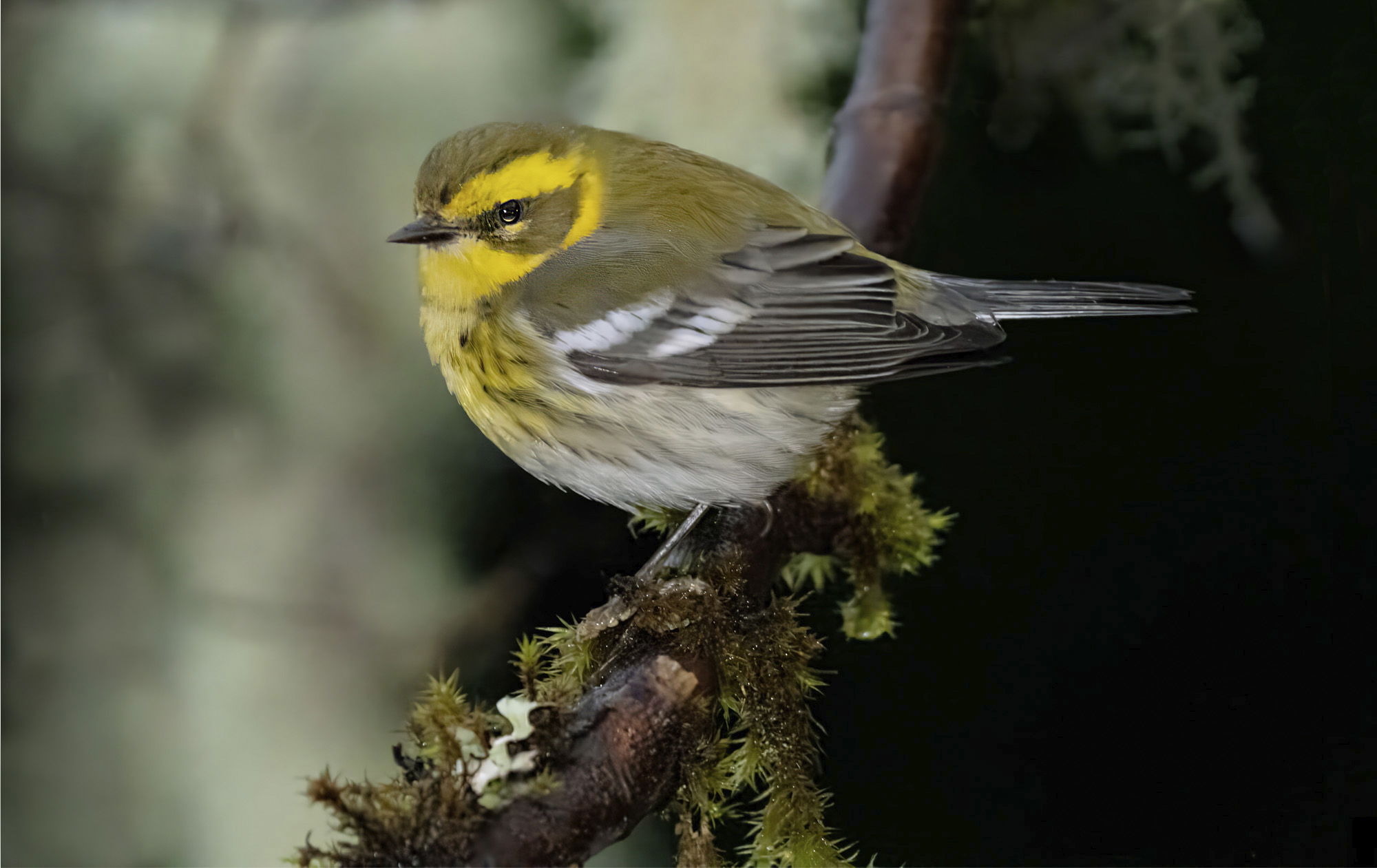
A very lovely bird! The softness doesn’t bother me, but the black areas feel too dark. The OOF moss in the UR and the area on the left are easily touched up with some 50% cloning, but that leaves the dark area on the right as even more prominent. Some 50% cloning could add some detail there but I didn’t go that far.
A possible fix is to select the bird and clone some dark into the area just above the bird.
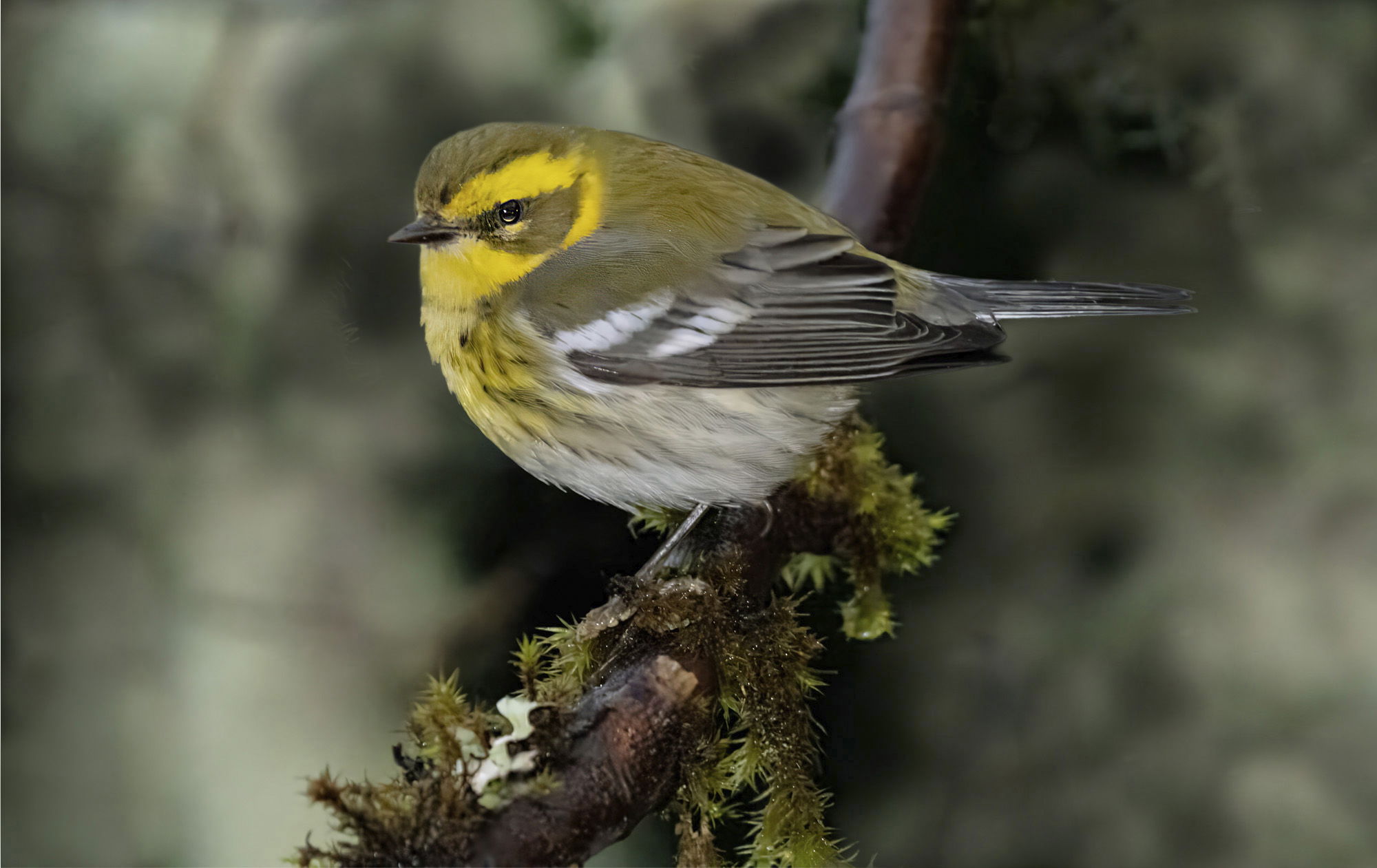
Then I had to go a bit further. This was just with select subject, inverse it, and 50% opacity cloning. Clumsy job just to show the idea. But I don’t know if your limited dexterity permits even that. You have been dealt an unfair hand.
Hi Dave
I like the overall look of this photograph. If I had this photograph, I would use it as a holiday card with your greeting in the lower right. But as a nature photographer, I am not in favor of making large changes to backgrounds. Although it does look nice.
Peter
Beautiful bird. I love the perch and the BG. Would maybe like to see the bird on the right side. Give it more room to “fly” to the left. Nice work!
Peter:
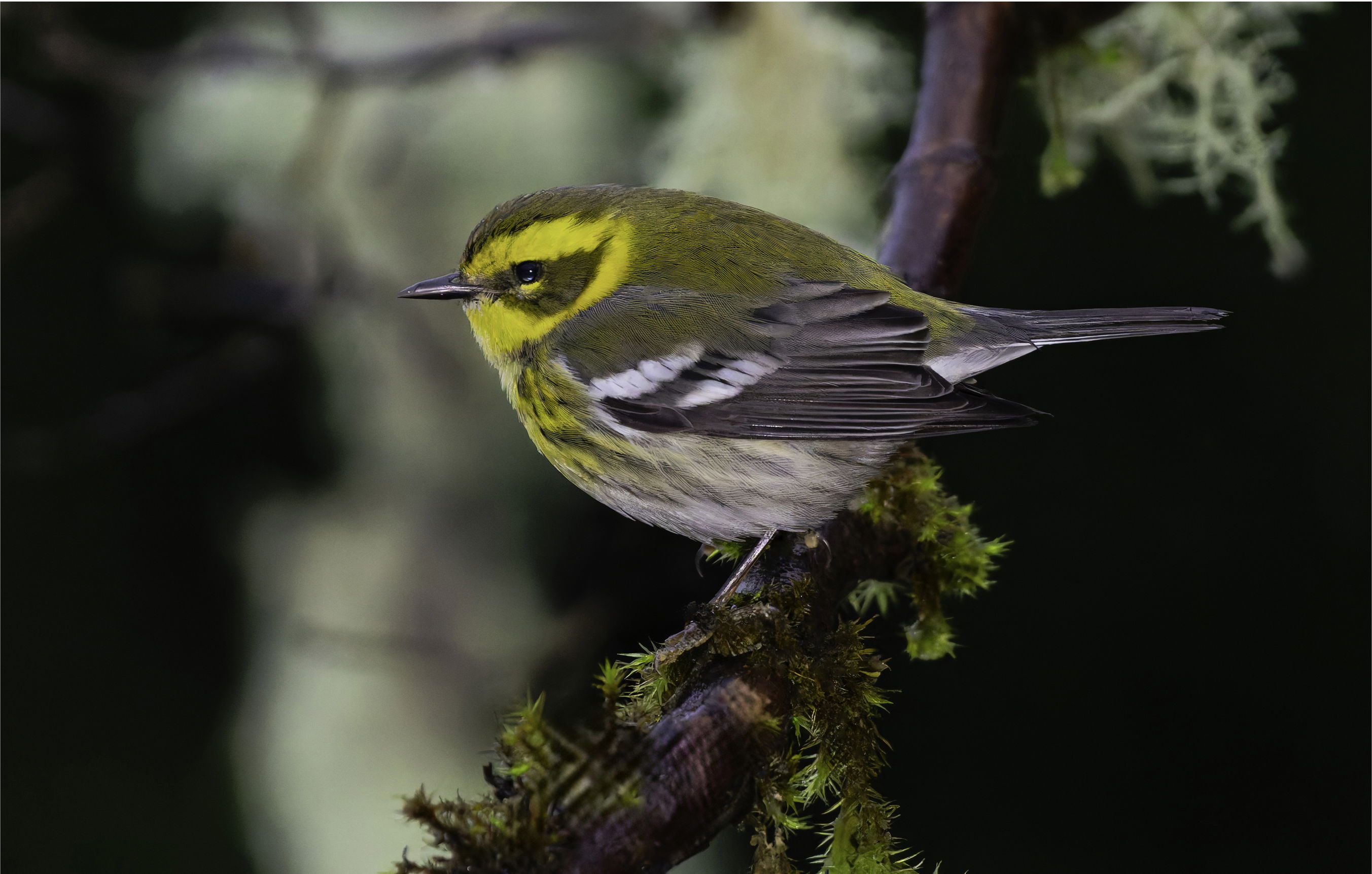
I agree with you about making large changes to backgrounds in this case I wouldn’t make any changes. I think we are all at a point in our careers where we accept dark backgrounds and images. I can see the point that Diane made about lesson dark space however like you Peter, a little more of a purist and don’t like to change backgrounds too much.I’m enclosing a less Softimage but without the head turn unfortunately.
this is a much sharper version although the head turn is missing. And my guess is there are none as sharp with the head turn. Oh well…
that was supposed to be a repost to the original. I didn’t really make any major changes. I got rid of the offending white spot and a few other little things.
Yes, this one is very nice. It’s not only sharper (although the OP was sharp enough for me for this very interesting bird), but the BG is better with more detail in both the light and dark areas on the left. I think slightly different raw adjustments could bring out even more detail in both those areas.
I also dislike major changes to BGs , and suspect the very dark area on the right could also be hiding some detail. Since select subject is so much better lately, there are easier options to bring up (or suppress) BG detail and leave the subject as it was.