The photographer is looking for generalized feedback about the aesthetic and technical qualities of their image.
Description
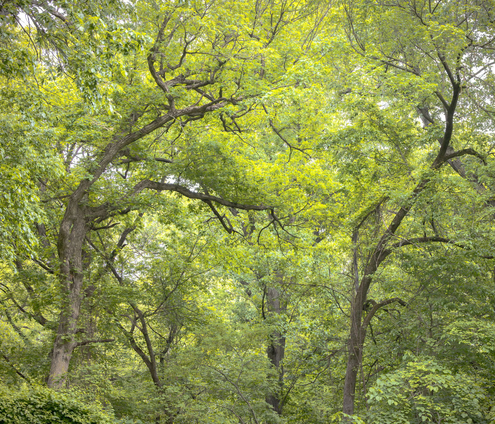
What attracted me to this image was curves of the two trees in the foreground. The light was not ideal but my current focus is to develop my eye for composition.
Specific Feedback
The main thing I am looking for feedback on is the composition, whether it works and what I could do to improve it. I am also open to other input.
Technical Details
I shot this at a high ISO as I did not have my tripod and then used LR denoise.
The strong bowing of the two trunks is reminiscent of a pair of dancers, and I can see why you were attracted. I also really like the green you captured. it’s not easy to get that green beauty to come through in a photograph sometimes.
Others will likely not worry too much about, or may even like, the asymmetry of space between the edges of the photograph and those two trees. I’m OCD enough that I’d like more space on the left. (Since there is symmetry between the trunks, I think symmetry between the edge space would add to that.)
I’d also recommend posting at a larger size. This is one of those images where detail would really make the greenery sing, and it’s lost when the image is too small.
Greetings John! I added some to the left and it does indeed help the composition. Thank you. That is precisely the type of input I am looking for.
I just tried to upload the image again and it reduced the resolution as it did with the original. I found the FAQ and will try uploading with 75% quality.
Attached is a revised image. I do have a bit more room on the left.
I concur with what @John_Williams has said about the symmetry and your repost helps immensely. Maybe even a touch more canvas can be added to the left but it’s sooo much better. The greens are well done without being too vibrant and saturated but this image is all about those two trees mimicking each other and that one tree on the left reaching out to grab it’s partner in a full swing dance. My little nit is that there is a tree trunk on the right edge of the frame that needs to be cropped off or dodged so it doesn’t stand out so much. I’m terrible with my edge patrol and it’s the first thing I saw. Others might not even notice it and it doesn’t detract one iota from the concept of what you captured in this frame. Well done Bill!
Thanks for the input @David_Haynes ! I did have more room to the left of the canvas so I added it. I also got rid of the “intruder” on right edge of the frame. The updated image is below.
Hi Bill,
I am a little late to the party, but I have to say that with each small tweak this image got better and better until you nailed it with the last one. The star of the show is obviously those two main trees and the graceful lines of their trunks; almost like two dancers as @John_Williams already mentioned. I find the greens to be quite lovely and very natural looking without being overdone. Beautifully done!
I’m also chiming in late, but I couldn’t pass up an image of my favorite subject, trees! Awesome job framing this; isolating this scene from the broader view. And yes, the main trunks anchor the scene, give it structure and reign it in from less chaos to more order.
Processing is spot on in terms of the greens and the saturation level. Great job there. I agree with others and the progressive iterations have really helped elevate the image. For me, I strive always, to “make the image the best it can be.” And I think you’ve done that.
One site tip - when posting edits, it’s often better to simply edit your original post and add the reworks there. This way, the viewers can page thru the edits for easy compare. No biggie, just thought I would mention.
The only thought I have for an edit might be to use a slight vignette - and actually maybe just 1/2 vignette for the top corners (bottom corners are naturally a bit darker so not needed.) Just a thought and a minor one at that.
I appreciate the feedback, especially from a fellow tree lover! I definitely will try to add a slight vignette that accentuates the top more.
Also, thanks for the input on the site. In the future I will add the reworks to the original post.
I also tweaked the color palette using David Kingham’s Natural Greens preset applied to meet my personal preference/aesthetic. The Natural Greens Preset is from the Beta version of his his Rethink Landscape approach to editing. After I did that, I did a luminance range on the trees and darkened them to accentuate them as that seems to have been lost. I am curious which version you like as far as color palette . Maybe I tried to do too much.
See revised version as part of the original post.
Bill