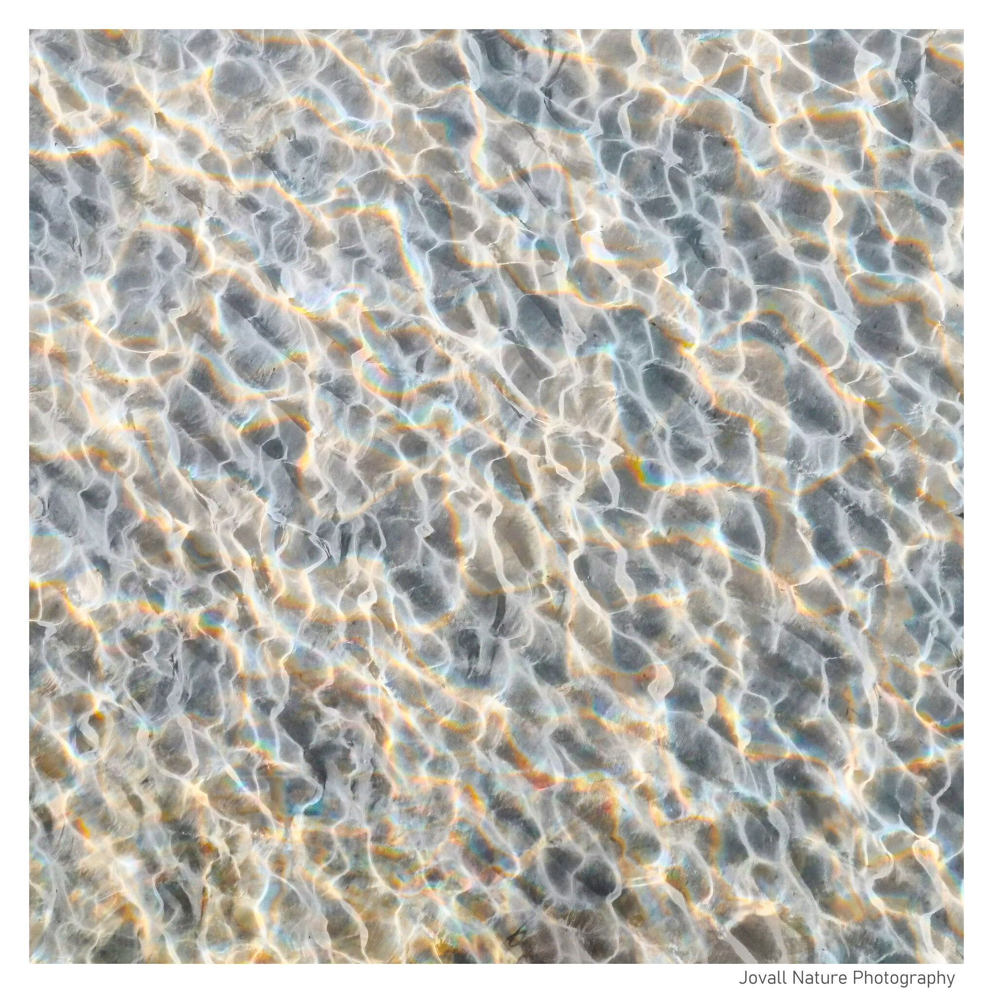
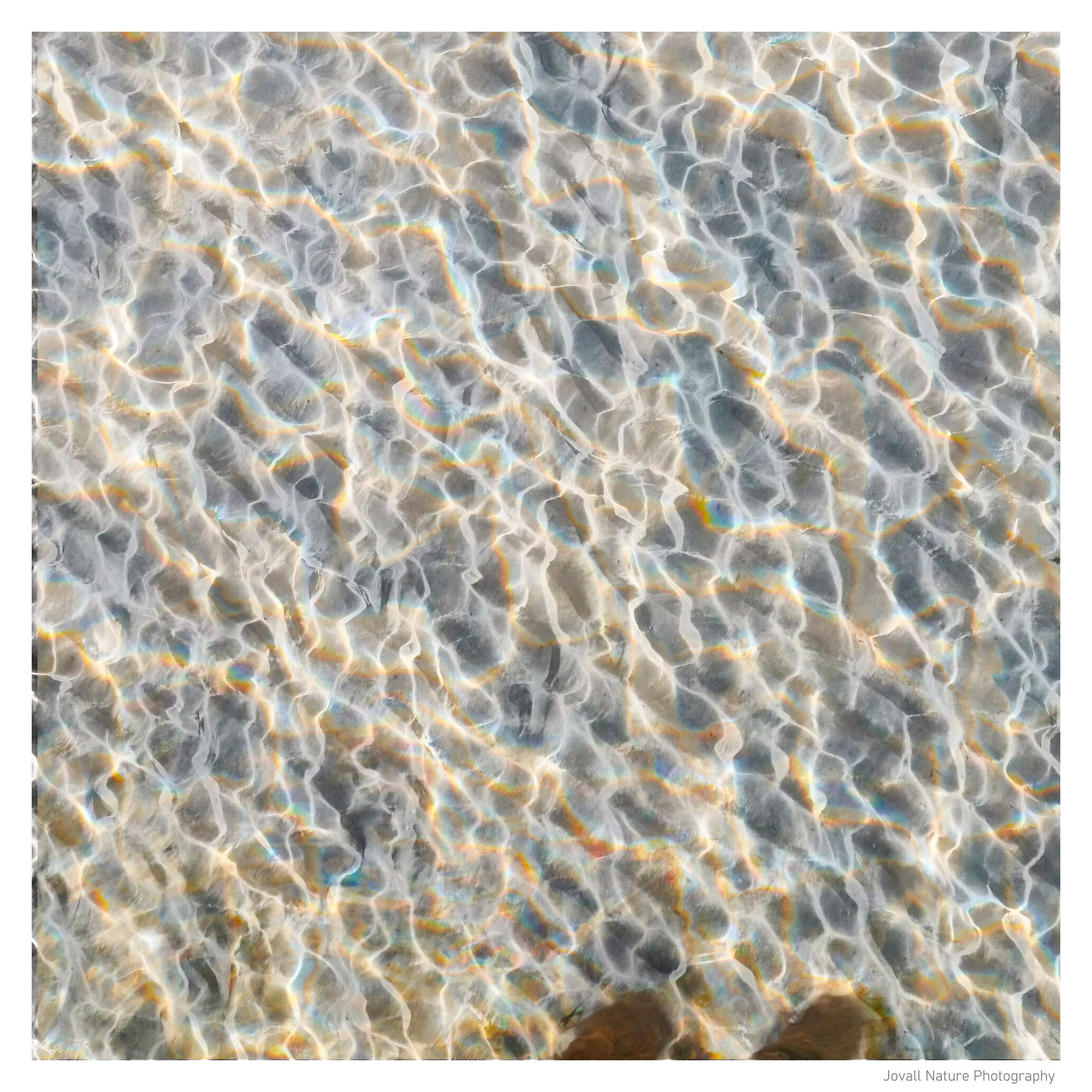
A couple of weeks ago during a morning stroll to the beach close to my weekend cottage, standing on the pier I recognized very nice ripples in the sand seabed overlayed by an intriguing wave pattern from small waves lit by the sun. I took some images with my mobile phone straight from above.
The base image is a somewhat zoomed out image rendered in b&w. Then I blended in an overlay more zoomed in color image. At the LRC I introduced a pair of pier poles to anchor the pattern. In a more abstract way of thinking you could see the poles to be the source of the colored pattern spreading out over the image.
Specific Feedback Requested
Any comments are welcome!
Should the pier poles be there or not?
In my thinking when photographing patterns that are abstract you could deviate more from reality than you normaly do. What is your opinion?
Ola, this is an intriguing image which somewhat reminds me of an abstract version of a honeycomb. I like the subtle colours. Not sure about the poles, it drags my attention away from the main part of the image.
Ola, water ripples catching the sun are a subject that I too thoroughly enjoy (as you’ll see in my post for this week). Having the patterns angle across the frame works well by being slightly disorienting. The textures showing through add interest. I would leave out the two posts, but that choice gets in to what you want the viewer to see and feel. If you’re looking for a bit of a surprise or “what’s that” reaction, then leave them in.
Ola, this is really cool. I love all the colors and texture here. There’s a lot to explore in this image.
I also don’t really like the poles at the bottom. They just break the pattern to me, and are what my eyes keep getting pulled back to even when I want to be exploring the ripple patterns and colors. Also, there’s a band along the left edge that is darker than the rest.