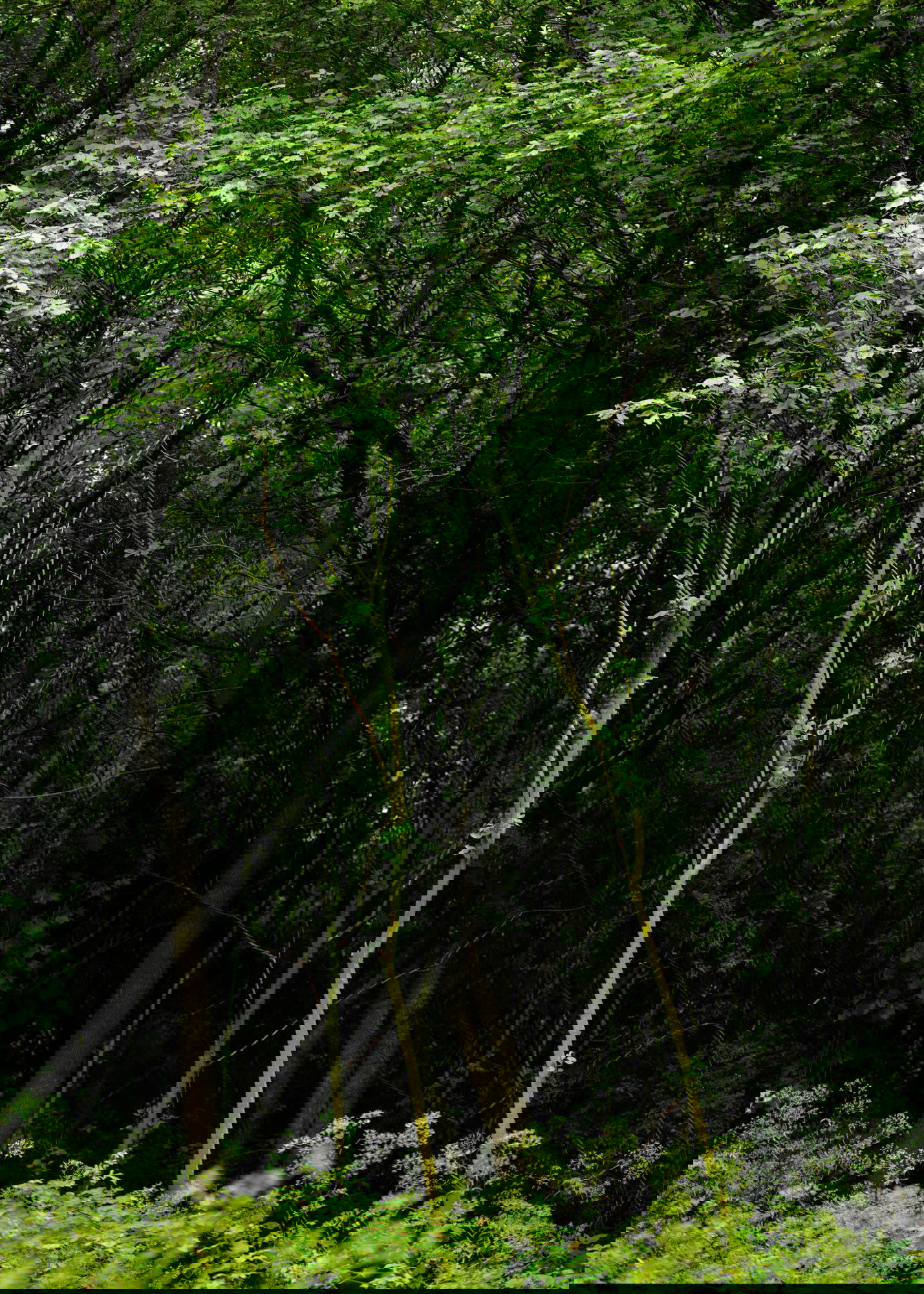
By seeing the image of @Joaoquintela (sisters),I remembered an image I made some time ago (TWINS)
I was not sure of the image and let it rest.
The comment of @Ed McGuirk set me to work on it again. I lightened up the dark background behind the trees on the right site. That did strengthen my image
Specific Feedback Requested
All feedback is more than welcome
Technical Details
Is this a composite: No
Ben, IMO this is a nice little scene. One idea could be to darken the trunks behind the twins somewhat, to isolate the twins even more. I gave it a quick try:
This is nice Ben,
those sure are twins.
I would try to crop the bottom, simplifying the image. I also try to manage the greens that seems a little over the top on my screen.
@Ola_Jovall , @joaoquintela , thank you both for your comments and tips.Ola, thank’s for your rework . I also did darken the trunks after lightening the right part of the image. so its personal taste I think.
Joao,about the over the top greens.
I hope to get more comments of NPN members about this issue of which I can imagine its not only my problem.
I process my raw images in photoshop on a Eizo calibrated screen and save them in adobe bridge. The colors in bridge on the Eizo are different than those in photoshop.
As I send them to NPN as srgb jpeg the colors seem always more saturated on my Mac. So I never am sure what one sees on his monitor
1 Like
Ben this this image sure does have some parallels to Joao’s “Sisters” image. I love it when you can place glowing vegetation against a dark background, you made great use of that here.
Ben I have been having some color space issues myself with posts at NPN. Is your Eizo monitor in the Adobe RGB Color space? I assume you mean the colors viewed on your monitor after posting look more saturated than they do when you are processing them? If so it could be web browser you are using isn’t set up to handle color mismatches. When you view Srgb images on an Adobe RGB monitor, and the image does not have an embedded color profile, then they will look too saturated. One way around this is to embed a color profile in the Jpeg you upload to NPN. The other thing to do is is to research how to set up your web browser, I use Firefox and there are some settings you need to tweak to pick up the right colors. Search for color space mismatches and your browser to learn more.
If you mean that your images look different in Bridge vs. Photoshop, you need to check your preferences for each, it sounds like they may not be set up in the same color space. I have both Lightroom and Photoshop set to Prophoto color space, and when I export Jpegs, they get converted to Srgb with an embedded profile. If you do not have an embedded profile this may cause color issues on Adobe RGB monitors, your own or other peoples.
1 Like
Ben if you continue to have issues with color after trying some of this, post a discussion topic and we can get some other folks involved to try to help you out.
@Ed_McGuirk , Ed I just did before I got your first answer. Thank’s again .