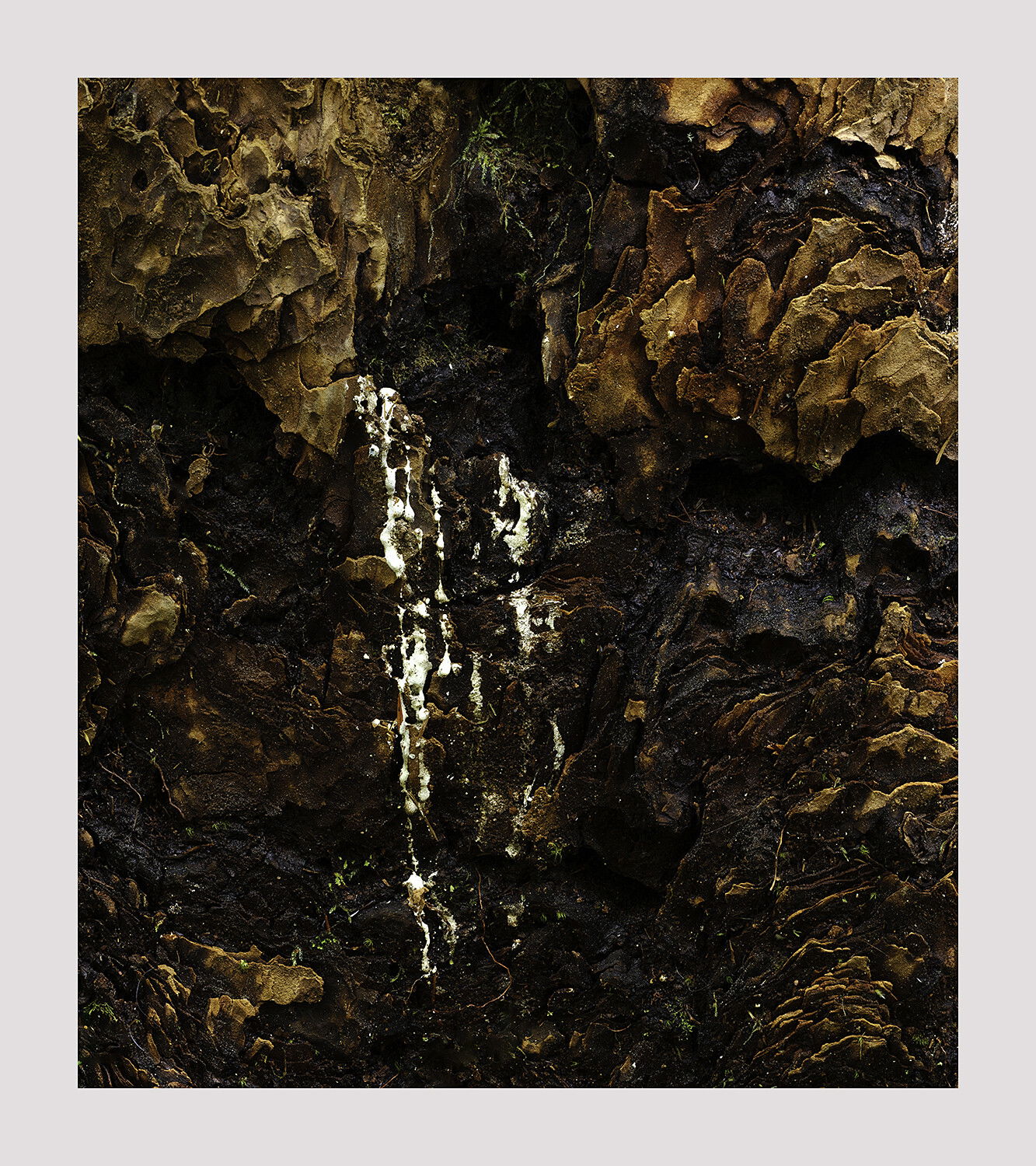
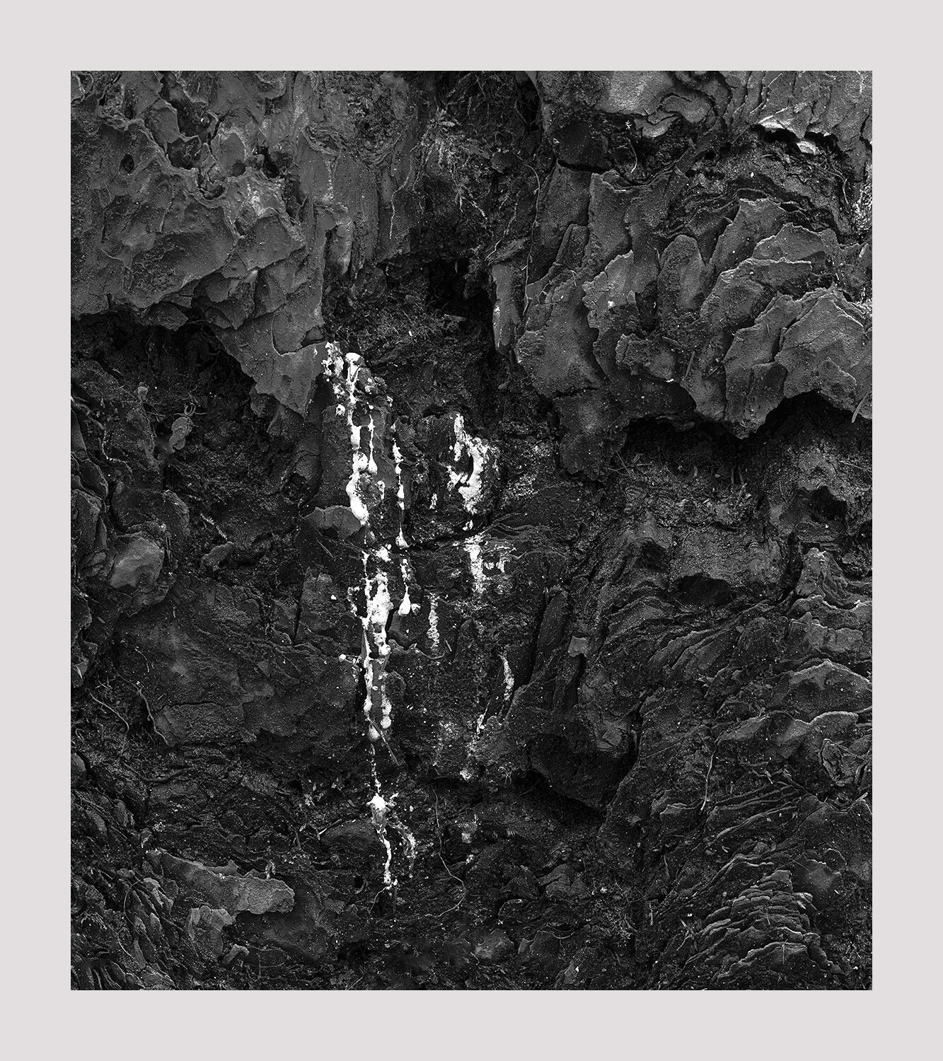
I’ve decided to leave this one untitled in order to not influence the user on what it is. It is, in fact, sap oozing out of a cedar but I just prefer to view it as an interplay of tones and textures. This image was originally processed in color and I was quite satisfied with that. But just before posting it I decided to give b&w a chance and I liked it a lot as well. So I’m posting them both and let you decide which is better. If you give a reason for your preference that’s all the better. This is one of those images where I would be interested to @Kerry_Gordon’s often repeated question “How does it make you feel”.
GFX50R, 45-100mm
PS. I would never have thought of taking such an image had I not purchased and studied a couple of books by Minor White. I meant to write a bit on him in this post but maybe will do so in comments if it goes in that direction.
I am enjoying both, Igor. But on first reflection, my thoughts went towards the color version because I like the warmth of the cedar. Want to take more time looking at them for my final thoughts.
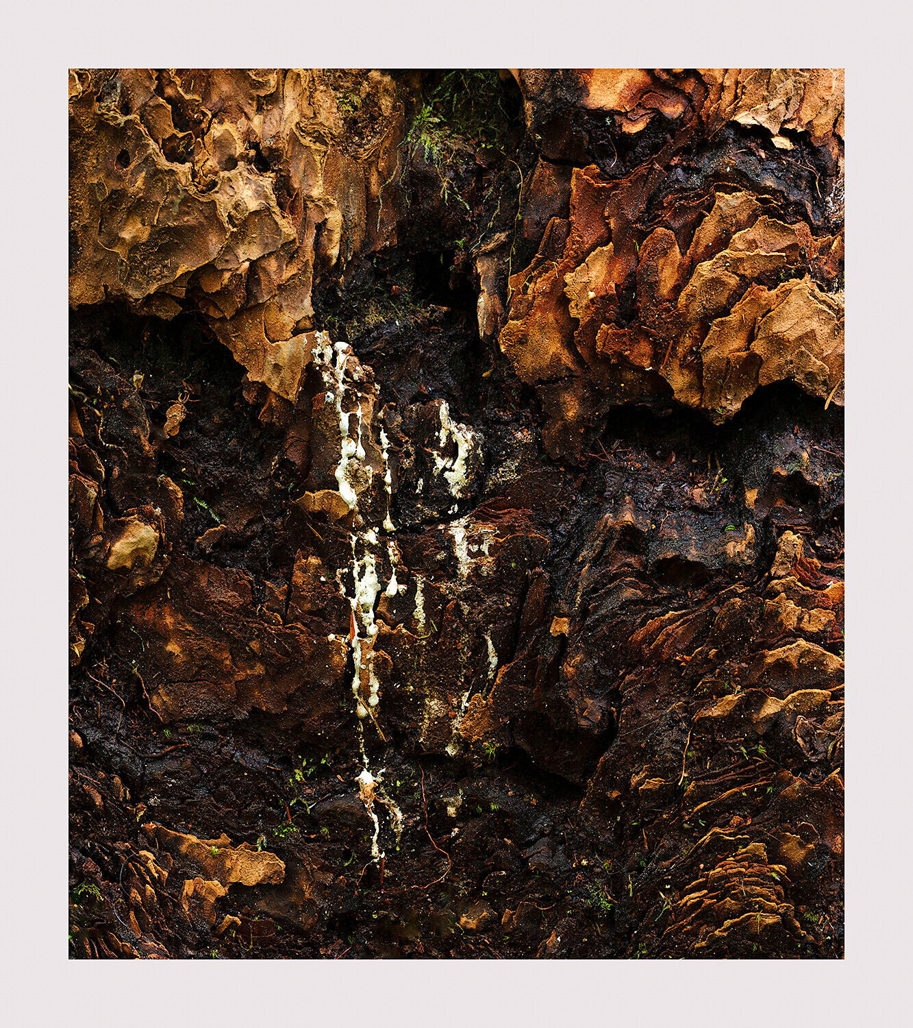
Igor, I like the texture and patterns in both images but prefer the warm tones in the color image. I think an increase in exposure and raising the blacks would help. This is a version that has those adjustments. I also added a gradient across the whole image and then selected the warm tones using a range mask in Lightroom. Then I increased the exposure to help bring out the bark of the tree.
Thank you Alfredo. I actually have a version like this but chose the darker one because I wanted the stark tonal difference between the white sap and the bark. The bark is intended to be the background, a supporting role in the composition. It’s all a question of intent of course. I appreciate your work in showing a different outlook on the same image. But as I stated in my post this image is not about showing the beauty of the bark and white sap. It’s not meant to be taken literally but an abstract which you can interpret as you wish, or not interpret at all and just enjoy shapes, tones, and patterns. That, at least, was the intent. Whether it is conveyed is another matter. Thank you for your critique though.
I find the colour version very powerful. Regardless of what it is, the feeling for me is of “earthiness”, which has to do with the colour, tone, and chiaroscuro feeling overall. For me, this is a “dark” image - an image taken, perhaps, along the path of one’s descent to the underworld. But, it is the white drips that brings this image to life and that is well framed with the orange and browns of the background texture. I agree with you, I’m not crazy about @Alfredo_Mora 's rework for the reasons you’ve outlined. As for the black and white, I think it has possibilities but, in my opinion, it would need more work. As it is, I find the background too “muddy” and while I understand that it is meant to be a frame and not the show, it still occupies most of the image and so I feel like it needs to be brought to life a little more. But then, that’s why I much prefer the colour version, because the colour itself does most of the heavy lifting. At any rate, a very intriguing image and one that is a bit risky and out side of your traditional wheel house.
Thank you for your critique Kerry. The two images actually have exactly the same tonal value yet one looks lighter than the other. I’ve often being amazed how much brightness the yellows provide an image every when tonally they aren’t so. I bet this image wouldn’t look as bright if it was mostly cool. I totally agree that the b&w needs more work. Let’s see what I can come up with.
Here is another version. Something has been lost and something has been gained. But overall I think it’s better than the original b&w. A couple of bright areas in the urc though.
As is often the case, I cannot help but be drawn more toward the monochromatic version. It’s quite an intriguing piece which maintains the pondering of what it is, until told; my first thought was it being a rock wall in a quarry.
A piece of me goes back and forth between the tonalities, however. One part of me wants the image to be darker, so as to really bring out the highlights (what I view as the main subject/draw of the image), but another part of me doesn’t wish to give up those intimate details. Perhaps darkening the piece just a bit, and boosting those highlights some, would create a happy medium.
To me Igor, this look like an image that has tears. I see two owls and the one of the left is shedding tears. I love the rich tones and colors in the color version and that’s my favorite. I also love the really dark, almost graphic nature of this in color. The black and white, falls a little bit flat and I don’t get the depth that I get with the color version. It is emotional to me because of what I see, the owls. But, I’m sure others will see something else entirely and base their emotions on that.
In the end, I think this is a sensational image and is composed perfectly. If you don’t see the owls I can diagram them for you.
I like the color much more for some reason. The brightness is a bit punchy for my tastes, but might be what you were going for! It feels a bit top-heavy to me as well as far as composition goes. I like the texture, so I guess to answer your question, how does it make me feel… I feel like I’m standing there and touching the bark of the tree. =)
Hi Igor, I’ve held off on commenting, primarily because I did not feel I had anything relevant to add. Plus it has generated a lively discussion. After looking at both images for a couple of days now, I can say that the color version works better for me, even though I am a huge fan of B&W photography. The color version has much more depth to it. The bark reaches out from the image making it feel 3 dimensional. I agree with @Matt_Payne that I can feel like I’m there touching the bark.
How does it make me feel? I can’t say for sure…sorry. I do wonder if I would have stopped to photograph it if I had come across it. Probably not. So, I salute you in seeing this and making an image.
Hi Igor, my preference is for the color version. For my tastes at least there is not enough tonal variation in the black and white to make it work as well. I feel like the color contrast is needed to reveal all of the detail and texture.
Thank you for commenting on this one. The color version is definitely superior. This one has kind of grown on me due to it’s mystery. I’m still grappling with it. It’s like a waterfall from the underground (the other world). There’s a lot of untidiness about it which still bothers me a bit. I’m ready to move on, however.
I also see this as a “dark” image as @Kerry_Gordon says above. Interestingly, this feeling is better revealed by the color image than the B&W one. So my favorite is the color image.