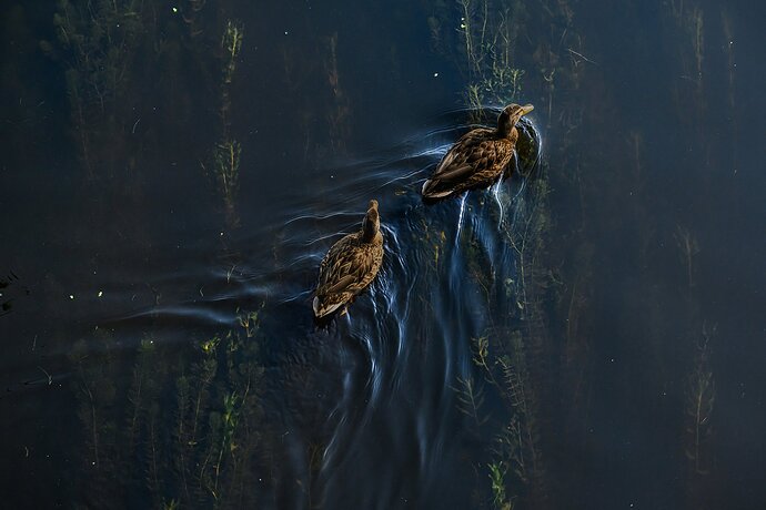
Edited minus subject mask
Original unedited
Critique Style Requested: Standard
The photographer is looking for generalized feedback about the aesthetic and technical qualities of their image.
Description
On the return hike I past the final part of the journey which was a four lane bridge that cross a river, I took a look straight down and saw a mallard sitting on the rivers edge. It dawned on my that this was a vantage that would usually require a hot air balloon or a helicopter to achieve.
Specific Feedback
Composition definitely, the photo was shot near 9 am so there was definitely some harsh light. Any advice on either getting it right in camera, or post processing would be greatly appreciated.
I just looked at the exif and I’m guessing a slower shutter speed would have helped
I really like the weeds in the water but I’m wondering if in monochrome or black or white would be better.
Technical Details
Nikon Z8, 70-200m 2.8 Z + 2x TC
1/1600 f6.3 140 mm ISO 2500
shot off hand, edited photos were first edited in LR then topaz
My preference is for the second version that has the mallards a bit brighter, though I like the extra dark water in the first. If you use the local adjustment brush in LR, you can apply some dehaze to the hazier area on the right and really make the water cool. By the way, it looks from the vegetation that they’re quartering across the stream in the downstream direction, though I must admit that that’s a catchy title.
I like the unique perspective in this image and I think your processing is quite good. You could clean up some of the white flecks in the water that do distract a bit. I like the wake, but I think you can still get the same feel if you crop a bit off the bottom and left, which I think would improve your composition a little.
It looks like your in-camera work was fine. You had the ducks pretty bright but not blown out and that’s exactly the way it should be.
1 Like
Interesting perspective. Good work with the harsh light. I like the second one-I wouldn’t want the ducks darker.
Quite an interesting point of view you have here. I think a version somewhere in between the first and second would work well for me but both are nice. I might want to darken everything to the right of the lead duck as that section of water appears to be brighter than the rest of the image but only slightly. Processing looks really good to me. I agree with what @Dennis_Plank said about the bright specular highlights that really pop against the darker background. I think those could be removed.


