A couple of years ago i shot these vertical composition at a lake near my home.
I would receive any comments and suggests regarding composition, post processing and crop format choice.
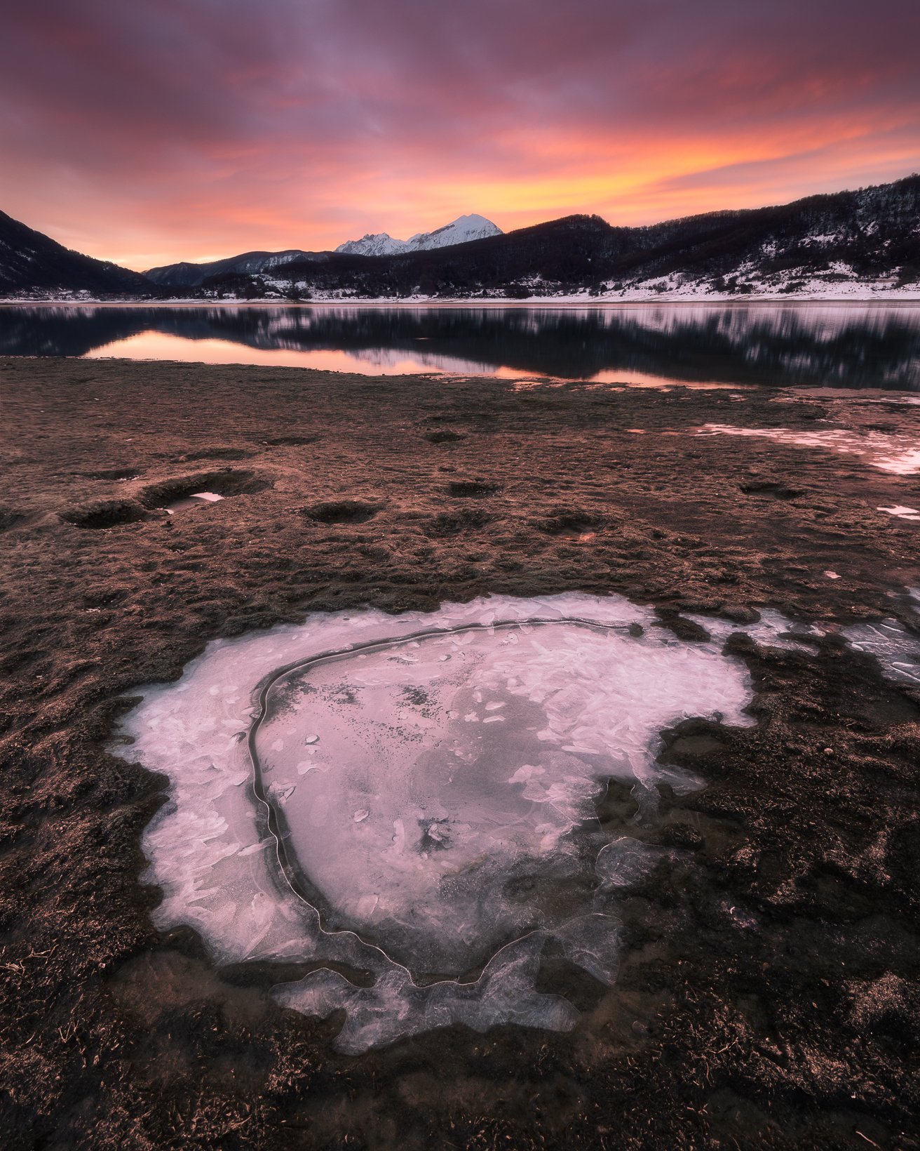
I don’t know if the images are over processed (particularly the first).
Post process techniques:
Foreground and background focus stacking
General adjustment in LR
Dodge and burn in PS
Regarding crop format, i prefer 5:4 format, in my opinion vertical images are more balanced than 4:3 or 3:2.
Do you have any considerations?
Both look quite good to my eye and neither looks over-processed to me. My only suggestion is minor, but maybe clone out some of the small ice patches in the middle ground in the first image?
HI Massimo, these both are gorgeous scenes, and like Nathan I prefer the second one because of the shoreline that sweeps my eye gracefully to the beautiful light, fog, and colors in the distance. These work perfectly as vertical compositions! Congrats.
Hm, the first one feels to be more balanced than the second one to my eyes, Massimo. All the bright areas in the BG of the second one pulled my eyes to the left and then I left the frame… if you know what I am saying. That said the foreground in the second is more appealing than the first one. I think they are not overly processed at all.
Massimo, you are very fortunate to have a lake this nice near your home. Neither of these look over-processed to me at all. Exposure, contrast and color look pretty good in both.
I prefer the second image to the first one due to the composition. In the first image I am slightly bothered by the mountains reflection merging with the shoreline. I also think the patch of ice has so much visual weight that it overwhelms the the background mountain and sky. The second image feels like the foreground and background work better together. To me part of that is due to the mid-ground doing a better job of connecting the FG and BG in the second image. The mid-ground in the first image is just not as appealing.
However, I would suggest a tweak to the second image to sculpt the light along the shoreline a bit. I would darken the dark tones in the near foreground, and dodge the lighter tones along the more distant shoreline. Here is a rework that reflects my comments. The changes are subtle, but I think help pull your eye along the shoreline better.
I prefer the second image. I agree with Ed, in the first image the patch of ice dominates so much that it almost creates two different photos, and the flow between them is not strong.
Massimo,
These two images are both lovely and well processed IMO. If I had to pick a favorite it would be the second image as I love that sweeping curve of shoreline as it draws me nicely into the scene to the spectacular warm light and mist on those BG mountains. The light on the FG rocks also works well and helps to separate them from the shoreline. I hope you were able to get closer to the lake in the first scene and capture some reflections of the colorful sky and the mountains reflected in the still waters. Both are winners for me.