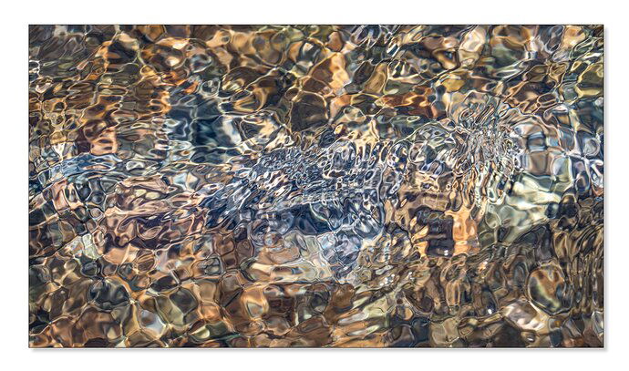
Another from spring-fed streams on the flanks of Mt. Shasta. As a hydrogeologist, the springs are technically interesting to me, but they are also quite beautiful.
What technical feedback would you like if any? What artistic feedback would you like if any?
Is that patch of green on the right a distraction, drawing your eye out that side? Is the color believable - specifically that blue area (the raw file was overall more monochromatic)? Any other critique welcome, too.
Pertinent technical details or techniques:
Single frame, a7r3, 24-105@105mm, f/16, 1/250s, ISO 800, hand held.
3 Likes
Bonnie, nothing is pulling my eye away in this image. What a real treat. I believe I am enjoying this one better than the other one. Quite the abstract.
Neither the green or the blues distract me. I think the blues make the rocks pop. Nice pattern
Similar to your other image this is beautiful and nicely done. When I view the large image because of the patterns in the ripples I can see the shape of a fish (with a little imagination of course). These images are outstanding!
Yes, nicely done again Bonnie, Nice color contrasts, and again, superb clarity.
Another wonderful image Bonnie. I don’t know which I like more. Which one do you? These seems just a bit less abstract in that I recognize a stream. I don’t see any ‘flaws’ here. Keep them coming.
Thank you for sharing your unique perspective, @Bonnie_Lampley! I really enjoy this image. It’s one that you could get lost in, staring at it and losing track of time. Like others have said, I am not distracted by anything and my eye is not pulled out of the frame. It’s a beautiful image. @Brian_Schrayer mentioned seeing a fish in the ripples and I can see that, as well, but my first impression is the ripples resembled a Phoenix in flight. I like how the cooler ripples are framed by the warmer tones on the edges. Well seen, captured, and processed!
Thank you, @Shirley_Freeman, @Nathan_Klein, @Brian_Schrayer, @Eva_McDermott, @Igor_Doncov, and @Jimmy_Arcade for your appreciation. Brian, I, too, saw a fish once I got started on the processing. Jimmy, now that you mention it, I can see the phoenix, also. Igor, I don’t know which I like better. I’ll have to live with them, and even then, I may not be able to decide.
2 Likes
Bonnie, this is another good addition to the stained glass series. I think I prefer the firs tone, but it’s pretty close. I do think the brighter luminosity of the green patch of the left could be burned down slightly. If nothing else, it would make the “head of the fish” stand out a little more. It’s a matter of personal taste, but i also think you could benefit from slightly more contrast and color saturation.
I just love the earth tones you get from the stones, there are a lot of subtle differences in color that create visual interest.
1 Like
