This was photographed in 2008 when I picked up my very first camera - the Nikon D70 - processed during Covid19 lockdown
EDIT 1 - Many thanks Eugene @Eugene_Theron. This is what I look for on NPN. You have taken a lot of trouble analyzing my image and making suggestions - which, btw, make sense.
I have not been able to remove that “teal” on the R side - mid zone, effectively ( tried selective color - green, cyan in PS ) any other suggestions ? I don’t think it looks as pronounced as in the 1st image but for process, it might be worthwhile knowing how to
Edit 2 - Found the raw file! And started from scratch - simplified this a lot - incorporated some of Eugenes @Eugene_Theron suggestions - thanks
What technical feedback would you like if any?
over processed ?
What artistic feedback would you like if any?
any
Pertinent technical details or techniques:
(If this is a composite, etc. please be honest with your techniques to help others learn)
If you would like your image to be eligible for a feature on the NPN Instagram (@NaturePhotoNet), add the tag ‘ig’ and leave your Instagram username below.
Hi Karl, This is quite a stunning image and these canyons intrigue me quite a bit.
Im far from an expert on slot canyon photography but I’m going to do my best on some cc here based on other images I have seen and stuff I can pull out my head.
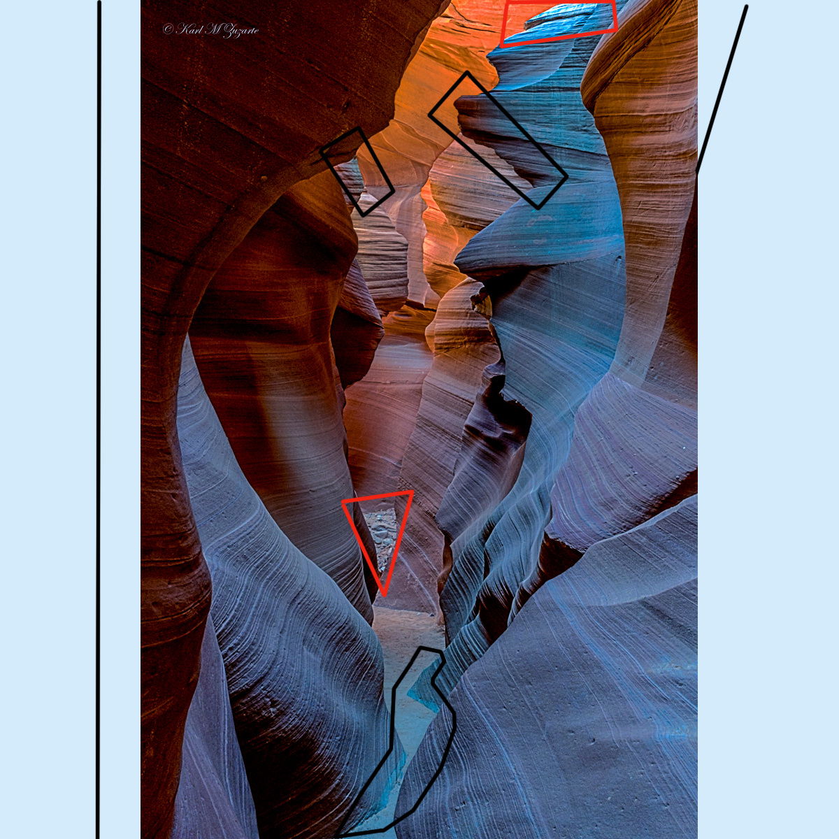
I’ll start off with my thoughts on the composition. I think you have composed this pretty nicely to be honest. It gives a sense of depth A couple of things that I may have considered would be to give the image a bit more space on the left and allow the ridge line on the right to extend into the upper right corner. I also may have considered getting the walls to overlap where the pile of stones in the background are. They are quite bright so do draw the eye. I would also keep an eye out for the brighter sections of light, such as the one on the upper edge as they draw the eye too. You could overcome it in this shot with either cropping or some selective burning.
I quite like the range of tones in this shot from the deep reds to the blues. I think the warmer colours have been dealt with quite nicely. To me, the blues come across as a bit unnatural, at some points they look as they are verging on teal (the greener side of blue). I would play around with the HSL sliders to give it a more natural colour look. I would say a greyer blue would give a better effect. May even try some slpit toning on the RAW file in LR before working in PS - I do this in most of my shots these days and have found it a really effective tool.
Looking at the image in PS I noticed some transitions in colour (I marked a few in black boxes on the shot). I assume a selection was made to isolate colours and/or sections of the image for selective colour work or doging and burning. The ones that are most evident are at the canyon floor and on the edges of the right hand blue section. The use of the mask or selection has created a dark halo around some of the edges, especially the prominent edge on the right of centre. I’d play around with the feathering or using a soft brush at low opacity when doing this sort of adjutment. As much as I like the image these transitions really stand out to my eye.
In terms of balance the compsition you used has a good structural balance between left and right. In terms of luminance, the right is much brighter than the left which makes you look there first rather than down the canyon. I think that some darkening on the right will give you more depth to the image, really drawing you through the image. I love how, on the left, it goes: dark - light - dark - light.
Hope all this helps and feel free to shoot me any questions if you have them.
Cheers,
Eugene
PS: apologies if any of my assumtions about the use of masks are wrong. It was just that way to my eye looking at the image posted.
Hi Karl, no worries at all. Glad it made sense too - sometimes I just type away and at the end think “i hope that made sense” .
I certainly think your edit is starting to move in the right direction and is looking much better. I had a very quick and dirty play in photoshop - i’ll try and explain what I did but you’ll have to have a go yourself and see what works for you.
For reference your edit is on the right and mine on the left.
1 - I made quite a large vibrance reduction and also a bit of staturation. As the ‘blue issue’ in on the right i applied a graduated filter mask do it just applied to the right.
2 - applied a general curves adjustment to the midtones
3 - slight exposure recution. Right side only
4 - significant contrast adjustment. RIght side only
5 - general curves adjustment applied across the whole image.
I think these adjustments have reduced the the saturation and added some contrast to the ‘blue’ sections. That highlights the striations in the rock more and the expsosure (certainly the contrast) feels more balanced left to right.
I am still noticing a dark edge round round the prominent ridge on rock in the center. As the ridge is such a feature of the image I think this is something to look at. I fear it may have happened earlier on in the editing process and the further we take it, the more prominent it becomes.
As an aside, on the right side on the sharp edge of orange rock (top right) you seem to have introduced a kink in the edge since the first edit
Wow @Eugene_Theron, you have ptovided one the most thoughtful and helpful critiques that I have seen on NPN in a long time. There are some excellent lessons to be learned from the feedback that you have given to Karl. I especially liked the comment you gave on using bright and dark areas to direct the viewers eye to the most important parts of the image. Your rework provides a great example what can be achieved with some localized dodging and burning.
This is a great example of how sculpting the light via processing can have way more impact than just relying on color saturation for pop.
Thanks Ed! That’s very kind. It’s interesting how subtle changes in light can really draw you though an image and add so much depth. Karl’s image has loads of potential in this respect.
I’m assuming that the very first image is the raw file. I like the tonal work that was done in the reprocessing. I don’t like the direction the blues were taken. But it’s all a matter of taste really. There’s an artificial look to the blue that is hard to accept easily.