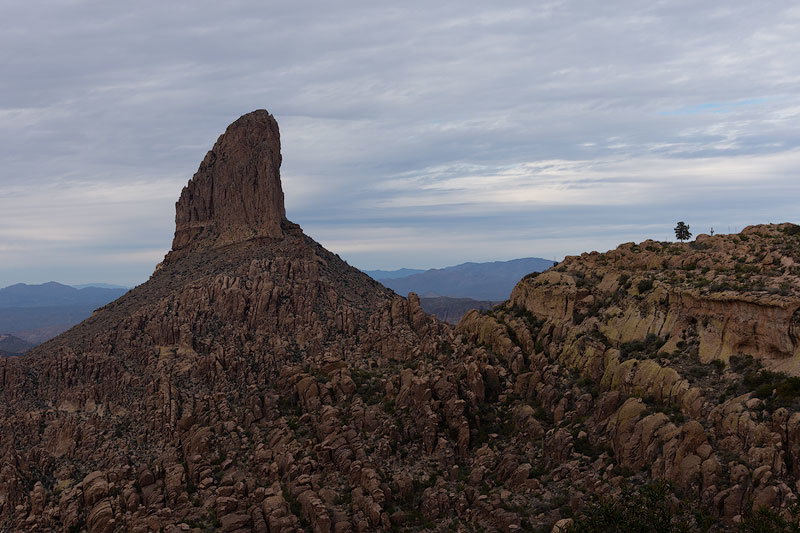
Bit of an icon here, though one I didn’t know about. My friends took me hiking here. Trail was packed. Must’ve been a 100 people or more while we were there. It’s a pretty hike and this is the view from the high point. It totally surprised me as I wasn’t familiar with this place.
What technical feedback would you like if any?
The day turned overcast and light was completely flat, though I think clouds were preferable to a clear sky. I ended up inverting the brightness of the rocks and the sky. Does it looks backwards or is it still believable?
What artistic feedback would you like if any?
I also used a lot of color and contrast enhancements to try and add interest. Wondering if the overall balance looks right. I’ve been known to take things a bit too far sometimes
Tony, nice that you showed the raw to compare. Seems you really brought out the features in the geology with the exposure. To me the overall exposure looks pretty reasonable. Far be it from me to judge the scene as I’ve never been there, but my gut feeling suggests the FG balance looks a little on the warm side. Of course I may be all wrong, but it would be interesting to see the BG warmed up a little, just as an option?
I like how this has turned out Tony. The detail in the foreground really exemplifies the ruggedness of the landscape. I also like how everything leads to that striking peak. The mountains in the background and the sky help is providing a more soothing touch and I feel they play a big role toward making this whole composition very successful.
Very cool landscape there. I can’t say I ever remember seeing this in an image before. Surprising since it is as popular as you say. I think I’d remember it if I did see it. Nice image!
This peak has quite an attitude. To me it looks cocky. The fact that it has a personality is what makes it for me and distinguishes it from a beautiful image. It looks down at you. I thought an image of just the peak would be better but that tree on the right really adds a lot. They do so more in the original. The processing lost some of the significance of the tree and that’s unfortunate.
I really like that peak, Tony. I’m ok with the color and contrast, maybe tone down the right side just a touch, my eye keeps drifting to the right. The tree adds a lot, size matters and the comparison of the tree and rock pinnacle accentuates the size of the pinnacle. A very rugged looking area, well done.
Very impressive what you were able to extract and present in this scene. I certainly don’t think the processing goes to far. At the same time, I think the processing has moved the emphasis to the rock on the left and away from the the main peak formation. Don’t get me wrong, I think the processing is beautiful ( I especially like the contrast in the sky/clouds), it just seems a bit off balance in terms of where you would want the light to be - if that makes sense.
Thanks for the feedback. I thought the yellow highlighted rock was a counter balance to the spire, but maybe it’s a bit strong. I’m going to take a look at making the rocks on the right less prominent and maybe adding some highlights to the rocks below the spire instead.