I think this is the right forum for this but apologies if its the wrong topic.
I haven’t started processing this image yet as I can’t decide which crop looks best. Lots of negative space or close in and the make the island more prominent.
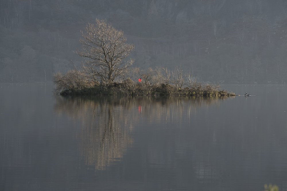
Shot the other morning just as the sun was rising and shining on a small island in derwentwater. There was a nice haze on the background eliminating any distractions.
The top image is less centered and yet the island is more prominent. Much prefer the top one. I know you haven’t processed it yet, but the green on the bottom right and the red in the middle really draw the eye.
I’m glad you mentioned that this is yet processed, cause I was really wondering if you intended to make the buoy a featured element?
It’s weird and I know you haven’t processed yet, but the broader view seems to be slightly more hazy? Maybe it’s just me. But anyway, for that the top one has a bit more clarity in the tree and island while the bg is still diffused by the haze.
I definitely like the tree off center - it’s the island really that centers things and helps with balance. I also like the extra space of the second, wider view. For that one I might opt for a slight crop off the left to push the tree more away from center like view #1
In general, very simple and quiet scene, very effective comps.
defo the top, but without the tiny branch in the corner. The lower image has distractions in the brackground that I keep seeing. Think they are rock faces.
I prefer the top with a bit off the bottom to remove the LRC bush, a bit off the top and retaining the geese at right tip of island and the float. It adds some mystery to the photo.
The bottom one is too static with so much negative space equally distributed around the subject. Add more tension by moving it closer to the upper left or bottom left. Then it would compete with the top image.