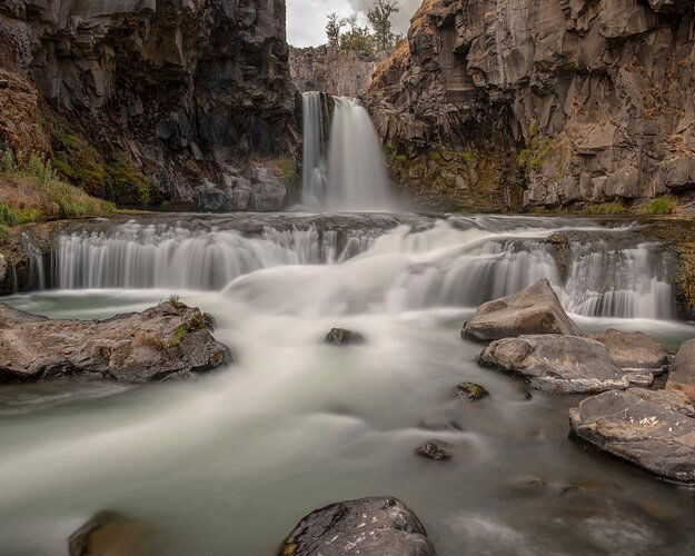
This is another view of White River Falls from the same trip as my last photo. For this picture I had to climb down to the base of the falls which got rid of the ability to see the color of the glacier fed water but there is something about this view that I like better than the one taken from higher up. This view makes the falls seem more grand to me which is think is due to the lower viewpoint and centering the falls in the frame, but please let me know what you think.
This is a combination of two photos, one 10 sec with a 10 stop ND filter for the water and another fast exposure without the ND filter. Shot with Fuji XT-2 18mm, both at f10 and iso 200.
What technical feedback would you like if any?
any
What artistic feedback would you like if any?
any
Any pertinent technical details:
You may only download this image to demonstrate post-processing techniques.
I am not familiar with this waterfall, but it’s cool that you put in some extra effort to get something different. I do like all the lines that point toward the center. I think that gives this composition potential. I see this is cropped square-ish and I’m wondering if this was originally a horizontal or a vertical?
Anyway, a lot of this feedback I think may come down to subjective preferences, so take what you find useful (if anything) and discard the rest 
- I am not really a fan of the super long exposures of moving water. I think it might work here for the upper falls and the smaller falls on the left and right, but as far as the very middle (where all the leading lines are pointing) and the bottom, I think the long exposure loses a lot of what might have been interesting water texture that would visually communicate the power of this river. I just find the void of texture in those white areas to be uninteresting, and that’s what the leading lines are pointing to.
- I would crop the top and buttom such that the sky and lower rocks aren’t showing. I don’t think those things really add to the photo.
- I think a touch of vignette and some contrast could further direct the eye toward the center.
- Just a little bit more saturation could bring out some nice red in the rocks.
Here’s the quickest and dirtiest of edits of what I described above (I hope that’s ok with you, let me know if I should take it down):
1 Like
@Brent_Clark, thanks for the feedback. I go back and forth with cropping out the sky and can’t decide which I like better, and now that I see it I agree that the rocks in the bottom aren’t bringing much to the photo. It is always a balancing act without how much blur I allow in moving water. I like the velvety smooth look of a long exposure but I try to keep the exposure short enough to still have some detail and not have it go to pure white. I am going to try playing with blending some detail from the short image in that center portion to see if I can get a bit more detail out of it.
I like your photo. Love the viewpoint. I do like Brent’s edit and don’t have much to add to his great comments. I will expand a bit on the soft water preference. It’s one of those personal taste things but I tend to really like the long exposures on water when it’s a calm stream or lake, something evoking serenity. When the water movement is more powerful, however, I tend to want to see that power through its texture. It’s a different mood for me.

