What technical feedback would you like if any?
What artistic feedback would you like if any?
Pertinent technical details or techniques:
(Fuji GFX, 32 -64 lens, f11, no filter
If you would like your image to be eligible for a feature on the NPN Instagram (@NaturePhotoNet), add the tag ‘ig’ and leave your Instagram username below.
ig allenk2222
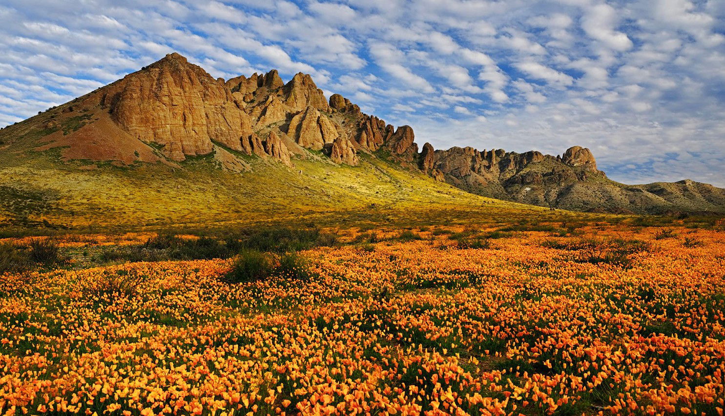
Wow, that is quite a field of poppies. The colors are lovely. It feels a little dark to me, though. I guess the foreground was in shadow from those scattered clouds? I think with just a touch of judicious dodging of areas that are already slightly highlighted (like that patch of yellower color on the alluvial fan slope), you could bring out an even better sense of depth. Wish I was there!
Looks like a beautiful scene. I like the composition. The field of poppies is wonderful.
I think the image is significantly dark however. Here’s a version much lighter with some selective dodging to help with the flow of light.
See what you think.
1 Like
Allen, Beautiful image that is unusual for me as I haven’t seen a burst of poppies in NM before. The sky was your friend on this excellent midday shot. I especially like @Keith_Bauer’s adjustments. He nailed the light issue. Thanks for the post.
Thanks. Actually, it was shot about 1 hour before sunset.
Allen
Well, it all came,togethre for you on this one, amazing field of poppies, spectacular clouds, and an interesting mountain formation. The composition looks great, with a nice balance between clouds, mountain, and flowers. I especially like the two smaller mountains as they recede into the distance.
I agree with @Keith_Bauer that the image is too dark, and his rework takes this in a better direction. My only other suggestion would be to cool the greens slightly in the foreground, to create some more color contrast between orange and green.
1 Like
I agree that it’s a bit dark. I like Keith’s changes but would prefer a little less ‘pop’, less contrast. In that sense the original was better. The moodiness of those mountains is now gone. Therefore a less drastic change might be a good thing.
Hi Allen,
This is quite a beatiful image. I agree with what @Keith_Bauer on the exposure adjustments. Brighter is definately better. I would consider adding slightly more contrast to the mountains to compensate for the increase in exposure and enhnace the light play on the cliffs.
My cc revolves around the composition. I find the green patches in the lower right really draw the eye. I would consider cropping to the base of the diagonal line formed by the flowers on the right edge. This will help accentuate the flowers more (see below). It also accentuates the curve of the flowers and curves at the base of the mountains.