Critique Style Requested: Standard
The photographer is looking for generalized feedback about the aesthetic and technical qualities of their image.
Description
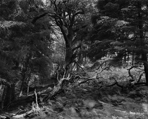
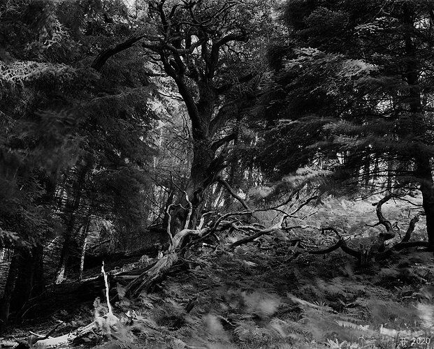
A blustery windy day exploring a new bit of woodland, with very breif and long spaced breaks in the clouds.
Technical Details
6x7 B&W fllm. Exposure details not recorded.
Tomas, I like how the fallen tree(s) lead into the view from the lower left. This creates a good sense of depth. I think some dodging of the darks near the lower left corner would add more interest in that area and help with the angled lead. I also think that burning in the brightest area near the center of the right edge would improve the visual balance of the entire diagonal. The blurred vegetation shows the wind well.
1 Like
Thank you; the LLC dodge is an obvious improvement, I wasn’t entirely convinced about burning in the center right, but now that I tried it I think you are right there as well. I have updated the original post with a quick edit to show that.

