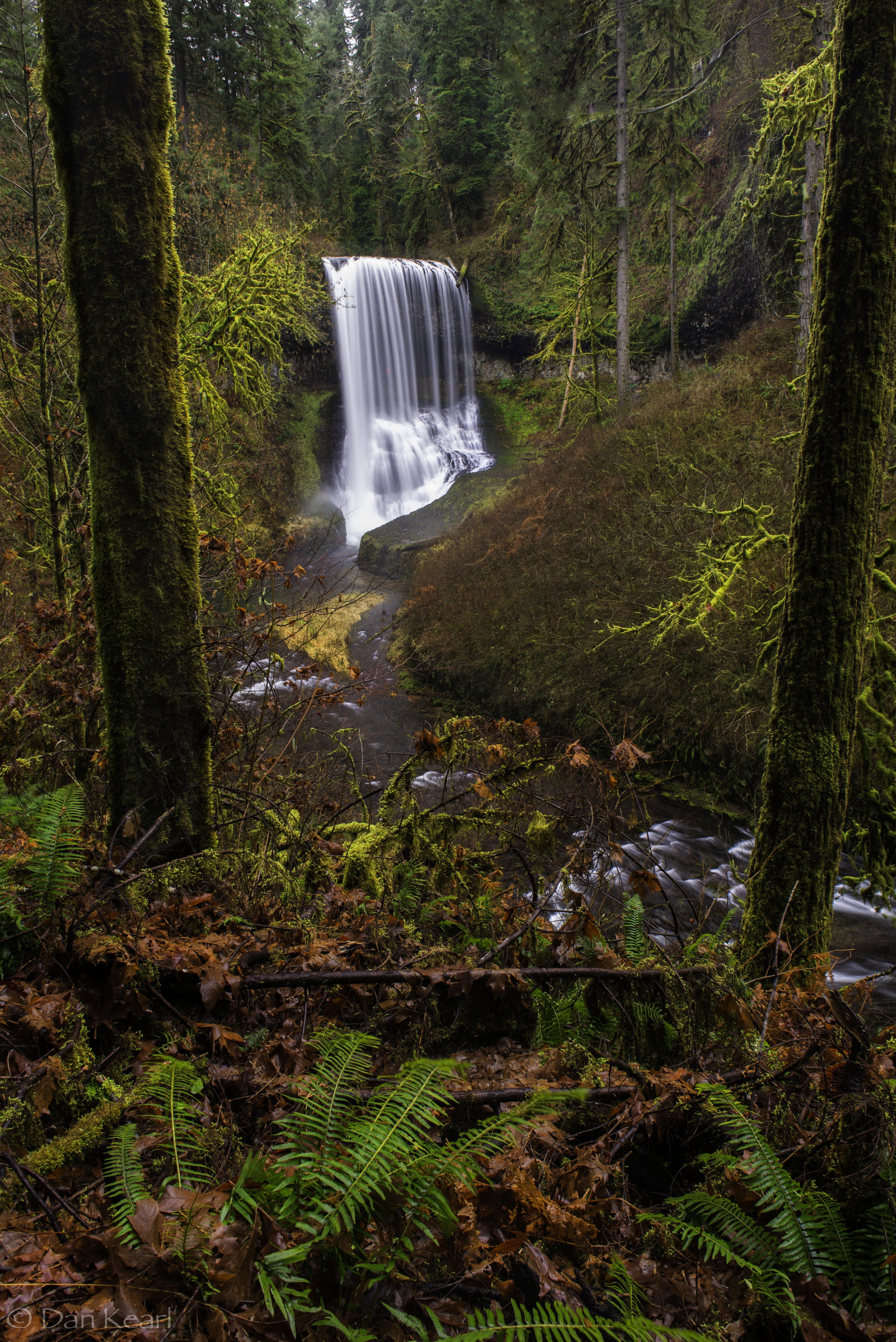
A view of North Middle falls, Oregon Cascades.
In a nice critique of a photo of Middle Falls in the same area the other day, Ryan Dyar suggested that he desaturates the reds in the winter forest in the Northwest for color palette reasons.
While aesthetically I agree that it is mostly just rotting vegetation, I find the color refreshing since the forests are so Green here most of the year.
Is it too much red?
Any comments appreciated.
You may only download this image to demonstrate post-processing techniques.
The distant red is fine but the near red is too much which leads me to think that it’s not a saturation issue but a balance issue. I think you’re on to something new and just need more time to work it through.
For me the red (and the entire photo) works because of the contrasting green ferns in the foreground. I’m not uncomfortable at all with the reds because our winters are highlighted by dead fireweed plants, and they’re even more red than yours.
All told, this is a superb capture, right down to your choice of shutter speeds for just the right water movement, both in the falls and the foreground.
About the only nit I can find is the apparent wide angle distortion toward the top, causing the framing trees to lean away from each other a little. Who knows? They might even have been leaning. You could deal with that in post, but I’m more inclined to anticipate and deal with such a thing onsite. Again, if possible. In this case if the terrain allowed I’d have backed up and used a longer lens for the same framing without the distortion.
Another nice winter rain forest shot Dan. I love the gorgeous rim-lit moss on the two trees. I do agree with @Hank_Pennington that the wide-angle distortion of the two trees is a bit distracting. I also think the white sky above the falls creates some hot spots that pull your eyes away from the falls. A crop of the top from just below the white sky will eliminate that, and I think it also makes the two trees look slightly less distorted (while still leaving plenty of breathing room above the falls).
Some of the brown colors below and to the right of the water fall are muddy and look flat and posterized to me. Increase in midtone contrast may put some definition back into the area. The top line of the waterfall needs to be level with the horizon so a slight counter-clockwise rotation should fix that. This might be from the type of lens that you used for the image too. I think that try to reduce magenta saturation may help pull those reds back in line. I like the composition and can certainly see why you took this image…Jim
The reds work fine for me, especially since they are juxtaposed with the deep greens of the ferns. If anything it might be the brightness of the yellows that distracts a little - I do wonder if a slight desat . there especially, but maybe even all round would be good.
I like the reds, Dan. They make an excellent counterpoint to the lush greens. If you have a chance to go back, I would recommend moving those two horizontal sticks behind the foreground ferns-they seem to interfere with the upward flow of the image and I don’t think you’d harm the forest by moving them a bit.
The reds are perfectly fine as it gives the scene color contrast. I’m on my phone and can’t see what that orange area in the middle of the frame is but I find it distracting.
The reds look just fine to me as do the rest of the colors in the image, Dan. I do find the lighting on the two moss covered FG trees to particularly striking and beautiful. I have only two minor suggestions: clone or crop out the white sky center top of image and tone down the bit of dead yellow grass in the stream as it tugs my eye slightly. Beautiful image.
Very nice framing of the falls with the trees and the small horizontal stick near the bottom. I find the overall saturation, not just the reds, to be a bit too much, however. Having not spent much time in this area, I can’t speak from experience - it’s just my reaction. And I’m not saying you should do anything different, just commenting because I find it interesting to have such a different reaction than everyone else.
Wow, what a frame! I’d verticalize those trunks a little more to emphasize this element. The reds are nice, but my focus is the falls in the distance. The reds are actually a bit chaotic and the waterfall is a bit of a soothing element by comparison.