The photographer is looking for thoughtful feedback on the image as a whole, especially around the areas noted below.
Feedback Focus: Artistic + Technical
About This Image
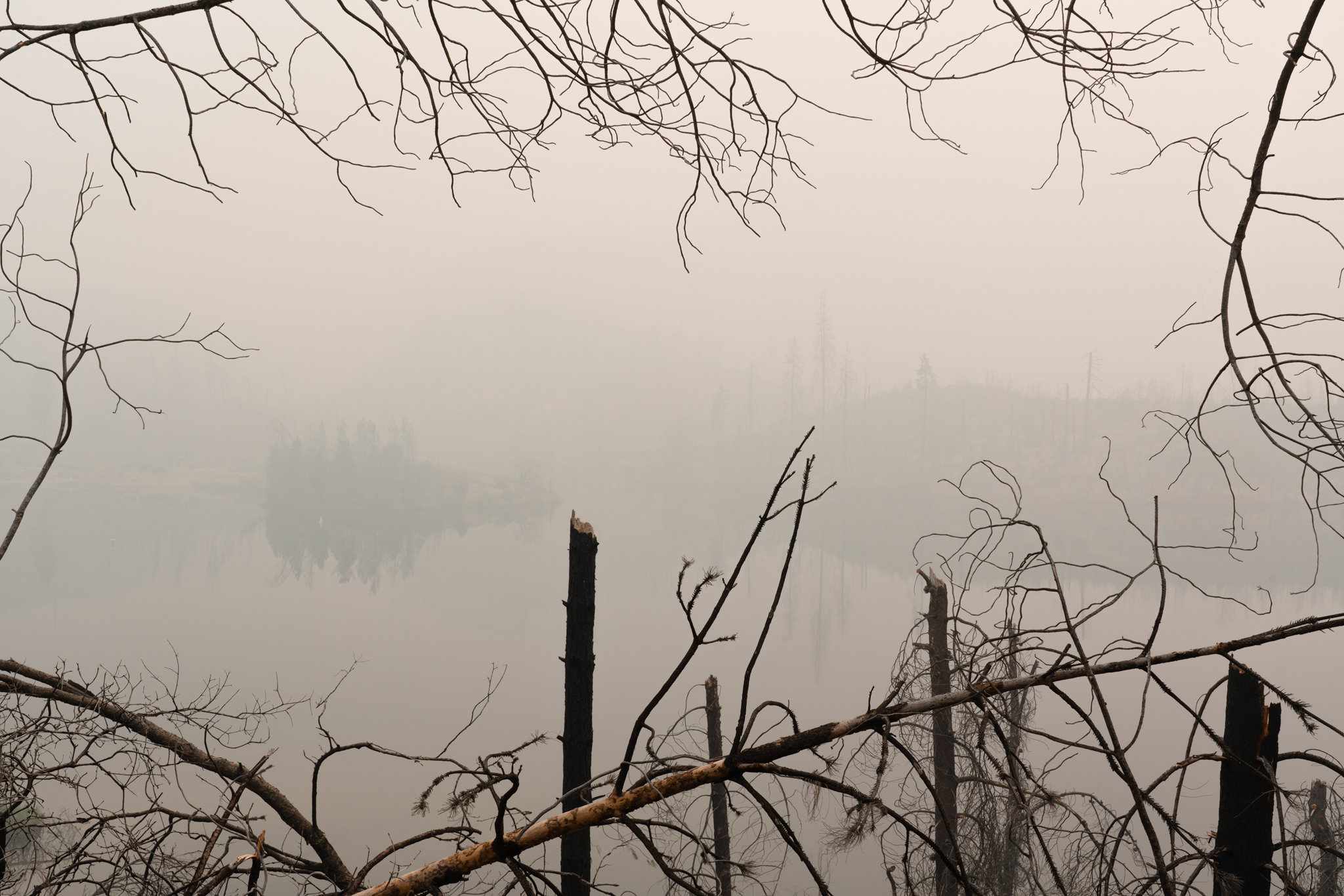
Since there’s not many submissions for this week’s WC, I shall post another fire-related image. I call this Yet Again because it was made in 2021 on a day when wildfire smoke was filling the hills and the branches framing the smoky landscape were burned in the 2018 Carr fire.
Feedback Requested
This is deliberately low contrast both because that’s what the scene looked like and how depressing it felt. I didn’t want it to feel bright. Any comments welcome.
It must have been frightening as well as very depressing. The picture conveys a misty scene and the brown colouration of the mist /smoke does help the narrative, and the broken and damaged trees in the foreground do speak of the destruction.
Regards
Yes; this is a bit depressing as well as a little frightening; as it does illustrate the damage that out of control wildfires are inflicting on this planet we call home! The smoke adds an air of mystery and foreboding as it partially obscures the BG tree3 line. I also think you framed that mood perfectly with the burnt limbs from the prior fire. I think you succeeded with your intent.
The Apocalypse! Yikes, this really tells a story. Wonderful natural framing around the edges to isolate the view of smoke and the forest beyond. The stark nature of the foreground debris adds to the story of a prior fire. Great use of that. This is almost a black and white but the little bit of color adds to the story as well. You did well processing this to make it appear smokey and depressing. I wouldn’t change a thing. Well done.
I didn’t have to do a lot of processing - this is what it looked like. I think I probably brought out the distant trees a bit by slightly lightening the atmosphere.
Outstanding! For me, the framing is what makes this image. And the fact that you left this in color is really driving the message home and telling the story.
Honestly, without the framing, the background could easily just be a foggy morning. Perhaps with that thought, I’m wondering if some warm/orange-ish toning might have an effect? It may or may not, but again I’ll say that the framing of the burnt and haggled (is that a word?) branches and their “every which way” layout completely make this image.
I can’t offer anything else for improvement. A story well seen and told. Kudos.