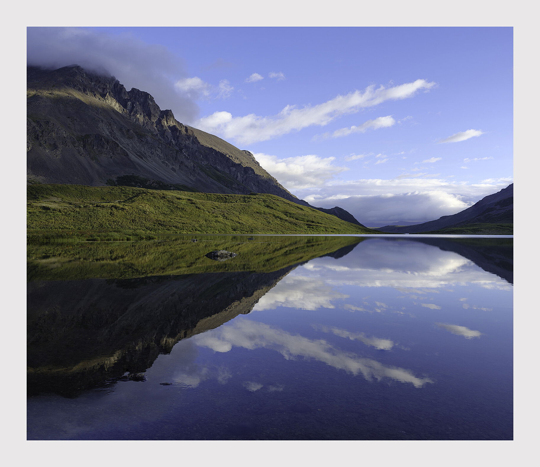
It’s seldom that I add a grand landscape tag to any of my images but here is a couple. I spent 3-4 days in this area and all of my images came out looking the same. When you’re faced with such a spectacle it overpowers your creativity and makes it difficult to tear yourself away and create a ‘personal composition’. It dominates everything in the area. It would be like being in that parking lot at the Tunnel View and turning your back and search for a composition amongst the rocks behind it.
There was excellent grayling fishing (catch and release) also at this spot which greatly added to the experience. The only thing missing this time were the delicious porcini mushrooms sprout in the area.
Is the image oversaturated? Any and all suggestions are welcome.
What a gorgeous view. These are definitely priceless moments and you took it to another level with time spent fishing. The image is not saturated in my eyes. I would imagine its what you saw at that time. Well done.
This is a beautiful photo Igor, and the color looks very natural which is fantastic. One of my favorite aspects of this composition is the submerged rock off in the distance that breaks the symmetry between the reflection and reality. I also really like your aspect ratio on this one. It’s very calm and pleasing.
I’m loving this one, Igor. The colors do not look too saturated at all for me. Ver realistic looking. This is less complex than your last post of this scene. Very serene. I also love the aspect ration you’ve chosen for this. The reflections add to this scene.
Outstanding image. Landscape, or I might call a “reflectionscape.” But no matter, this is just beautiful.
So many enjoyable elements that keeps me engaged and want to explore more; Terrific clouds + their reflection, the light striking both the grassy shore (and reflection) and the very nice strip of light near the mountain tops, the distant low-hangling clouds and then the rock then Ben points out, the strip of the lakes surface on the far side… just everything about this.
Also appreciate the concept that gets missed so often - and that is having the mirrored surface darker than the non-reflected elements. This should always be a bit darker and too many want to force the “exact mirror” reflection and make it all even. I think you’ve processed this masterfully - including the colors and yes, the saturation is wonderful.
Great grand landscape image. I agree with the previous comments. The image is not oversaturated IMO. The different areas in shadow and in sunlight respectively adds to the quality of the image.
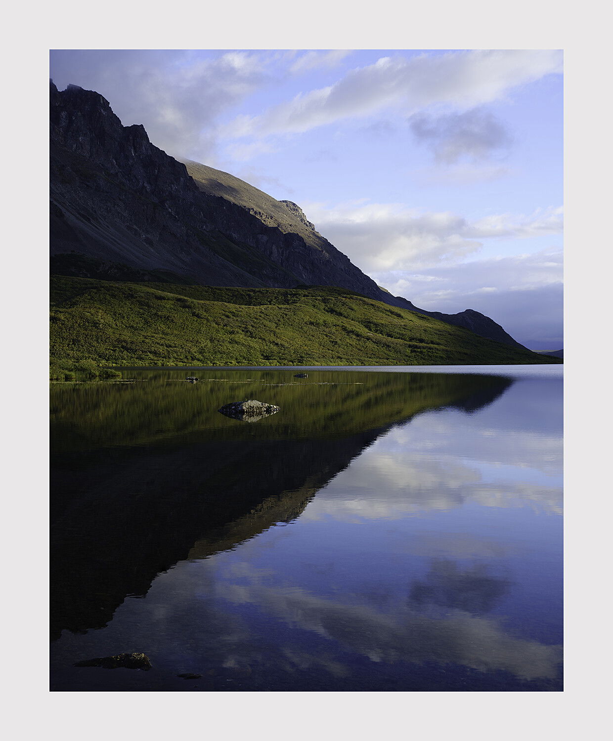
I mentioned that I took several images of this subject. Here is the vertical. I am interested to know which you prefer. I see no point in making separate posts of the small differences between these views of same subject. Also posted above for comparison. This one is slightly moodier as it was shot with weaker sunlight.
What strikes me immediately with this vertical version, is the rock; the light striking it as well as it’s positioning in the mirrored surface, it really stands out - in a positive way. The softer light on the far shore allows the rock to stand up even more. Only thing I might suggest here is cloning out the little rock at the bottom.
Otherwise, this one stands on it’s own. I think between the two I like the original, but again these are really similar only in the location and being a reflection landscape. Both are beautiful!