The photographer is looking for thoughtful feedback on the image as a whole, especially around the areas noted below.
Feedback Focus: Artistic + Technical
About This Image
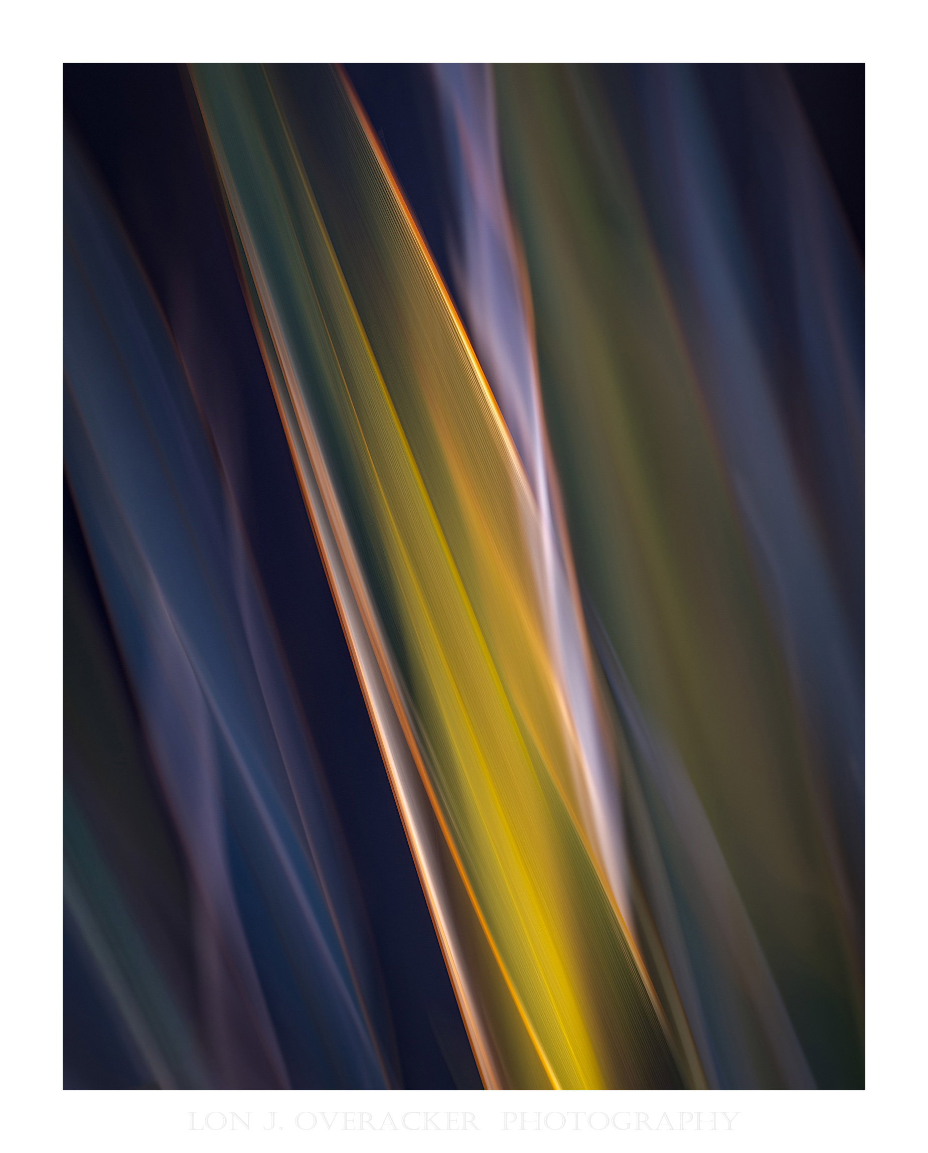
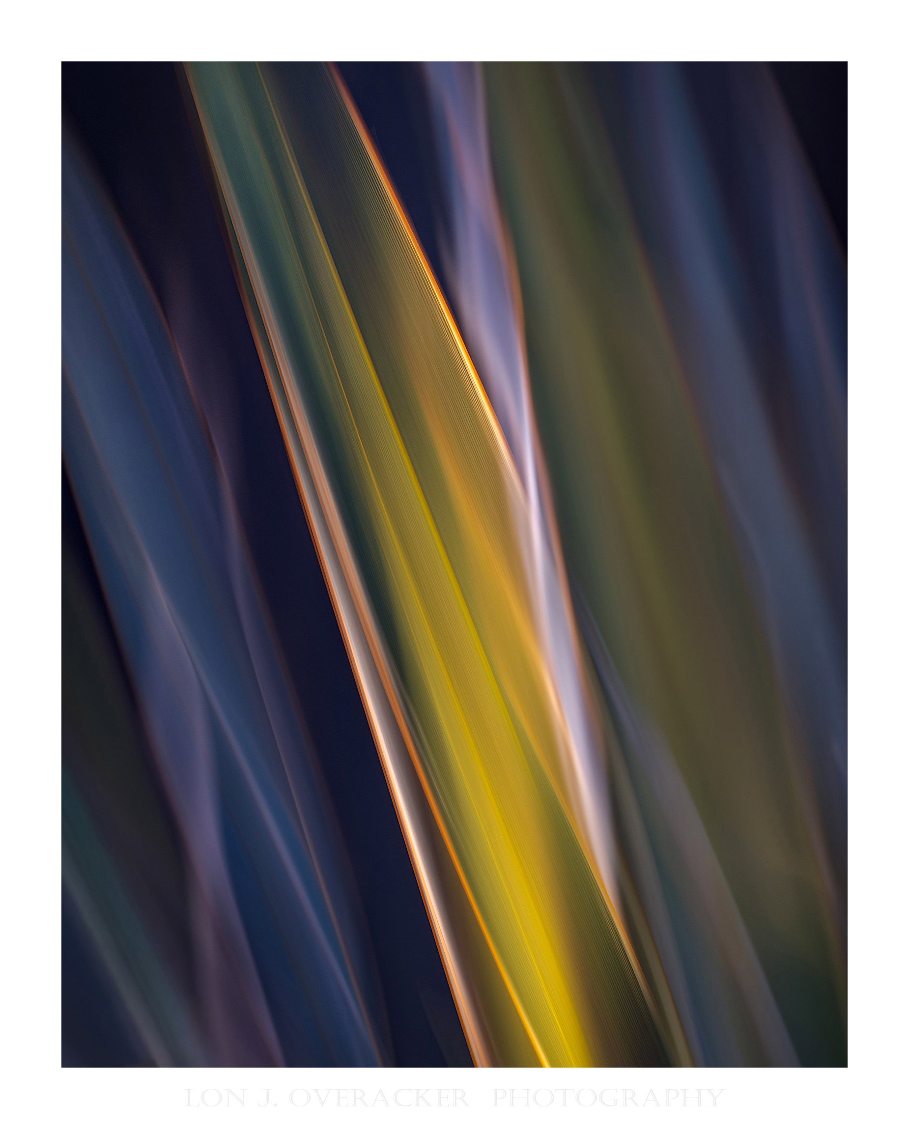
I find it hard to believe myself, but this is literally the next frame in the camera - AND it’s also a 2nd yucca plant; this one is bigger, slightly broader leaves and not uniform in terms of color (lighter edges). But the sun through the fence was doing similar things to the plants, so I fired away.
This one emphasizes color and lines. It’s about a 60% crop of the original. As you might imagine, the RAW is pretty flat. However, the colors are there… they just needed some coaxing to come out. And in the words of my processing mentor, Mr. Tony Kuyper or “TK”, “… let the image take you to where IT wants to go.” As it goes with many of the abstracts, color/saturation are freely utilized. But I was hoping to emphasize light and lines too.
Feedback Requested
As always, your critique, comments and feedback are always welcome.
Technical Details
Single ICM frame, vertical movement. I added a recent trick to the layer stack, but adding a copied layer, then adding the High Pass Filter and layer set to Vivid blending mode. I then masked it in black and then painted back at around 50% opacity brush, hitting most of the highighted vertical lines for emphasis.
Camera: NIKON Z 8
Lens: TAMRON 150-500mm F/5-6.7 Di III VC VXD A057Z
Focal length: 250mm
Shutter speed: 1/4s
Aperture: f/18
ISO: 32
Hi Lon,
Yet another beautiful yucca, this is my favorite so far. The color and lines are striking, I like the light purple with the yellow/green. This image is soft yet impactful, fine art at its best and in your backyard at that!!
Alice
Wow. Such a beautiful range of colors in this one and the light is more diffuse it seems to me. The varying intensity of the light shafts as they fall among the leaves is intriguing and mimics the change in coloration with direct versus reflected light in the shadows. Those diagonals are the kicker and the center placement works well and I can see this on a wall with two others showing other aspects of the light, forms and color. Fantastic work and the only way anyone could make yucca appealing to me.
Wow!!! Another gorgeous image, described so well by @alice and @Kris_Smith that I’ll save the typing. I love the golds and purples.
A trick I figured out with the high pass filter is to change the blending mode on the layer before calling up the filter, to get a much better idea of how far to adjust the radius. I’m sure I’m not the only one who has figured it out, but every tutorial I have seen for this technique (and I haven’t looked at one for years) does a guess at the radius then changes the mode then lowers opacity if it’s too strong.
I always struggle critiquing abstract images like this as they are so far outside the things I typically photograph, but I do love this one, Lon. The muted tones, with the splash of yellow, really make this one stand out
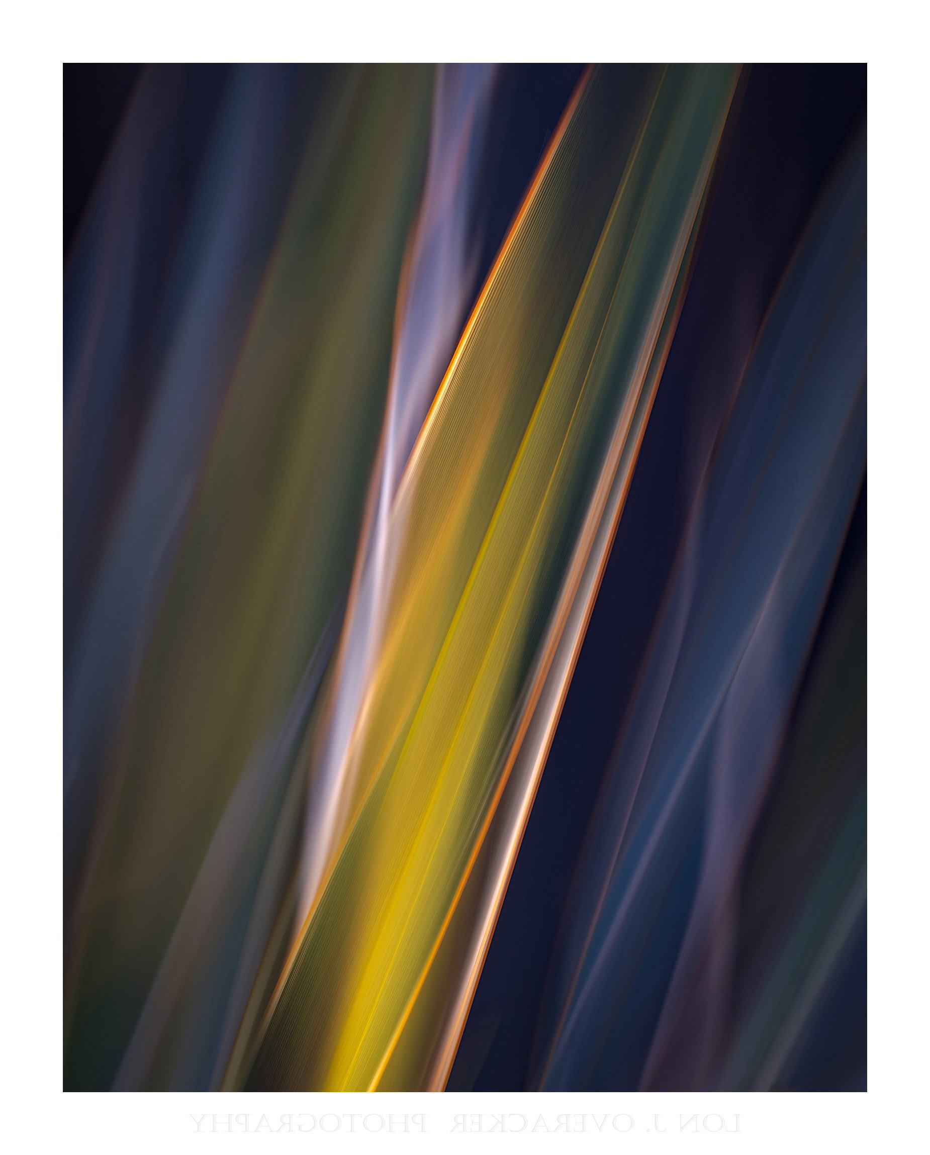
The difference in palettes between the two images is pretty amazing, Lon. I like this image a lot for the lines and surprisingly to me, the colors, which I’d probably never come up with on my own. It did strike me that this might be even more interesting flipped horizontally, so I tried it. It does suit my eyes a bit better, but I suspect that’s strictly personal taste.
I guess you could say I’m with Zak on this one. I’m fascinated by the ICM, but I really have no interest in trying that myself because of my orientation photographically.
Some of the images have been spectacular as this one. I guess I find it interesting that my above statement seems to contradict my gravitation towards abstract images. In any case, keep it up. It’s nice to see something that’s different that I probably wouldn’t attempt.
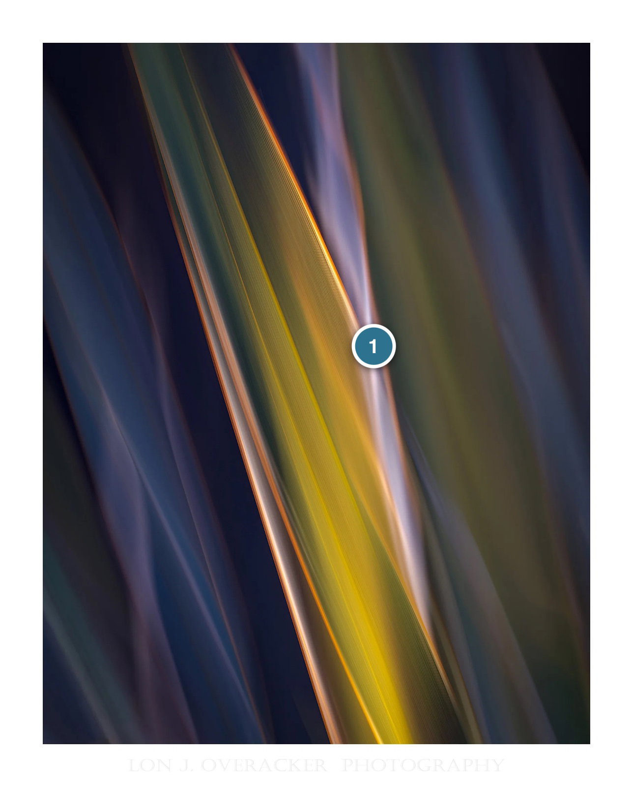
Lon, you’ve got some fine lighting and a great sense of flow here. I like how the light emphasizes those central leaves, with the surrounding leaves adding their own subtle, quiet colors. Since I’m a fan of filling the frame with interest in abstracts especially, I tried some mid-tone dodging to lighten the edges and the upper part of the blue/magenta leaf on the left. There are so many ways to process an abstract, depending on what the artists wants…
Lon: Shame on me for being so late but this may be my favorite of the bunch, but it must be like the judges in a beauty pageant; how could one go wrong? I love how well you’ve taken to these and the results are flat out marvelous. Most, most, most excellent! >=))>
Thank you Zack. Very much appreciate you taking the time
I don’t see a contradiction David. In fact, I can flip yours and Zack’s statements. i.e., I’m not likely (at this stage in my life…) to dedicate myself to studying animal behavior, habitat, etc. beyond my backyard or the local park… but (and I think most of us feel this way,) I can and do appreciate all the wildlife images - and what it takes to make great ones!
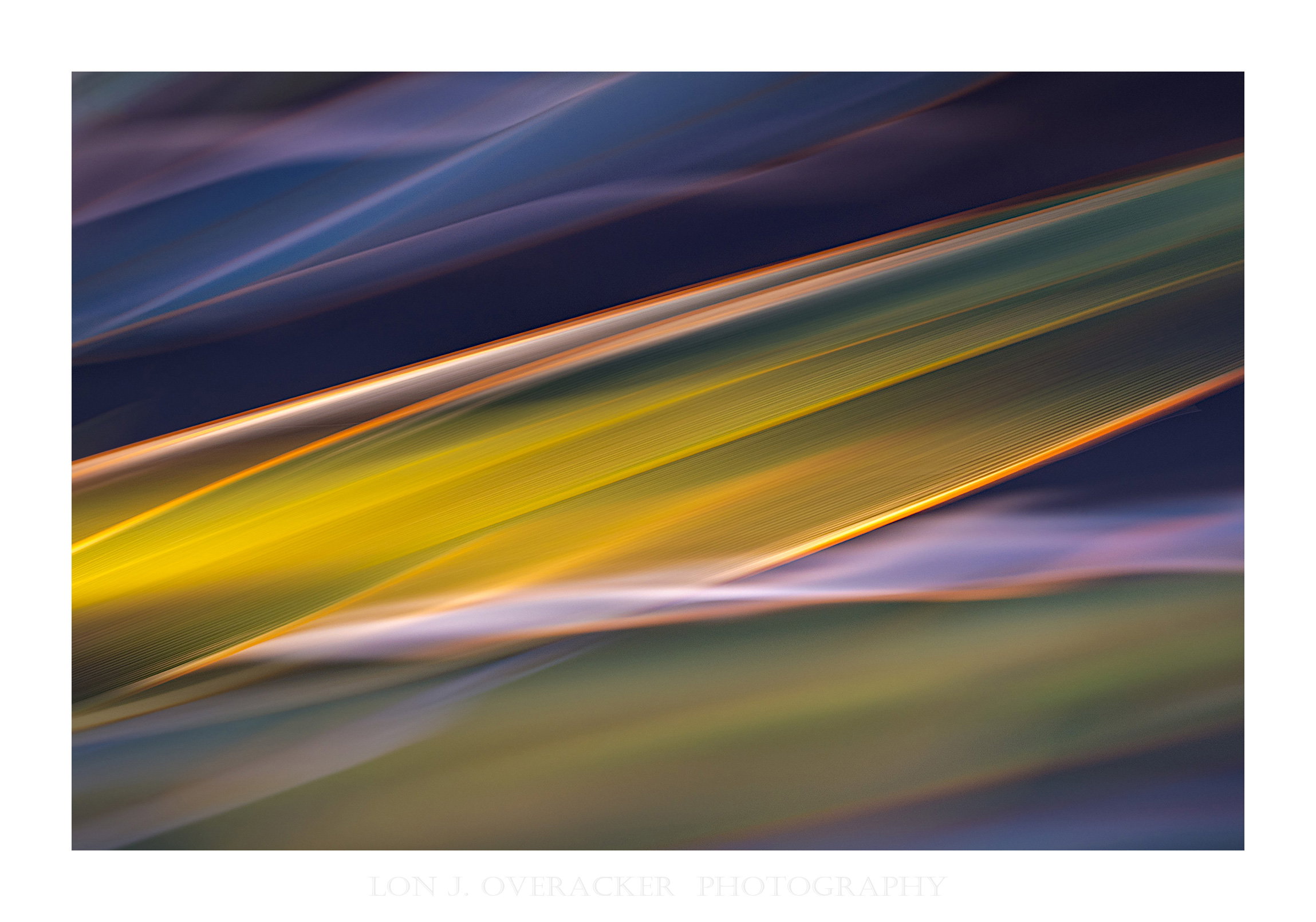
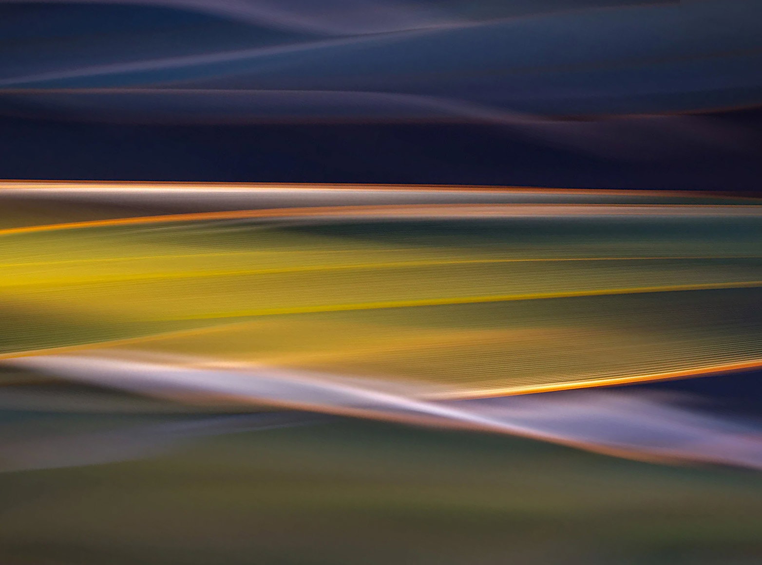
Mark, thanks for the suggestion. In my rotated revision above, I tried to incorporate the feedback by raising the luminosity of the outside colors. I think it works well, and the central lighting in the middle still has an impact.
Please suggest! A great idea! My first reaction when you said “farmland…” The Palouse! Of course! So I’ve posted a revision rotated horizontal. Now I didn’t rotate further as you did, and so I don’t think my version gives that same farmland vibe, but I do like the horizontal orientation!
Thank you everyone! Inspires me to spend more time with my plants in the backyard. In fact, this morning I pruned that yucca of all it’s dead leaves for potential future photo ops!
I’m thoroughly enjoying all your yucca weave variations, Lon, but the Revision 1 at the top would take pride of place on my wall - it’s sumptuous! I think some people dislike yucca because it’s prickly, but in your hands it takes on a whole new life. Do you get flowers on it at some stage?
I like both of the horizontal presentations, and the colors put some Wow into yucca leaves. @Don_Peters crop works well with the abstraction for rolling farmland. Awesome…Jim
Bill_Fach
(Bill Fach)
selected this as an Editor's Pick
18
Marvelous concept coupled with superb execution. Also a branching out for Lon and it’s been a delight to see what he’s creating. >=))>
Lon, going horizontal and the dodging both above and below that main streak work very well. The revised version makes an outstanding, dynamic abstract. I’d hang that one on my wall.