Critique Style Requested: Standard
The photographer is looking for generalized feedback about the aesthetic and technical qualities of their image.
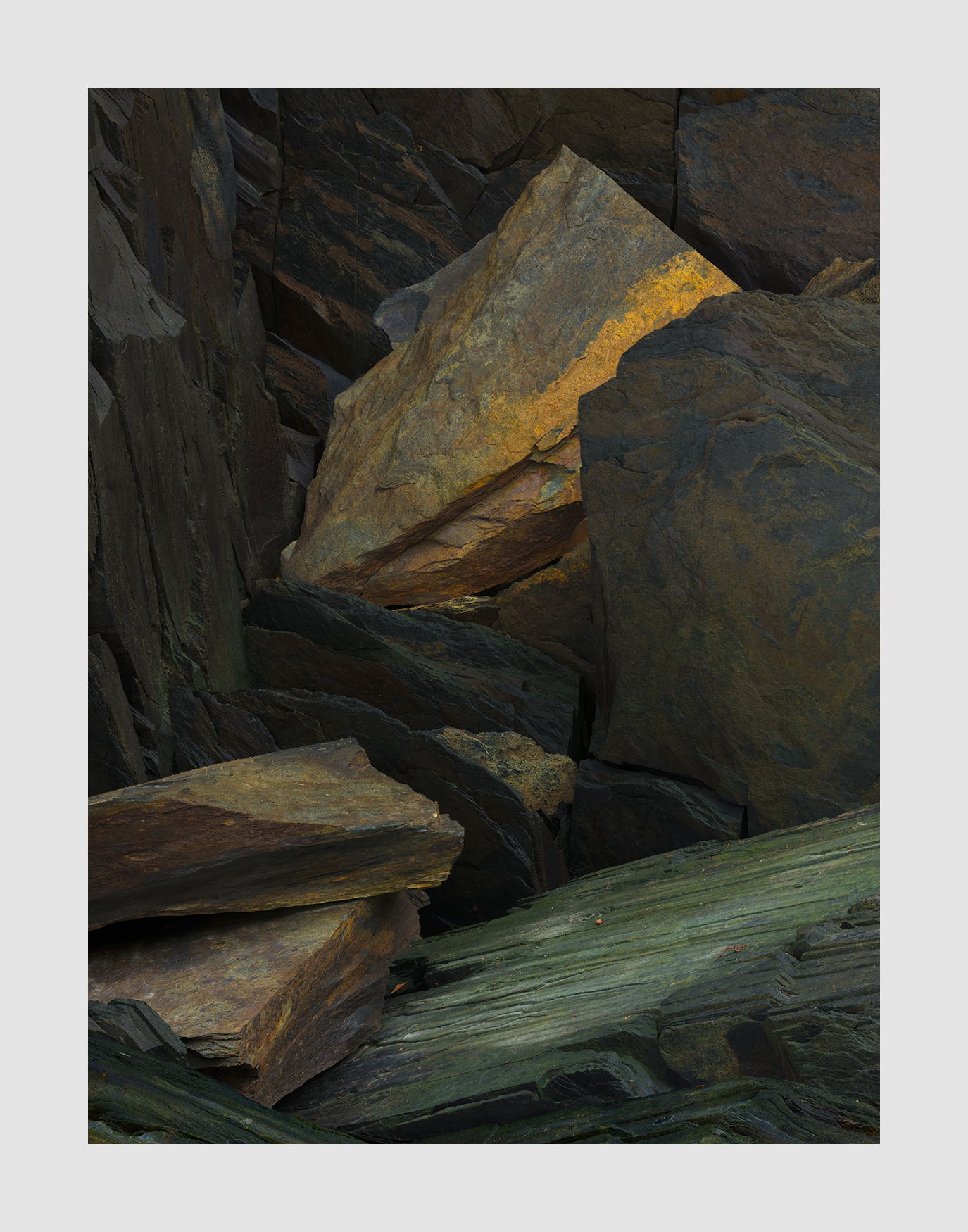
Description
Yet another rock image from Alaska. I was attracted to the yellow rock initially and then things developed from there. This version included the green slate which I decided added to the image. The initial vision was a portrait of the yellow rock and its immediate neighbors. But in the end I decided that version was too simple of a composition.
Specific Feedback
Is this too dark?
I’ve been wrestling with how much brightness to add. But decided that the point was for the yellow to come out of the darkness so why make it bright.
Technical Details
GFX50R, 120mm, f/11, focus stacked
This was a huge stack because the fg rocks were much closer than the bg.
Critique Template
Use of the template is optional, but it can help spark ideas.
Vision and Purpose:
Conceptual:
Emotional Impact and Mood:
Composition:
Balance and Visual Weight:
Depth and Dimension:
Color:
Lighting:
Processing:
Technical: