A living, breathing thing

V1- a lighter above the wave, more drawn out gradient about 2/3rd of the way to the top. Indeed, almost a uniform colour rather than a gradient.


V2 - a slighter more colourful gradient just above the horizon and about midway to the top


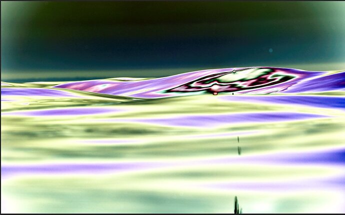
Solar curves visualization of the “dirty” sky

Critique Style Requested: In-depth

The photographer has shared comprehensive information about their intent and creative vision for this image. Please examine the details and offer feedback on how they can most effectively realize their vision.

Self Critique

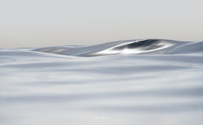
Straight off capture of a rolling wave in the water.

I cropped about 25% of the bottom - but there probably is still some way to go.

Creative direction

My aim in processing is to try to enhance the natural metallic quality that was captured. I wish I could achieve a more subtle result, particularly as concerns contrast but that’s the best I can do for now.

Specific Feedback

I am grateful for aesthetic and emotional feedback, but my request for this image is more technical.

Due to the camera being in an underwater housing with an acrylic port, there often are water droplets/smears and salt residues that require cleaning up in post. This is worst in the sky, as you can see in the attached solar curves visualization of the image.

My question about this image is: does the sky look convincing?

I have made many versions of the sky, but here are my final two.

The first one is very light with a very slight, very wide barely there gradient.

The second one is a more pronounced gradient with a slighty darker, more saturated colour from the top of the wave transitioning into a light gray colour roughly matching the bottom part of the wave which reflects the higher sky. Due to the difference in color between the bottom of the new sky and the top of the wave, I have had to reshape and match colors along the top of the wave using frequency separation.

I am not sure whether the difference between the 2 skies will be visible in these uploads, but if they are I would be very keen to hear which one you prefer, and why?

Technical Details

If you would like to know about the shooting data, please DM me.

Description

I was in the water for 3.5 hours on that day and only got 1 exploitable frame during less than 10s of shooting. Hard work, but fun!

Laura,

What a fantastic abstraction of waves. I actually like the original version without the graduated sky as I feel it creates less separation and thus gives the image a little more, if that makes any sense.

1 Like

Hi Laura,
it’s funny when I saw the thumbnail of your image in the feed, I immediately thought “Oh, someone is doing something similar to Laura.” :rofl:

In my opinion, you succeeded. The image looks like you photographed a wave in a sea of quicksilver. I like the amount of contrast you applied to the image.
And the DOF is perfect. I like the transition of the slightly blurred waves in the foreground to the main wave in the background that stands out quite nice.

Your image looks quite clean in comparison to some of mine. Photographing in the rain, at waterfalls, or changing lenses in the field collects quite a bit of stuff on my lenses and sensor. So, removing dust spots from my images belongs to the daily workflow in my post-processing.

The sky fits well with the rest of the image. I love the simplicity and the sky adds to that because there is nothing distracting from the beautiful waves.

I’m sorry that you obviously put some effort into the frequency separation but I prefer the first one. The difference is really subtle, but the wave stands out better against the slightly brighter sky. And the warmer color adds a slight color contrast to the cooler tones in the wave. The clear edge between the sky and the wave fits better with the metallic look you are after.

That sounds exactly like my hit rate. Anyway, being outside and enjoying nature is my biggest goal. And I’m happy when I take home some nice pictures, too.

I’m curious about what your shooting looks like. I assume you wear a neoprene suit and float in the water? You have set your camera to burst mode and taken two-thousand images in a single day?

1 Like

@Youssef_Ismail
Hi Youssef, it’s great to hear that you like the image. Many thanks for your appreciation and feedback. It is interesting that you like the first version with the brighter, almost uniform sky, which is closer to the original capture. It was my first choice, too until I started thinking that there’s almost always an atmospheric haze just above the horizon, even in the clearest of skies, and that this gives some sense of perspective whereby the wave may appear slightly closer to the viewer. But I cannot be sure, so thanks for saying which version you prefer and explaining. This will help me to make a final call.

@Jens_Ober

Hi Jens,

Many thanks for your comprehensive feedback. I do know that this does not take insignificant amounts of time and energy :pray:

Not that I know of on NPN, but I’m sure similar work is being done out there.

Thank you. With regards to the contrast, I have in my mind’s eye a more subtly luminous yet not-lacking-in-contrast image which I could not realize. The gap between vision and execution, if it is ever possible to bridge it, looks impassable to me at this point in time. I need many more years of training my eye and developing my post-processing skills. The guys who have been doing it for 10 years + can testify to how much effort and how long it takes, I’m sure.

Relieved to know that the sky does not look fake at first sight, my biggest FEAR being to ruin a good capture with gross post-processing. Arghhh!

That is excellent feedback, thank you very much. The only consideration is that of perspective, in that the more pronounced and warmer gradient may provide a little more sense of depth, resulting in the wave appearing to be closer and thus captivating the viewer’s eye a little more strongly. My thought at this point is that I could attempt to make the edge of the wave sharper in V2 (which is the warmer one), as your point about the clear edge better fitting my vision is an excellent one. But this is more work and I’ve already made 24 versions of this image, so I gotta stop somewhere and should deem V1 good enough for now… but with large, expensive print at the end of it, it is a bit scary :scream:

Exacly the same here :slight_smile:

I go out to sea jumping into the water from a wild rocky shore on the French Riviera, alone and in complete freedom (luckily there’s very little chance of encountering sharks and other dangerous creatures in this part of the Med). I have a float which I attach to myself, both for security and to carry my equipment, and I swim along the coast, exploring, taking pictures (yes, bursts and 2,000/day is spot on, though I try to keep it around the 1,200 mark these days because the sorting is too much!), diving, and taking some more pictures. It is heaven! And yes, I have a shorty neoprene suit. Necessary if you intend to spend 2-3 hours in the water, plus for protection against the sun.

My pleasure. That’s one reason I like this community here so much. There are like-minded people who will take the time to look at your work. And by that, I mean more than on other social media, where your picture in someone’s feed gets maybe a second of attention as he scrolls.

And personally, I’ve found that I learn a lot by looking at the work of others. What do I like about a picture, what don’t I like? And why do I like it? So my answers are kind of self-serving. :slight_smile:

1 Like

@Jens_Ober Totally agree with your views about NPN. It is definitely worth the investment in time and energy. I think it is developing into a real art school for photographers, and the people who started it and have kept it going have done an amazing job!

As for other social media, don’t get me started…! :face_with_symbols_over_mouth:

I too prefer v.1 . It really looks like the ominous eye of a sea creature. Your slow shutter speed creates a beautiful smooth flow with nice horizontal lines.

1 Like

@Larry_Greenbaum Oh now that you’ve said it, I can see it and love it! Many thanks for the very imaginative feedback, Larry! And for voting for V1 :smiley: Shutter speed, though, I wouldn’t consider slow, 1/1250s?

WOW! I think this is wonderful and well worth the time and trouble! It is liquid silver! I prefer the original but both are amazing. There is not much I can add to the great discussion above, but I did wonder about a slight gradient at the bottom, and then just for balance added one at the top (on the original version) – just to add to the possibilities.

Sunburn – definitely a consideration. We were snorkeling in the Caribbean once and I wore a white t-shirt for some protection, but it wasn’t enough. I decided to back-float for a while and forgot to spit out the snorkel. Then a couple on the boat (a day tour thing) came up from diving buddy-breathing – her regulator had failed at some non-trivial depth.

1 Like

Laura,

OH MY! This is surreal - an alien landscape, liquid silver as others have commented. I’m almost at a loss of words… or on the flip side, so many words could describe this.

I think the highlights and mini-star highlight anchor the scene visually, and those rolling waves are again, so surreal. Add 3D to the descriptions as well.

I would have a hard time suggesting any improvements here. But since you provided an edited version, I can at least comment there! I prefer the original over the edit. Why? because the introduction of the gradient or change you made, makes the atmosphere above the horizon look more like dirty air (rather blunt, but just relative between the two versions for description…) I really, really like Diane’s edit as well.

The only question I have really is the color. I know the outing and conditions were very different from your last post, but I’m curious what the conditions were like that prevented any ocean or sky blues? Don’t get me wrong, this is incredible as presented, but just curious on the colors.

Lastly, 1,000, 2,000 frames, 5min or 3 hours… if you only had 1 keeper, you should be very happy! I know I would! Congrats!

Lon

1 Like

@Diane_Miller

Thanks so much for the suggestion, Diane. I would not have thought of a gradient at the bottom and even less of one at the top to balance it out, but it definitely closes the image nicely and focuses the attention on the main subject of the metallic roll. Looking at your version, I feel that the FG in my V1 image is too luminous (I did that on purpose with a white to transparent gradient map in the larger FG waves) and that the image rather flat.

To be honest, I think I was too preoccupied with giving the waves in the FG great importance because I have been kind of obsessed with capturing waves when are naturally that colour, more cloud than blue sea, a merging of sea and sky… So a BIG thank you for helping me clear up a bias and nasty blind spot. I figure, it may be worthwhile just drawing gradients or vignettes in any image merely as “reveal tests”, to possibly identity flatness or imbalances. May I ask, is the gradient that you used a curve adjustment layer in multiply blending mode with a B&W gradient on the layer mask?

I know what you mean about wearing a white t-shirt in the water. It’s better than nothing, to be sure, but the Caribbean sun almost goes right through. So strong! Oh, did the couple come up very close to you when you were floating on your back? I hope the diver who came up with the assistance of her buddy was alright? Diving accidents are quite scary, but I’ve never dived myself and would love to try to some day.

@Lon_Overacker

Hi Lon, Very happy to read your reaction, thank you very much!

I totally get the “dirty air” perception and appreciate your pointing it out bluntly. This is what I suspected, and most want to avoid. I have been mulling for the last 3 years over sky gradients, and am still nowhere close to knowing quite what to do. Certainly food for thought/research/experiment.

This shot was taken on the 18th October, 2022. The sun was shining, but much lower above the horizon than in the summer and the light was rather diffuse, although the sky looked clear. The sea looked a pale blue rather than deep blue, and very calm. Typical autumnal conditions. As it turns out, I am now more interested in the sea inter-seasons rather than in high summer, but the drawback is that the days are shorter, the water is colder and the jellyfish can be abundant, so a little less pleasant conditions to shoot in. And yeah, one keeper is great. I’m very happy!

Laura, your feelings about, and sensitivity to, the subtleties of the water is wonderful and that appreciation comes through in your images.

I used a simple linear gradient – go to quick mask mode (Q key), then the linear gradient tool (black to transparent), pull it from the edge (usually, for the most subtlety), then Q again to make it a selection. (I have changed the default for the quick mask tool so the area I cover with a gradient, or paint with the brush, is selected rather than protected. If you haven’t changed that, just inverse the selection.) Make a Curves adjustment layer and pull the center or right end down, depending on which works best, or sometimes a little of both. I never use the multiply mode thing, I just adjust the curve itself. And sometimes I’ll tweak the color channels in the curve interface.

This can cause posterization even in a 16-bit image in PS, if taken too far. In that case there is more tonal range to work with in the raw file, with similar adjustments, either the Curve or the other tonal adjustments.

Subtle images are the most difficult to work with. I usually try to let them sit for a while and when I come back to them I always change things a bit.

We were just climbing back on the boat when the divers came up, but they seemed surprisingly calm about it. I assume they were quite experienced. I’m content to stay in the top 10 ft or so.

1 Like

@Diane_Miller

Hi Diane,

Thank you very much for seeing and for appreciating. I’m very, very glad for your kind words!

Thank you also for the detailed steps of your workflow.

You wouldn’t believe how many hours I’ve spent fighting with gradients in the last 3 years… it’s indecent :laughing: I am very aware of the posterization problem, as I work on my files with the largest possible printing size in mind. I’ve never seen any gradient, even in 16-bit, without banding frankly. This is fairly easily sorted with the addition of some noise, RAW noise possibly being the best quality noise (to be debated…) Where masks are concerned, there is something to know though and it is that they are loaded in 8-bits from selections. The workaround for this is to save the selection as a channel, create a blank mask, click on it and then load it in 16-bit from Apply Image. I learned this trick from Ben Wilmore, who is a real Photoshop master.

It’s good to hear that the divers were ok. For a very long time, years really, I was terrified of being in the water, but I can assure you that it’s only a matter of familiarity and habit, of swimming/diving hours, just the same as flying hours… :wink: I would say that it took me about 200 “flying hours” to start being comfortable in the water, that is not paralyzed by fear, tunnel vision, etc… That said, a little fear is always good!

Thanks for the reminder about the 8-bit thing – that’s something I never think about, although I rarely see posterization in gradients. If I need a strong one I do it in LR where there is more overhead.

Good to know you overcame issues with swimming. I assumed you were a mermaid!! I struggled with trying to teach our two beanpole preschool/kindergarten daughters to swim, until I bribed them with $1 a minute for treading water. After 20 minutes I called time. A year later they were gleefully body-surfing.

@Diane_Miller That’s absolutely right. I’m a bit averse to masking in LR, so thank you for the reminder!

Haha… that’s the way to do it! Thanks for the laugh (and I had to look up “beanpole”. Cute!)