Metallic foil seas

RAW

Critique Style Requested: In-depth

The photographer has shared comprehensive information about their intent and creative vision for this image. Please examine the details and offer feedback on how they can most effectively realize their vision.

Self Critique

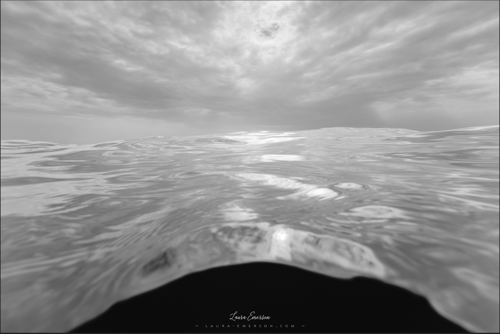
In this image, I like that the surface of the water looks like a thin metallic foil that’s fluttering in the wind. I like the darkness under the surface. We can’t see what’s underneath, but it’s mysterious! A large portion of the sky around the most lit part is badly blown out in the RAW image. I think that’s as much detail as I can recover. I also like that the horizon line is sharp straight out of camera. It takes a lot of shots to get one like this, and am lucky I got one at all! I also like the sense of motion, speed, ephemerality in this image.

Creative direction

I seek to emphasize the metallic, fluid aspect of the water under these specific light conditions. I’m always happy when an otherwordly feel naturally emerges in post.

Main post-processing steps:

  • initial RAW processing
  • double RAW smart object using Linear Profile for the sky, masked the water
  • burnt the hole in the sky where the sky is showing a bit (totally blown out)
  • hue/sat adjustment in the same place to try and get out some bluish colour
  • curves to fix difference in WB between the sky and the water (not sure how it occurred)
  • closed off the very top of the image with a linear gradient at the top (white to black)
  • curves in multiply mode, low opacity to darken just above the wave on the right (was distracting)
  • cleanup of some irregularities on the black edge
  • LAB curves to bring out some better contrast (masked HL and where needed)

Specific Feedback

Aesthetic - the overall visual appeal of the image, including its color, lighting, and composition.

Conceptual: Feedback on the message and story conveyed by the image.

Emotional: Feedback on the emotional impact and artistic value of the image.

Technical: does the bluish fringe on the edge of the black look like CA? I am using an acrylic dome port which, I believe, is the source of some CA there (don’t know really, am not a specialist) Other than that, I’m happy to receive any other technical feedback that catches your eyes.

I developed this image when my skills were still very shaky, but one’s gotta start somewhere! I wish I could have made a softer image, as in the RAW, but that was beyond my capabilities at the time, and probably still is!

Technical Details

If you would like to know about the shooting data, please DM me.

Description

It was a fun shooting session. Over 2 hours in the water. All alone along that remote part of the coast, so it felt a bit wild (in mid-September, the holiday season is over and fee people venture around there on a weekday). I saw the hugest moray eel I’ve ever seen in this part of the world, about 15m below. It was going about its business, weaving through the seagrass meadows that abound at the bottom. It was quite beautiful really. I was torn between going down to take a look and continuing my shooting, but as I was all alone and it was a BIG eel I decided to do the reasonable thing and keep shooting on the surface. But all throughout the shoot, I had images in my mind about the eel weaving through the grass with such grace.

Hi, Laura. I can clearly see why you titled your image as “Metallic foil seas.” Upon first looking at the photo, the metallic foil vision does make itself very evident. The more I look at the image, I also see how silky the surface appears to be. Conceptually, you achieved your goal in conveying your intentions. Emotionally, I feel the photo presents me with turbulence and smoothness at the same time. That is a beautiful thing to achieve in one image.

I do like the first version for its contrast, particular in the sky. The only thing that breaks that beautiful balance as I look at the image is the underneath section at the bottom of the photo. In the present crops you used, the dark underneath portion is not centered. Personally, I would crop a bit more from the left side in to leave the same amount of ocean on both sides. The DOF from FG to BG is nicely presented, too.

Hi Laura, I prefer the lighter of the two versions. Does the image look out of focus to you - is this intentional? I tinkered some and came up with an edit below. I sharpened the image in Topaz Photo AI and then cropped it as @Egídio suggested. I also straightened the horizon. I did a content aware crop in PS adding some space at the top. I think the inverted triangle of the clouds work well with the shape of the water. The FG is still not really in focus. Disregard all this focus stuff if you have it OOF intentionally.

1 Like

Hi Egidio,

Many thanks for your feedback.

It makes sense and I like that, thank you very much! :grinning:

It is an uncropped FF image.

The second image is a jpg of the RAW image.

The reason why I did not do any cropping is that this very wide view was the whole point of my using a FF, as opposed to a compact camera. As I said, it is one of the very few images where the horizon line is sharp from left to right straight out of the camera, so I was partial to keeping this. Additionally, I was quite comfortable with the feeling of imbalance produced by the asymmetry you mention, as I am floating in the water when taking the picture and had hoped to convey this feeling of “flying” to the viewer, as if “floating” in the air, banking, etc… SO it wouldn’t have occurred to me to crop. BUT I did implement your advice in PS this morning and I quite like it! Amazing how we become blindsided because of our emotional and technical investment in an image, and how uninvested eyes can open up new possibilities. Thank you!

@Larry_Greenbaum

The darker version is a jpg of the RAW.

The focus is on the edge of the wave with the sky. This is actually very difficult to achieve, a few shots in a thousand. That is why you will see lots of waves pictures around that are sharp in the FG but with unsightly (in my opinion) OOF horizon lines and clouds. Here the FG is a bit blurred but I used the smallest possible aperture for the SS and ISO. Limitation of a FF, I’m afraid and I seek the best possible image quality out of the camera. That said, the post-processing tools have improved so I will experiment and push the settings as far as I can to try and get maximum DOF.

Many thanks for spending the time to take the image into PS.

It’s very attractive at first sight, but…
i/ I am uneasy with compromising the integrity of the sky, as the surface of the water reflects everything that “goes on in the sky” - still, the portion where content-aware has been used is very limited, so… hmmm… I need to think about it. The reason why it may not work is if I can’t get it done perfectly seamlessly, or very nearly. I will have to play around and see what I can achieve.

ii/ it didn’t occur to me to take it into Topaz Sharpen (I do not have Topaz Photo AI), as the horizon line is more than sharp, almost too sharp for being real already. And I had intended a softer look…

This image was processed BEFORE I started using Topaz Sharpen, so I will certainly run it and see what I can get, particularly as regards the FG. I think it can work, as long as it doesn’t introduce artefacts - it is a fine line to tread here, because I have a clean image to start with and wouldn’t want to degrade its quality (thinking in terms of an 80in print here). But hopefully, I’ll manage to crank up the impact of the water a bit. That’s a super helpful suggestion altogether, thank you very much!

And I like your cropping and straightening.

P.S. Is Topaz Photo AI better than Topaz Sharpen??

You’re very welcome, Laura.

I believe they are the same. The difference in Topaz Photo AI is that they also added Topaz DeNoise AI and Topaz Gigapixel to the mix. It’s a one-stop program instead of using three separate programs.

1 Like

@Egídio_Leitão Cool, thanks for the info.

1 Like

@LauraEmerson
Are you stuck on color? This is a straight B&W conversion.


Much more like aluminum than the blue. I feel it has more impact.

Hi @Guy_Manning,

Ha… thanks for the suggestion!

I am stuck on colour for the time being, but I am started to feel tempted by b&w as a future direction.

I have no experience at all in b&w, so it will take me a little while to find my way around.

Funny, I looked at your image “The Shroud” and wanted to comment. I’m very struck by it. That 's a great piece of art, I mean it! (Gotta dash now, but will come back to comment tomorrow)