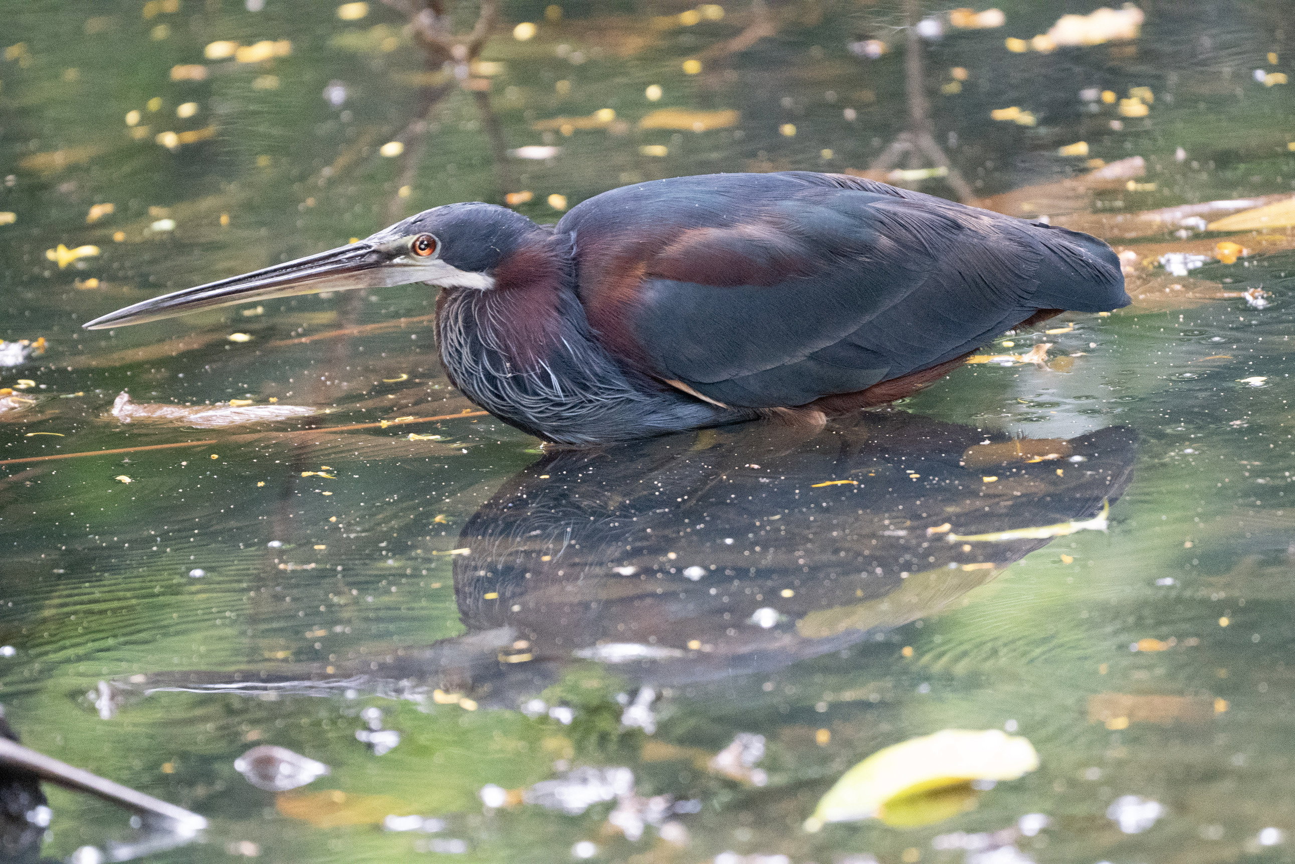
Agami REPOST. With new slight rotation


ORIGINAL IMAGE no processing

Slight clockwise rotation
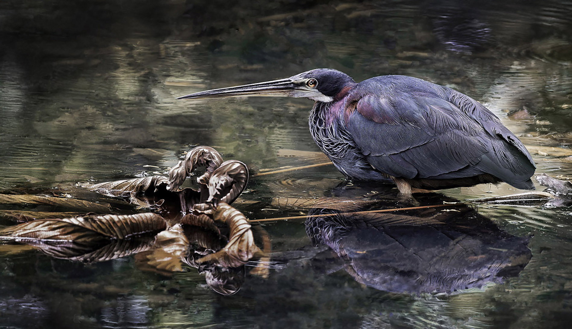
Critique Style Requested: Standard

The photographer is looking for generalized feedback about the aesthetic and technical qualities of their image.

Description

this image was taken behind a restaurant in Costa Rica. Was very steep and muddy getting down to the pond. I couldn’t get any lower and had to do with this point of view just to get this picture.
Several people who have looked at it thought it was kind of painterly and what I did here was try to make it less painterly. Did I succeed?

Specific Feedback

anything that will help me as a photographer improve my skills

Technical Details

I don’t remember… processing was done with DxO pure raw five, Photoshop, and ON 1 raw for the vignette

I did not use any of the new tools in Photoshop or Lightroom, which removed dust and scratches. I tried, but I found that doing everything by hand using the removal tool was far more effective and less complicated.


Critique Template

Use of the template is optional, but it can help spark ideas.

Vision and Purpose:
Conceptual:
Emotional Impact and Mood:
Composition:
Balance and Visual Weight:
Depth and Dimension:
Color:
Lighting:
Processing:
Technical:

I much prefer the looser composition of the rework, David. The cleanup works quite nicely. I’m guessing the dark masses in the lower corners are foreground vegetation, but they don’t bother me. I haven’t tried to check it with the reflection, but this feels like it could use a touch of clockwise rotation.

Really nice catch David and I like the looser crop as well. What a great looking bird and I like the surroundings you show in the first image. The photo does still have a painterly look to me but is a pleasing image.

This is such an improvement. It gives space around the bird and provided environmental context. The colours are exactly like the scene below our house! You did an excellent job of cleaning up the image. Bravo.

This was for Dennis. I think it still looks a little strange with the clockwise rotation, but you can tell me what you think.

Beautiful look at the heron, David. I like the top image with more space around the heron and the colors and detail look great. I think clockwise rotation helps, but that image looks really funky on my screen, though the crop from the bottom looks good.

I think on balance the original repost works best, David.