7DmkII; 1/60th; 5.6; 400iso; spot; wb: auto; 100/400 @300
(If this is a composite, etc. please be honest with your techniques to help others learn)
If you would like your image to be eligible for a feature on the NPN Instagram (@NaturePhotoNet), add the tag ‘ig’ and leave your Instagram username below.
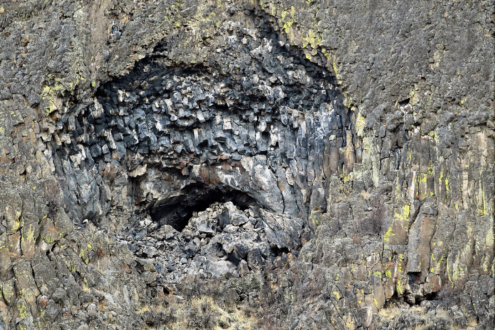
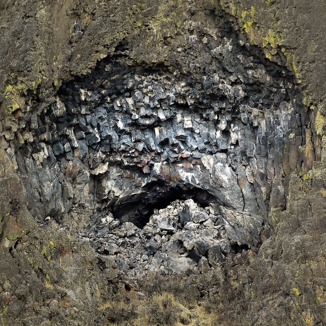
Very cool columnar basalt. It really looks like an anguished face. I think you might be able to bring out the anguished look even more by adjusting the luminosity of the central “face” vs. the surrounding area and cropping to emphasize the face itself. Here’s my idea (in ACR I lowered the exposure and highlights in the area around the face while decreasing clarity and texture, and warmed it; cooled the “face” area; cropped to a square). The square crop gets rid of a lot of that lovely yellow lichen, and maybe it’s a bit too constrained, but I think the surrounding area, especially the area on frame right isn’t contributing to anguish. Well seen!
Thanks for the comments. I do like your version especially the emphasis on face but not the crop. The reason is in the basalt columns below and to both sides of his face I see his knuckles on both clenched hands in the cropped area. (Or is it just my imagination?) Perhaps if those two areas were more emphasized. Thanks again for commenting.
I agree that full frame is better than cropped, but I like the way Bonnie gave more definition to the face. Basalt columns were a good subject for abstract art.
What an interesting subject for an abstract Jim, a really neat find. Lots of interesting details and textures for the viewer to appreciate. I would not crop this, the yellow lichen on the surrounding rocks is a very appealing secondary feature to this image. In terms of tweaks, I would add a stronger vignette and some more mid-tone contrast. And i would clone away the bright yellow spot in the ULC.