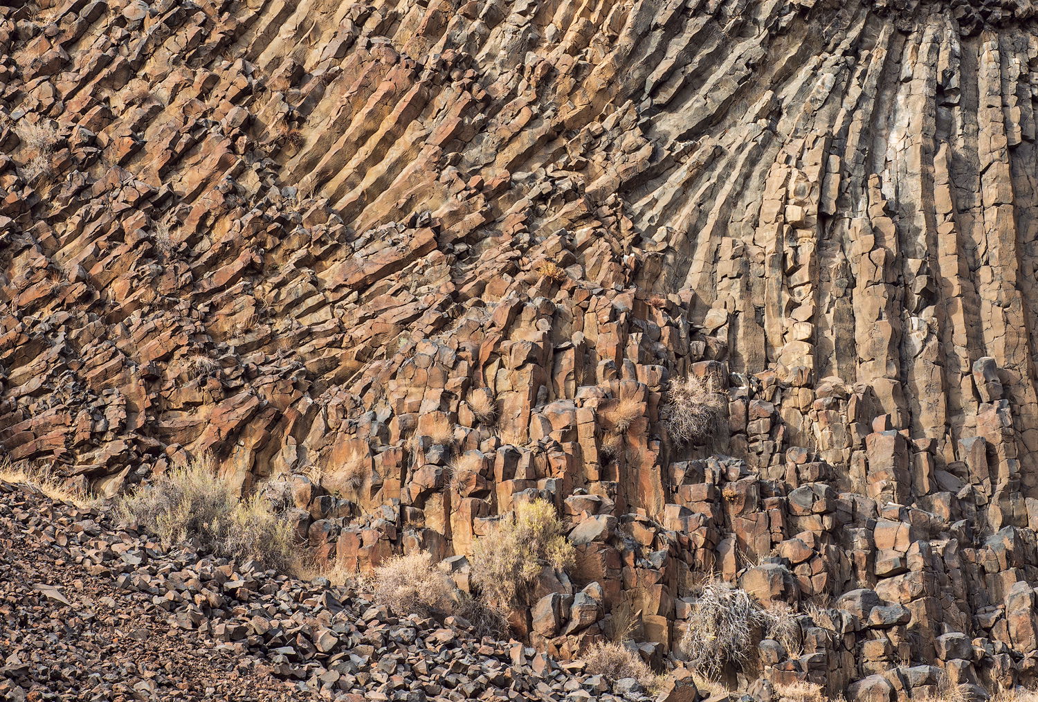
This image was taken in the Crooked River canyon not far from the dam. The sun as bright but fairly diffused so neither side of the histogram got clipped. I’ve driven along this canyon quite a bit recently trying to decide what aspect appeals to me the most. It’s those columns. They twist this way and that providing a lot of energy and power.
As usual, I wasn’t sure how I felt about this image. So I let it rest. I wanted to see if I could come up with better compositions but the light has been so strong that it’s been challenging. Flat light provides a totally different feel.
What technical feedback would you like if any?
Are the colors too strong?
What artistic feedback would you like if any?
Is the composition too compact?
Does this do anything for you?
Any pertinent technical details:
Nikon D810, Tamron 24-70mm, ISO 64
You may only download this image to demonstrate post-processing techniques.
1 Like
I like it, Igor. It’s somehow complex in its simplicity. I can’t make a good judgement about strength of color on my laptop, but it seems fine to me. Not knowing the area it’s hard to tell, but seems to me that a composition without the talus slope would be simpler and put more emphasis on the twist of the columns, which I find to be fascinating and the big attraction.
Igor, I think the colors are really nice in this image. They help place the emphasis on the column pattern. I do agree with Bill and find the talus slope a bit distracting from the very interesting abstract pattern of the columns.
I dig rocks Igor. Especially columnar basalt.
I think that the crop could have been tighter to eliminate the angled foreground or if you could have composed it to make the angle support the whole frame above it. Perhaps bringing more of it into the frame. I think that if you were to have zoomed in to a tighter more abstract composition perhaps squaring yourself up with the wall would help with the depth of the texture of the rock patterns.
Beyond that, I like where you were going with it and I love basalt. Nice work man. 
1 Like
@Gary_Randall, @Alan_Kreyger, @Bill_Leggett -
Thank you for your comments and suggestions. There is overriding agreement that the talus is not adding much. Let me explain my viewpoint. I really didn’t want a fully abstract composition with a vertigo inducing design. I wanted a composition that’s more grounded in reality. However, I will post a redo as suggested and you can come to your own conclusions.
The crown above the columns was not nearly as attractive so I cloned it out. It was all jumbled up with no pattern. I also cropped it this way because I like all the upward sweeping arcs that have no boundaries.
I always like these semi-abstract images where you can wander and looking at all the details. I find very interesting the shapes and the slightly different color between the right and the left part of the rock. I do not know is this makes sense and if it is doable but if you have the chance you can place the point of convergence of the rocks exactly in the diagonal of the frame to give more power to the image.
I would be curious to see what these rocks will look like with side lightning, maybe the result would be interesting.
Great rock and the colors look good to my eye. Before reading the comments, my first thought was a pano crop to eliminate the dirt/talus. I read what you said about not wanting the image to go fully abstract, but I played with the crop and it works really well for me. Seeing as it is not my image, my opinion is worth about what you paid for it.  I like the concept and it is a fine execution of it. Real nice image either way.
Thank you, @Mattia_Oliviero and @Harley_Goldman for your observations.
After rereading your comments and of those before you I decided to recrop this for another composition which addresses the issues noted. I suspect you’ll like this more. I do. However, the original has now been cropped so much it’s not of much use except as viewed on the view. I need younger legs to climb that talus and get up close and personal.
Igor,
I like this a LOT and I think you did a great job and accomplished what you wanted - you’ve got a semi-abstract image, “grounded” in reality; due to the fact you included that talus slope. I think you’ve included just enough of that slope to provide context, scale, orientation, etc. The wee bit of vegetation also helps with that and adds interest to the scene.
Colors/processing look spot on to me.
While certainly you could crop (as in your repost) and create a more abstract scene which I think works well. However, I much prefer what you originally presented. for one thing, it tells a better nature story.
Lon
1 Like