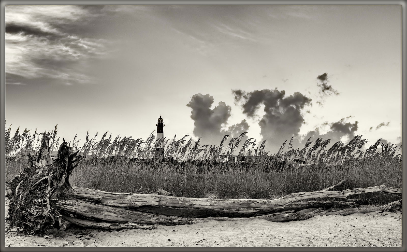
I posted this image in the reply to my previous post. Igor Doncov couldn’t see it. I could, but not in a large size. Why I don’t know. So here it is as a separate post. If this takes, I will add tech specifics and requests for comments.
It works here. Lon Overaker suggested:
Not sure what to suggest if you return. Not knowing the surrounds, but my thought my be to get a wider view, still incorporating the sea grass and make it less about the details of the log and root ball.
The log is still a central actor in the foreground. The Sea Oats are like a curtain, separating the natural from the lighthouse and environs. I don’t know why the lower clouds turned up so dark. Far enough away to be below the sunlight’s horizon?
Any pertinent technical details:
Camera Info: Nikon D750, HH
Lens: VR 16-35mm f/4G
Focal Length: 35mm
Focus Mode: AF-C
AF-Area Mode: Group Area AF
VR: ON
Aperture: f/16
Shutter Speed: 1/125s
Exposure Mode: Aperture Priority
Exposure Comp.: +0.3EV
Metering: Matrix
ISO Sensitivity: ISO 400
Almost full frame (slight crop for leveling)
PP in LR/PS CC 2018, Silver Efex Pro 2, Camera Raw filter, TK sharpen for web @ 35%
I like the layers you created with the sand, log, sea oats and sky, Phil. The B&W conversion also works very nicely. My only suggestion; just my opinion of course; would be to crop off the tree ball on the left, get rid of those buildings hiding in the sea oats, and the cloud above which so different than the others. The details and textures are lovely in the large version.
Ed, I drastically lightened the clouds, which really bothered me. I left the root ball and the “houses”. Actually the houses are a part of the history of the area; that is converted bunkers when this was actually Ft. Screven during and slightly after WW2. While they may be unsightly from an artistic point of view, they serve as a reminder of not only the past, but of the division between the natural and the artificial. So my choice was to leave them in.
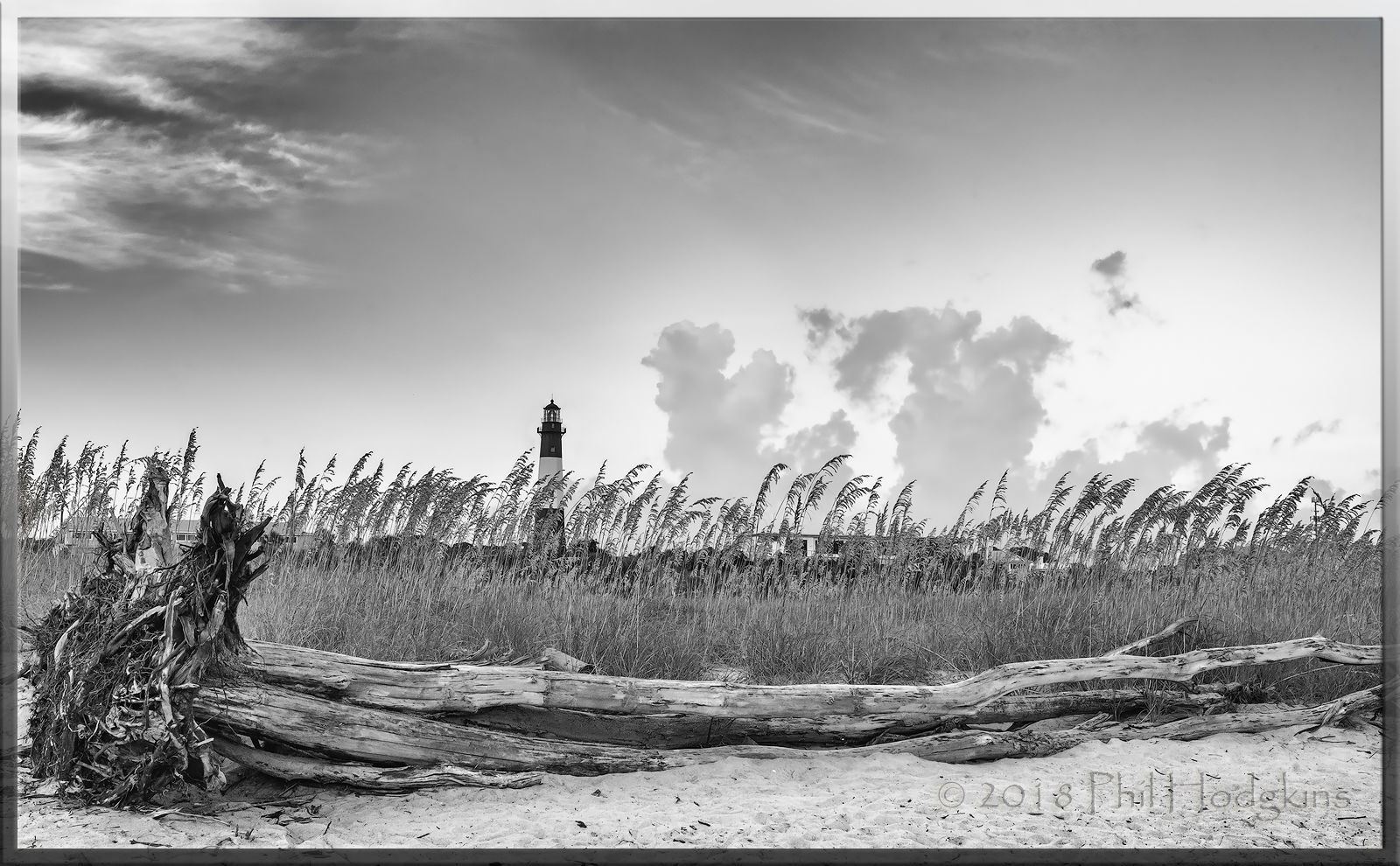
While this is a different take than before, and has a wider view of the surrounds, I prefer the “less is more” approach that you took in the prior post. To me there are just too many elements in this composition, and they compete with each other. I’m also a bit bothered by having the tree roots so tight to the left frame edge.
The processing here is very good in terms of contrast and tonal range, and I actually prefer the more neutral processing as opposed to the sepia tone in your prior post. My suggestion to improve this image would be to reduce complexity by focusing on the stronger elements in the composition. In my opinion I would crop just to the right of the tree roots, and crop the top leaving some space above the dark clouds in the center. As presented, my eye keeps bouncing between the tree roots and the lighthouse, and my eye stays primarily in the left half of the scene. With my recommended crop, the tree trunk (excluding the root) becomes a framing element, and the shot becomes more about the interesting grasses, lighthouse and clouds.
If you really want to incorporate the whole tree, another approach would have been to go even wider, creating some breathing room on the left of the roots, and maybe using a panoramic crop that eliminates a lot of the empty space in the sky above the dark clouds. I hope I haven’t been too harsh in my critique, that was not my intent.
Possibly, Phil. But I wasn’t able to see any images on this site at all! See this one and others now though. I like this image, but not sure which is my favorite.
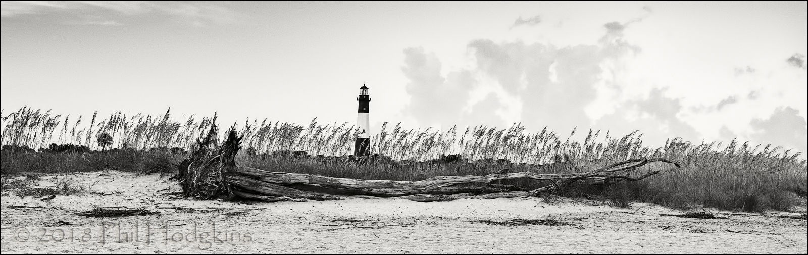
Phil, this is what I was envisioning for a re-post. I was okay with the buildings, but eliminating them perhaps puts more emphasis on the grasses and lighthouse.
BINGO on the cropped pano repost. I think this nails the scene. The original post here I think was too cramped on the edge, as was pointed out by others. The extra room on the pano works well and of course the pano format emphasizes not only the weathered log, but also the line of sea grass; the light house is icing on the cake.