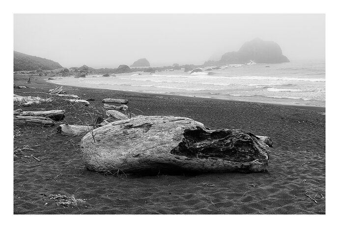
Thank you for the comments on this subject in the previous post. In order to remove the clutter I moved in closer and shot the log from a lower angle. This post is also different in that it’s more of a portrait of the log than an image of a log on the beach. There was much less fog this time as well.
I am posting both images side by side so that you can compare and decide which perspective you like more.
with suggested mods:
or
Igor, I rarely get the opportunity to shoot a location, post an image, get feedback from others, and then go back to re-shoot the same subject or scene a few days later. It’s kind of interesting to see the progression of this image through that process.
I prefer the current image to the previous post. You did not post technicals here, but it appears that you used a wider focal length on the current post, and got closer to the log. I think this helps a lot to make the log more dominant by exaggerating perspective. And the wider focal length has made the seastacks smaller, which I also prefer, the stacks now play a more complementary role to the log. I like the seastacks better in this second image because even though they are smaller, the lower level of fog shows more of their detail. Yet there is still enough fog to add some mood.
You are now showing even more of the log debris to the left that generated so many distraction comments in the prior post. Yet to me they feel less distracting now, probably due to the in-your-face presentation of the main log.
In terms of processing, I like seeing the greater level of detail and texture in the right side of the main log, it got too blocked up in the prior version. What I don’t prefer about the current version is the luminosity of the sand, I prefer the darker processing of the prior version. Maybe the sand was dryer for your second image, but I would recommend burning it down a bit. The dark sand in the prior image was very appealing to me. I would also clone away the small seastack that has now crept into the right edge of the frame.
Interesting exercise here…
Igor…I like this updated shot as well. The pull to the L side is much less prominent and not apparent to my eye anymore. The “larger” log really works well to my eye…more detail and a study in texture complementing with the softness of the atmospheric conditions. I agree with @Ed_McGuirk that the darker sand was a great touch, helping to further guide the eye to the major elements of the scene. Agree also with cloning out the little guy on the R. side of the image. The simpler sea with the isolated curling wave in the mid ground of this image is a real nice touch…great place for the eye to rest and appreciate the essence of the scene. Love this.
@Jim_McGovern, @Ed_McGuirk, Thanks guys.
I can darken the sand but I can’t make it like the previous image because the light was different.
@Ed_McGuirk, the difference in focal length was not that great, 34mm vs 48 mm. I was kind of surprised given the size of the island. I got much closer and down for the second image. I remember collapsing 2 of the segments of the tripod and getting down on my knees.
PS. I was just thinking. I guess you’d call this an intimate grand landscape (as opposed to Norton’s grand intimate landscapes).
Put me down for a strong preference for the original. I like the depth and sense of place in the other. For me, the beautiful background, moody and mysterious, gets completely lost in this one.
Taking a second look at the original, I would burn the bright log about 2/3 of the way up the left edge. The “clutter” looks completely natural and works for me in that image. As said, I like that one a lot.
OK, I’m liking this version best. Of the two new ones, I prefer the darker sand/brighter log version. I also like the fact the island is smaller and distracts from the log less. This version and the original are so completely different (both are nice BTW), but this has a definite subject/focal point to grab your attention versus just sharing a scenic image. Nice work, Igor.
Igor, put me down as preferring the original. As Harley said you’ve lost the great atmosphere in the reshoot. As for the composition both work. I was never bothered by the log clutter.
1 Like
Igor,
A little late to the party - even missed your first posting. But now i get a chance to review all of them.
First, I think your assessment sums it up:
And pretty much for that reason I like your original. The weathered driftwood is part of the whole scene - yes, it’s dominating by size, but as you say it’s not a portrait of the log, but merely a big log on a moody beach. I think including the receding, smaller pieces of driftwood in the original work nicely in taking the view in and around the scene - to discover the rocks. I like the foggier mood in the original as well.
The only thing I could suggest is raising the darker areas of the log as you did in the remake above. I prefer the darker sand as well. Good choice and good b&w processing.
Lon


