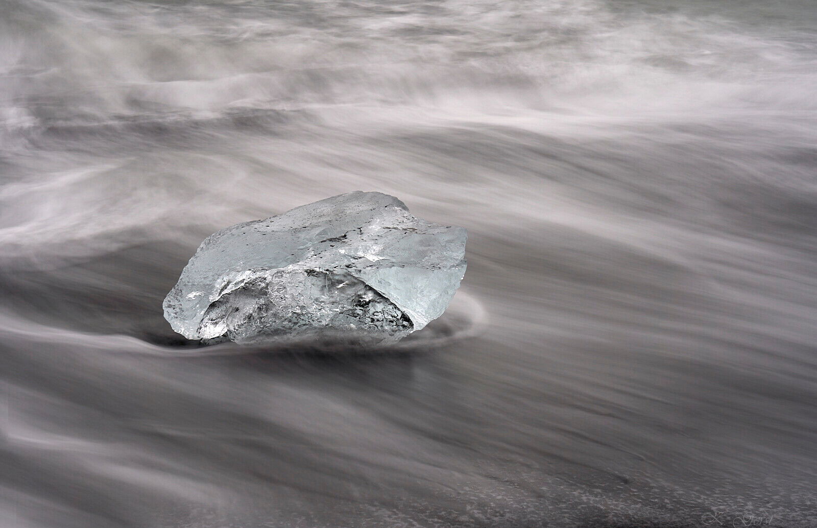
I could spend hours at Diamond Beach, and I have several versions of this chunk of ice. When I took this I was more focused mentally on clear ice, but I was really pleased to see the aqua color when I reviewed and edited my images. All of this series are some type of black, white, and aqua, but this one seemed to have the least variance in color (i.e. the water is darker aqua/varies more in the others).
Specific Feedback Requested
I have other crops of this, and it’s maybe not quite my favorite crop. Really, any feedback is always helpful.
I like this image very much. The color of the ice block is great, and the water is very well treated with its smooth part in the FG and the more upset water in the BG. A great image! The only thing that I do not like fully is the LLC, I would have preferred to have water there also. I made some cheating with clone a nd stamp, and croped a little at the bottom to get rid of the sand.
A lovely find! I think the soft browns of the water and sand work well against the appropriate soft icy-blue of the ice. I do like @Ola_Jovall’s suggestion to simplify the image.
The hint of aqua in the ice chunk is a terrific addition. The juxtaposition of still (ice) and motion (water) looks very good also. I agree with removing the solid land in the corner and along the very bottom. That change adds well to the still/motion drama. I really like the fine rim below and in front of the ice chunk.
@Mark_Seaver Thanks for your comments! I can see how the black edge is a bit distracting, especially with Ola’s re-edit. This will help as I process these.