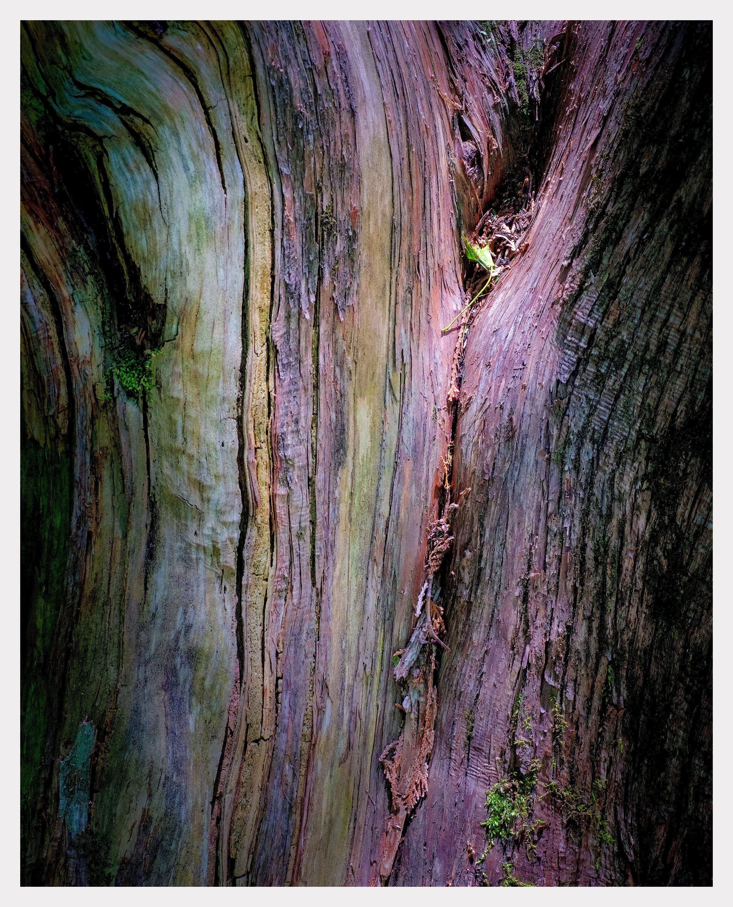
Here’s another in what appears to be the beginnings of an “arboreal abstract” series. This and the others in the group so far were taken a few weeks ago when my wife and I realized we needed to get out of the city and try to beat our Covid claustrophobia. I was really focused on more intimate abstractions but was not prepared for the amount of colour my camera was picking up. I have had a great time in post playing around. I almost abandoned this image until I tried flipping it to vertical and then pushing the shadows. I’m a sucker for chiaroscuro. I have a black and white version of this image, which is how I originally envisioned it, and it definitely works but I thought I’d post the colour version because it’s is so much more off the wall. I’d love to get some feedback around the colour and shadowy moodiness of it.

A bit mysterious, Kerry. You found the good color. Just OK.
Chiaroscuro indeed, the shadows make this image, and directe the viewer to the colors. The green / magenta color contrast is not one that you often see in tree images, but I think that is part of the appeal of this image for me. The colors lend an other-worldy aspect to the image. I also love the way that the green moss in the LRC is spotlit.
This is a matter of personal taste, but I would prefer to see this without the leaf in the URC. To me this image is about the light, color, and texture of the tree bark, and the leaf seems slightly out of place. For some reason the moss in the LRC does not bother me like the leaf does. Perhaps its because I view the moss as being more connected to the texture of the bark.
@Ed_McGuirk. I’m glad you found something to enjoy in this image. I had a lot of fun exploring possibilities with this one that take me outside my comfort zone. Your observation about the leaf is spot on. It had been bugging me, though I wasn’t able to put my finger on it. Removing the leaf didn’t seem like something I could do given how critically it is located in the spotlight. So, instead I made a colour mask and lowered the saturation and brightness. I think it brings this important spot in the picture more in line tonally with the rest. You think? I’ve posted the revised version up top with the original.
Kerry,
I like the way you “pushed” this one in processing. Great dimension in this one, and thanks for using the artistic term “chiaroscuro”, I had to look it up and and I learned something. That is always a good thing! I agree with @Ed_McGuirk regarding the moss, but I am ambivalent about the leaf. Tree bark seems to offer an infinite number of interesting images. Well done!
The shadowing definitely works. I like the textures in it as well. Try just a tad more vibrance and contrast. Having said that, I’m into BOLD colors. 
Kerry: Love the color palette and I think what you did with the leaf works well. A fine point of improvement on an already fine image. >=))>
The light and color are very enjoyable Kerry.