First, welcome to NPN, even if it is on just a trial basis. Beautiful rock formations but the sky wasn’t cooperating with you very well on this day. It appears it was a rather overcast day and that has really flattened the image somewhat. I downloaded it to see what I could do, and I boosted the contrast a bit using Luminosity Masks by burning a darks 2 layer on the rocks, and then dodged (at a low opacity) lights 2 and lights 1 on the rocks and sky. I then used Selective Color to try and add a little more contrast to the sky by darkening the cyan and blues a bit and lightening the whites a bit. I don’t know if it improved the image any or not. I guess that would depend on what your original goal was for the image. In the future, it would help those of us who comment if you would kinda share what story you wanted your image to tell, and we can provide more valuable feedback. Looking forward to seeing more of your work.


Hi Bill. First thank you very much for your welcome. I read your profile and recognize you have been a photog for quite a while and have gone through some painful and trying times in your more recent life. AND have had the joy of finding a new partner to share your life and art with - congrats to you both! Glad for the happiness that brought to you.
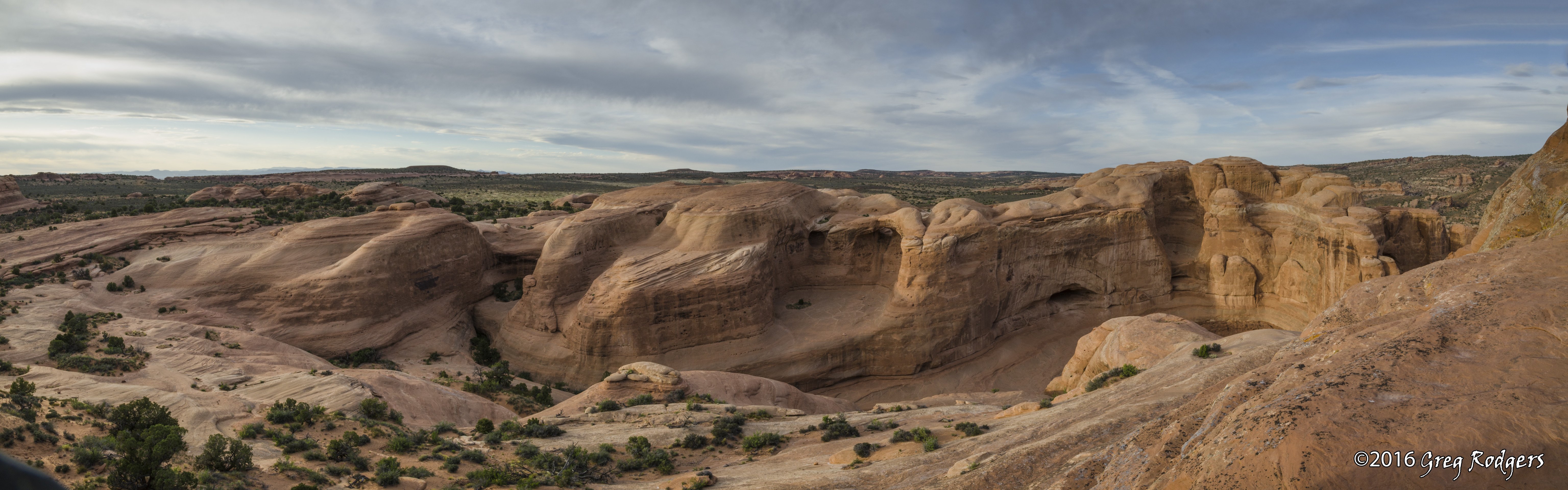
With regard to the image. In 2011 I began a trip from my daughter and son-in-law’s (he’s a Colonel in the AF) home in Colorado Springs where I had stopped on the way from a 9 year stay in New England to return to my home in the SF bay area. Brad had been sent to the middle east and Kelley was struggling to deal with winter while raising 2 kids on her own - Help Dad!. So I spent 3 months helping there. Then at the end of May 2011, I purchased my first DSLR (had been shooing SLR’s/film since 1969) a Nikon D7000 with a single lens a 16-85 DX for the crop sensor Nikon. I traveled for 4 weeks from CO to CA and spent every hour, except when moving between them, shooting in 6 National Parks with my new camera. The firs two days after receiving the new camera, I did not turn it on but spent the time reading the manual to try to understand the newly complex tool. After that I shot 20,000 images in 4 weeks on the road. This is a pano of a few of those shots. It is very near the famous “Delicate Arch” where I spent an evening waiting for sundown to get some “golden” shots. I was struck while waiting with the stucture of this geology and felt it could make a good pano. So I shot multiple images. I almost always shoot with a tripod and this was so taken. In additon to the structure, the color is important - the red rocks in this part of the country are famous and an important part of the beauty. You are right the sky was a bit overcast, but as most photogs, I regard weather as a good additon to my photos - usually an advantage over clear skys - not always. Your enhancement of the color is welcome - I think it is an improvement. Unfortuately, when I took the photos on this trip they were all in JPEG. I did not recognize the advantage of shooting RAW at the time - brand new to digial DSLR photography with only 2 days to learn. So, adjustments to my photos came later after landing in California. I am not sure how I feel about the contrast you added. I tend to try to show detail in my darks by lightening them where I think it needs to be to keep them from loosing detail. However, when I look at the total impression of the image, I think your contast enhancement does set off the brighter areas and hence focuses the eyes on those areas and keeps the image from being too “flat” as you pointed out. So, I guess I would keep that too.
Since that digital beginning, I have pursued my photography more seIiously. Shot a lot more of nature (CA and OR) with the D7000 and in 2014 began 3 years of shooting football games for my alma mater (where I also played) UC Davis. I purchased a D4s and a Nikon 200-400 f/4 for that sports photography. Lots of images. Pro Bono for the college and the athletes and families. My contributions. Also purchased a D810 and several lens (14-24, 24-70, 70-200, 16-35, 50, 85, and 105 macro - all Nikon) to up my game. I use LR for processing most of my photos, and PS when needed - but still learning masking and layers - have done some for specific situations)
I have two photos at the student union at Stanford University (from this trip) and on at the medical school at Ohio State (from a garden at Stanford). A few years ago I got permission from Stanford to create a guidebook for the Stanford Arizona Garden on campus. It is a cactus and succulent garden (1500 plants) and I have photos of every one. Am working on identification of them with some experts and may do some genetic analysis where needed. I am a scientist (physical chemist by education) and develop tools for biotech and medical devices. Home Palo Alto - right now for another month in South Lake Tahoe.
Best always,
Greg
Greg - Welcome. Thanks for the introduction to you and your family, and for the Utah scenery. At Arches, it is so easy to get caught up in the “trophy” shots, that it is very refreshing to see an image that is off the beaten track, and therefore a personal representation of the photographer. To go panoramic was a fine way to convey the sculptured subject.
I found my eyes drawn unwillingly to the sky … bright blue and white are sure attractions. So in this revision, I Curved the sky down quite a bit … then I cropped half of it out. Also cropped out some bottom (not as interesting as the gorgeous earth forms), some left (not too interesting), and right (the ascending hill seemed to draw me out of the frame). Also burned a few places in the hills, which seemed to increase texture. All this tinkering is just personal taste of course … but it was hard to resist with this dramatic subject.
Again, Welcome! Looking forward to more.
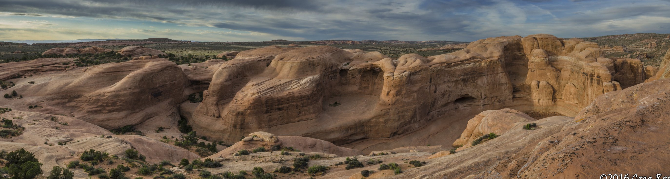
Hi Dick, thanks for the critique. I don’t understand what you mean by “curved the sky down”. I do understand and see that you cropped it. And it appears you added some drama to the sky. I do appreciate the crop from the left and below, The image does appear a bit dark IMNSHO. But that’s just a choice one can make. And I am on the fence about that. I think I would like a bit more sky and light in the sky to add some light to the image. I think the added drama in the sky even with the reduction in the height of the sky may shift the focus away from the rock which is the unique thing about this image. But it is a matter of taste and all is good.
The panoramic presentation really shows off beautifully the scope of the land. Several good comments have been provided for the sky. I have looked at this image a few times and one thing puzzles me. The cliffs become warmer as you go from left to right. That is they appear sunnier on the right part of the image than the left even though it looks as though all is illuminated in the similar manner. Is this a natural phenomena or due to some processing? My guess is that some high clouds were over the left area. It’s actually kind of interesting.
Hi Igor, thank you for your critique. Excellent observation about the left to right warming. Note there is also a difference in the sky on the right side - it is clearer and bluer. I shot this pano in 2011 and processed it in 2016 - about 4 years ago. I will have to go back to the original images to see if ther was a shift in WB or some other variation in treatment from L to R. If so, it was not intentionally done. I would point out that there is an elevation gain and compass orientaton of the cliffs from L to R and it may be that there was more direct setting sunlight on the cliffs on the right, receiving a warmer tone than the cliffs to the left. Memory is a bit soft as I took these images in 2011. I will look back for the individual shots to see if I can reconstruct my work. Note that these shots were take in the first month of my experience with digital photography so anything is possible here.
In Photoshop I selected the sky using multiple clicks of the Magic Selectio Brush, refined the edge, and added a Curves layer which had the sky selection as a mask. I pulled the dark side of the curve down. Result is increased contrast by darkening the blues. Now that also increased saturation of some of the blue so I remember adding a HueSaturation layer to desaturate Blues and cyans, masking to only apply it to the Blues that went too deep. I agree that the result might feel as if the sky is competing w th rocks so your sense of subtlety is valuable
1 Like
Thanks for the explanation, Dick. Had never heard the phrase “curved down” before.
Wonderful subject for a pano, it’s great that you were able to visualize this composition. As others have noted, it’s nice to see a non-iconic shot from Arches. As a result you have ended up with a very interesting image. Of all the reworks and comments you have received so far, my preference leans to the rework by @Bill_Chambers, his tweaks have taken a good image up another notch. His tweaks with contrast have added more vitality to the image for me. I think the difference in luminosity/warmth left vs. right is due to the cloud cover, rather than differences in brackets. Either way, the way the right side looks different from the left creates some visual interest for me.
Nobody has mentioned it, but there is some type of out of focus UFO (unidentified fringe object) in the LLC (lower left corner. I would do some cleanup and clone that away.
I re-stitched and adjusted this image. Added more image on the right and did some content aware fills or the upper right corner and lower left corner. Then selected the sky and changed the level a bit to bring out the blue on the right and the grays on the left. I also brought up the shadows a bit in the ground. I like this better and want to keep the sky as big as it is. Thank you everyone for your constructive critiques!
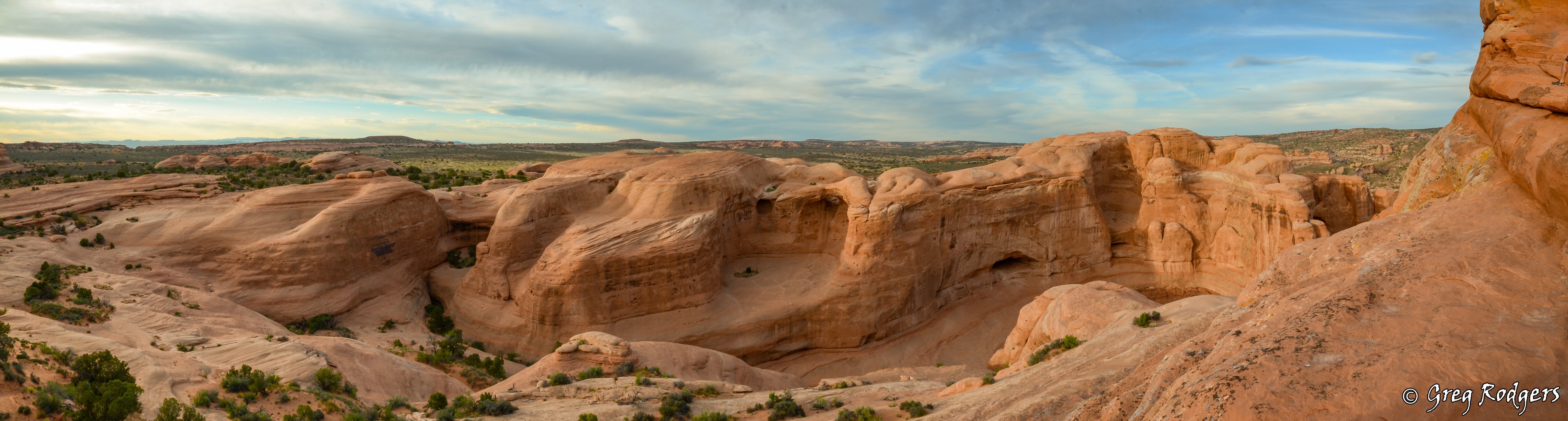
Greg, I like what you have done with the exposure/contrast/color of your rework, it has helped add some vitality to the image. I’m kind of of torn between liking / not liking the addition of the extra rock on the right. Having that rock hit the top edge of the frame makes the rock have more visual weight in the image, and the main formation seems to recede in the image as a result. It will be interesting to see if others comment on this part of your rework, I’m curious to hear how they react to this. Some might view it as a framing element, and think it works well.