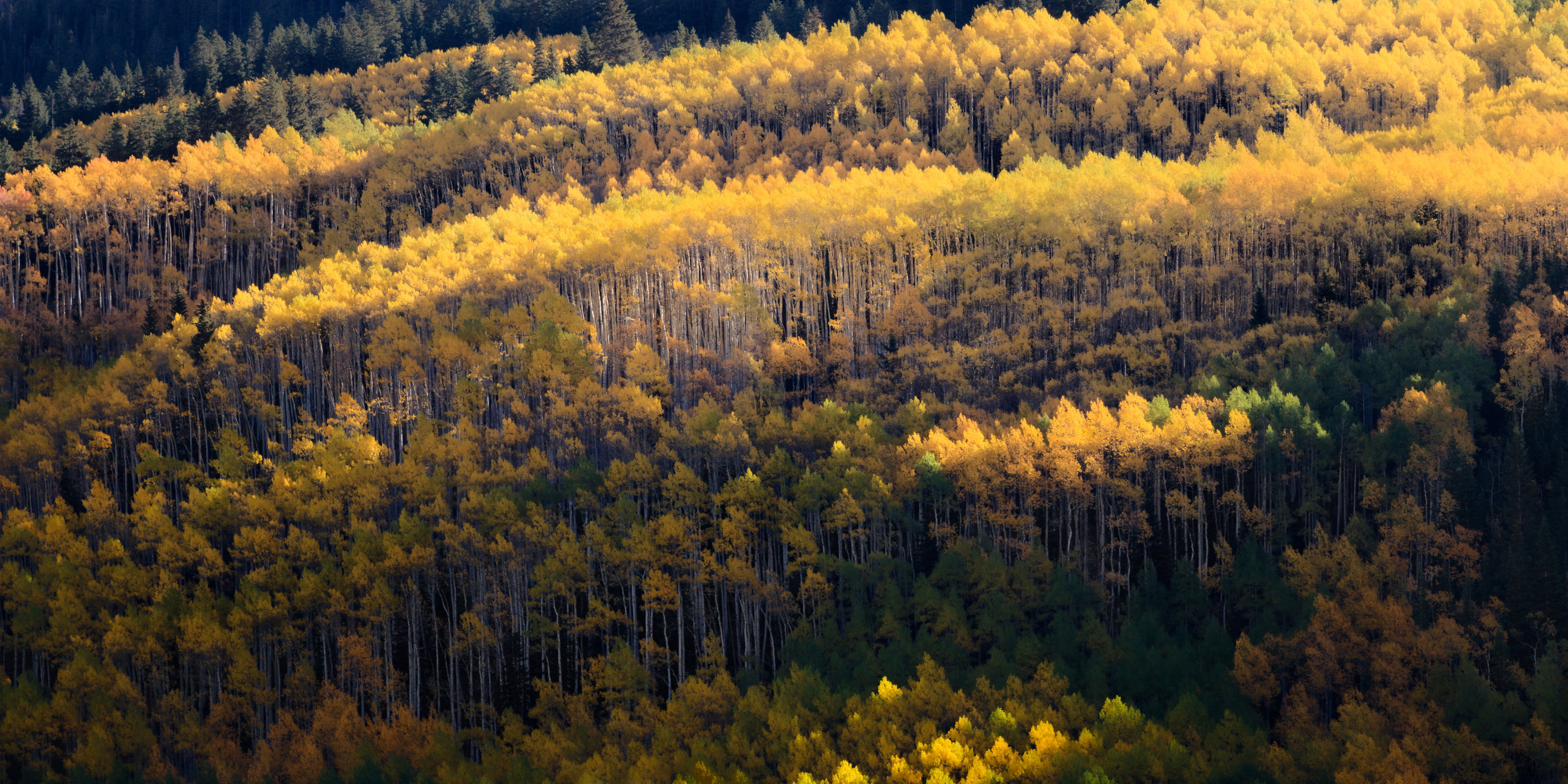
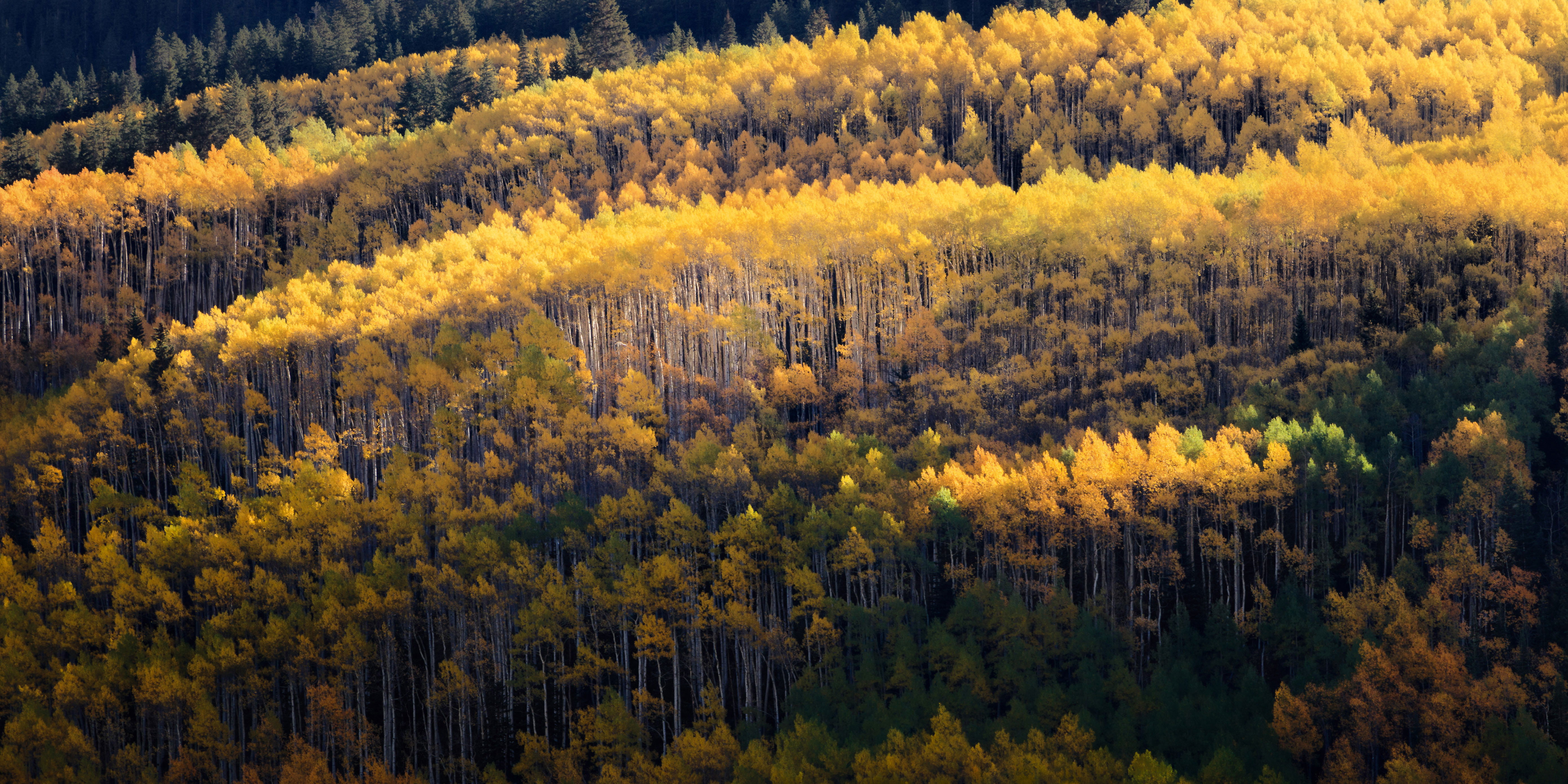
I’m terrible at naming images but the yellows in this kind of remind me of the tops of breaking waves. Anyways… I captured this near Aspen last year but, as happens far too often, it fell to the wayside after I moved on to other images from other trips. I decided to go back through my files from that trip as I’m sitting here in Hot Texas longing for Fall colors (and temps).
What technical feedback would you like if any?
Nothing in particular from a technical standpoint but I’m always open to input.
What artistic feedback would you like if any?
What caught my eye about this scene initially was the way the sunlight was cutting through the canopy and lighting up the white trunks toward the center of the frame. I’ve emphasized that area with this edit but I’m afraid it’s being overpowered by the strong sunlight in the upper right. Thoughts?
As with many of my recent images, I once again went for a painterly effect; call it a very subtle impressionistic take on the scene.
Pertinent technical details or techniques:
Single frame, edited in Lightroom. Used a lot of range masking on this one. To achieve the painterly effect I used luminance masking to key in on the brighter leaves and added a bit of an Orten Effect and also dialed the Texture slider down a fair amount. I also dropped the overall Texture on the Basic panel to soften the whole scene just an extra bit without losing the texture of the trunks.
If you would like your image to be eligible for a feature on the NPN Instagram (@NaturePhotoNet), add the tag ‘ig’ and leave your Instagram username below.
@michaelrungphotography
You may only download this image to demonstrate post-processing techniques.
I like this a lot, Michael. The aspens are pushed right to the limit and the layering is very nice. I really like this cropped to just above the bottom gold. To me it lets the wave action really work.
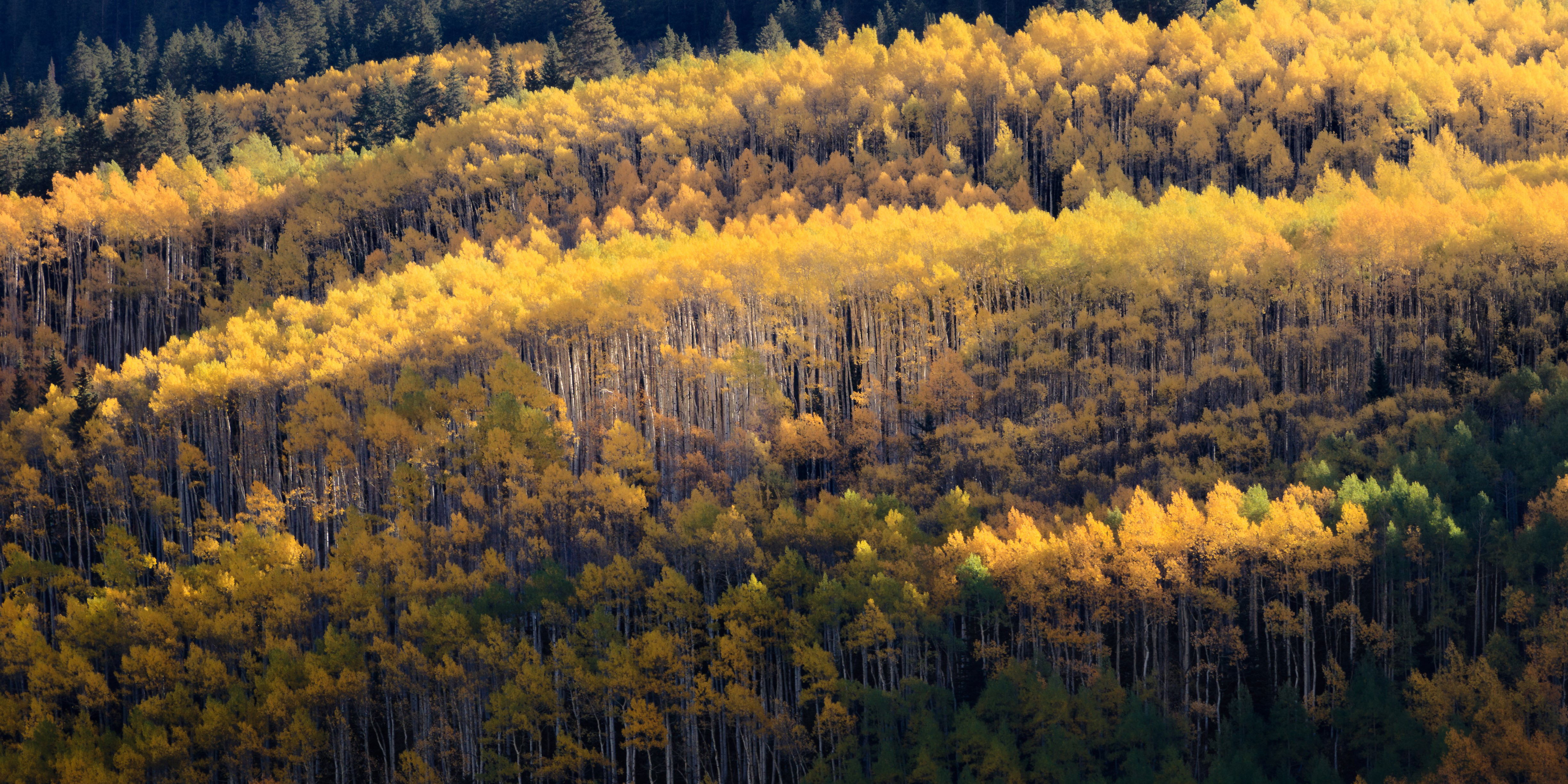
I really like this, Michael. The abstract quality and lines are terrific. I also like @Gary_Phillips’ suggestion. I did a quickie crop in Windows Photo Editor to show where I would crop it, keeping some of the small surprising lit up trees, but eliminating that bottom layer. My version needs a bit more “edge patrol” to address the lower right bright branches and a few other things as this was just a quick crop.
Just a possibility. It’s great as presented also.
ML
This is aptly named, Michael. The flowing shape of these groves is very appealing. Processing looks good to my eye. A couple of thoughts… I find that one area of highlighted aspen at the bottom distracting and appearing cutoff. I would be inclined to crop it out. I would also add a bit of vignette to slightly darken the frame edges.
@Gary_Phillips @Marylynne_Diggs @Dave_Dillemuth this is prime example of why I love this critique section! Cropping to exclude that bottom burst of yellow is a forehead-smacking observation, especially once I saw Marylnne’s quick edit.
Regarding a vignette, there’s already one applied so I guess I achieved my goal of using vignette in a subtle way. 
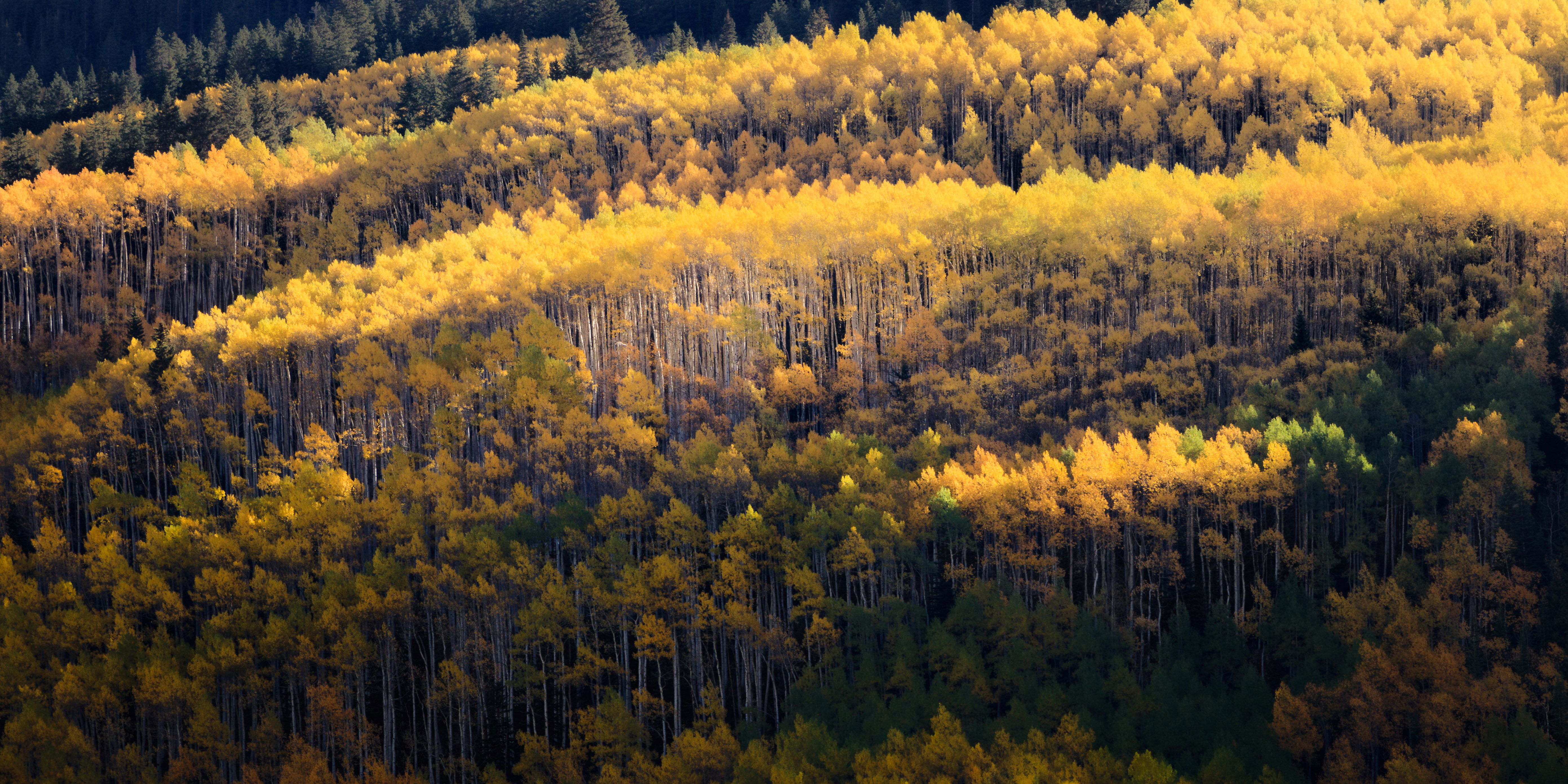
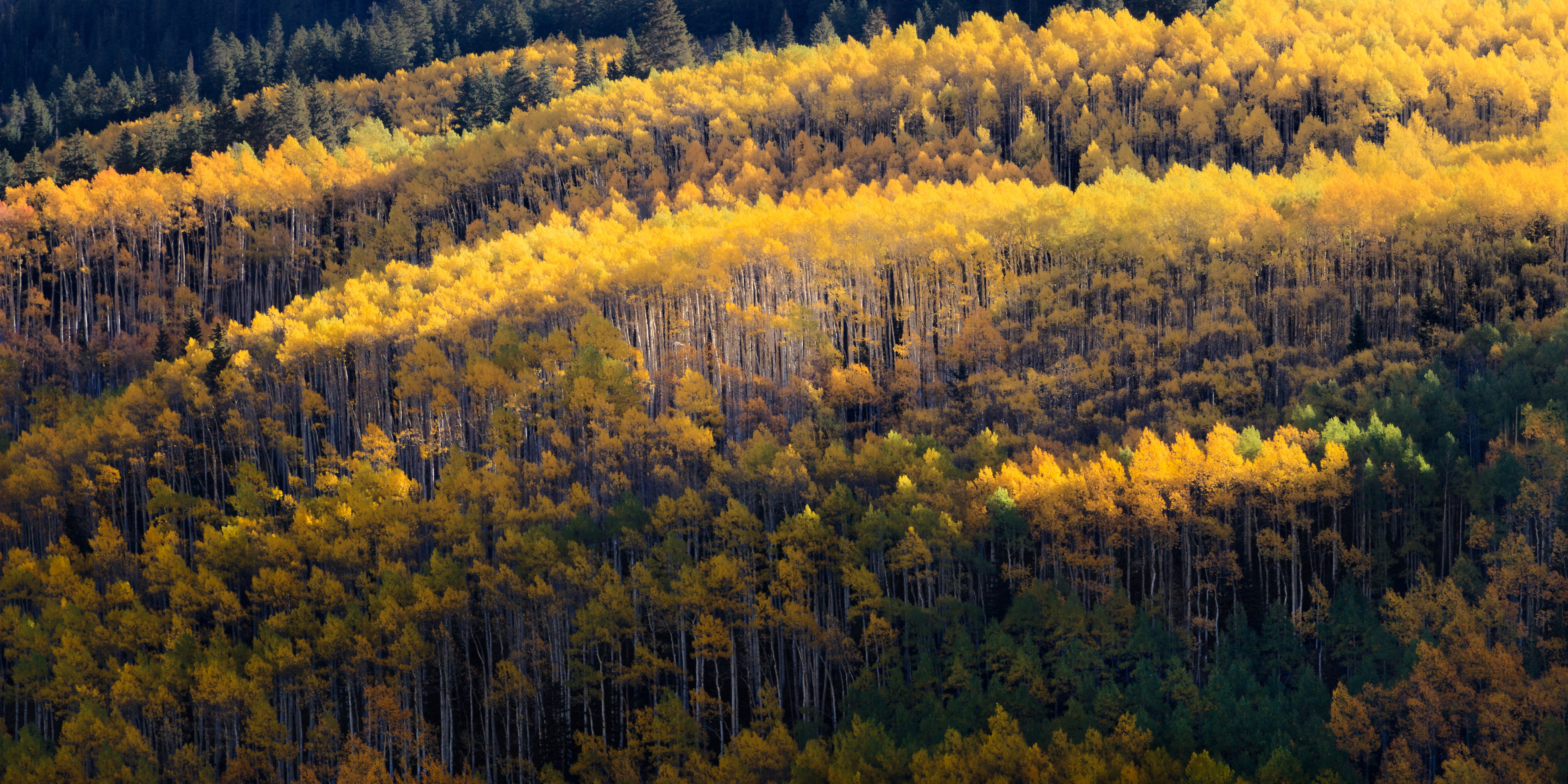
Version 2 - Cropped to remove the bright highlights towards the bottom, spot healing to remove some remaining tops of trees after the crop, and a slightly heavier vignette.
Thanks again for the feedback to those above!
Edit: Hmmm, looking at it here I don’t like that darker tree that’s now cut off on the right edge…
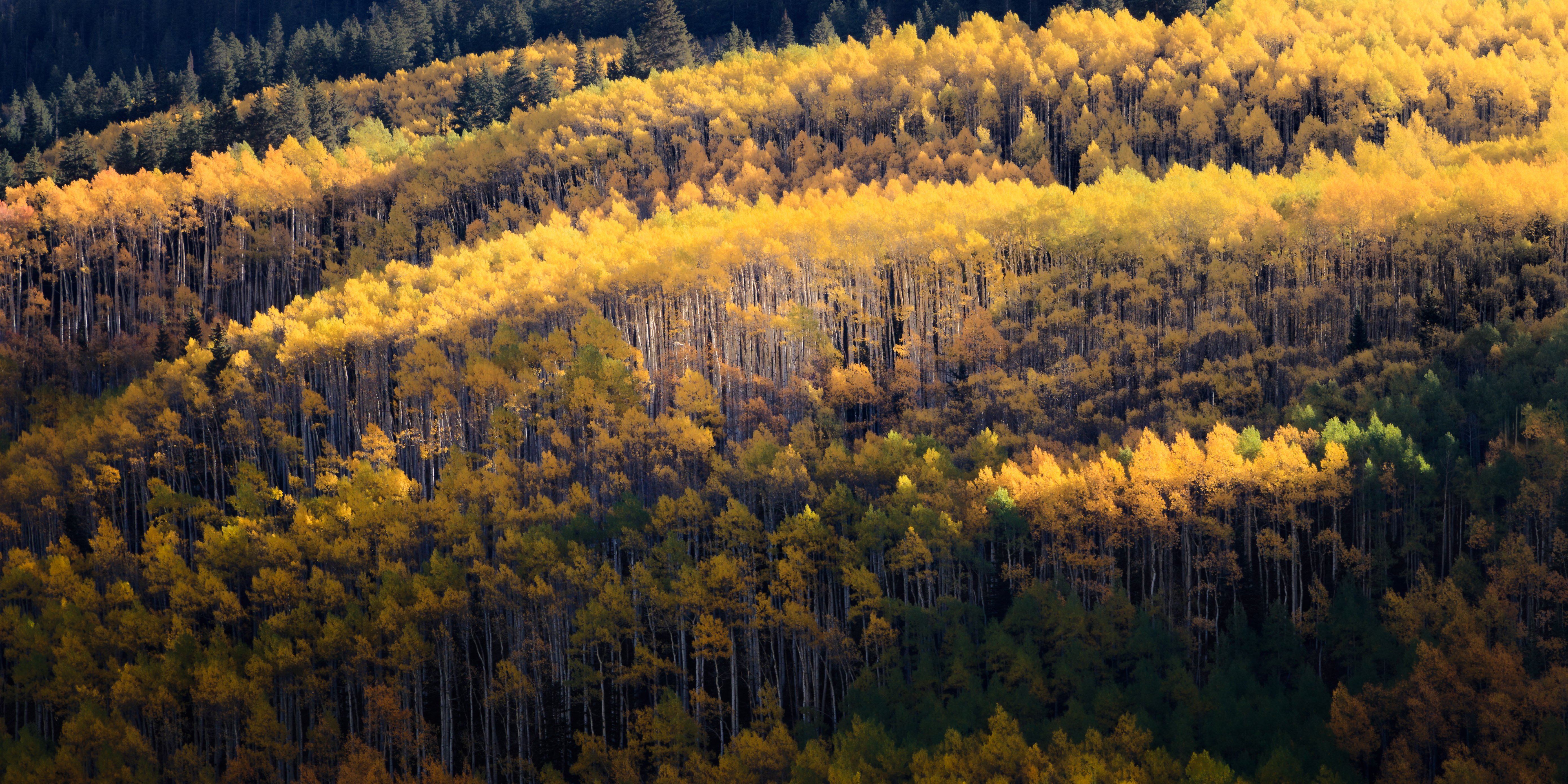
And now version 3…
1 Like
Version 3 works best for me. I like the waves of lighted trees. I would like to see more detail in the dark area in the lower right. I have to say that this quite a collection of aspen.
-P
1 Like
LOVE your last edit Michael; such a beautiful big scene.
A couple more nits, because this is definitely worth tweaking to the way you best like it. The red channel has some blown highlights, and if you tame those a bit I think the added detail in the brightest yellows would be nice. The crop is definitely an improvement, but I’d burn those couple of bright points along the bottom edge to let the eye settle in the center. Finally, I’d open the bottom corners a tad. The vignette is a great idea, but there is beauty there that I’d like to see a tad more; just not enough to rob from the fireworks above.
Again, thoughts/nits to play with on a great image. Here’s a crude edit with those ideas: (I had to steal detail from the green channel to edit the blown red highlights, but hopefully in the original you have red detail to work with.)
1 Like
Hey @John_Williams, thanks for the input. I’m not seeing any blown reds in Lightroom but did pull some additional detail by lowering the orange luminance a touch.
I agree w/your and @Preston_Birdwell’s thoughts about the lower corners and did some dodging there, while burning down those little brighter patches on the very bottom edge (I wasn’t seeing those in Lightroom as I edit w/a white background… as soon as I switched to dark grey they became apparent; thanks for calling those out!).
Michael, version 3 for sure. Gorgeous colors for sure and the crop factor is perfect in the 16x9 version or at least that is what I see it as.
1 Like