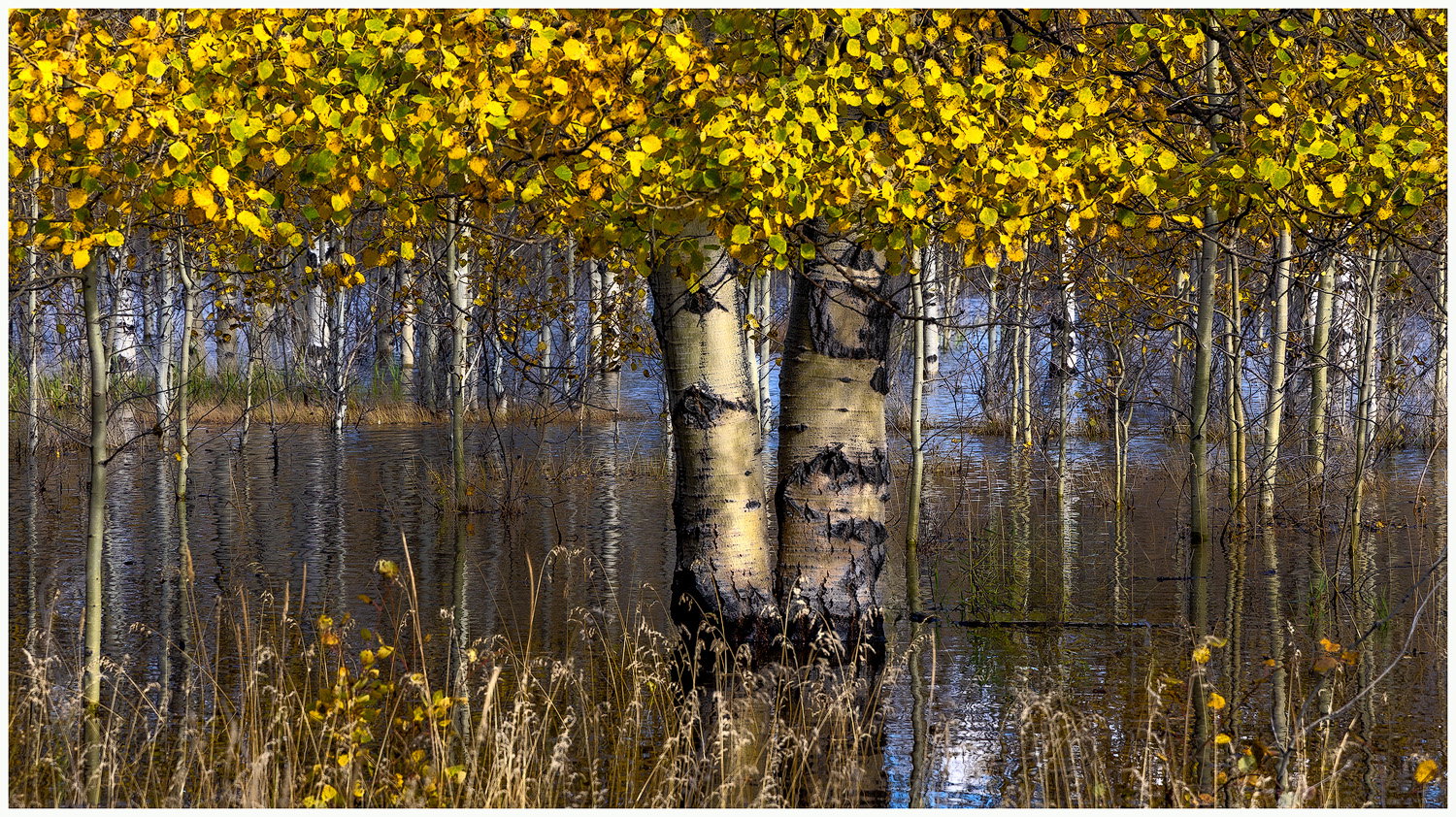
Aspen trees along the shore of Abraham Lake find themselves submerged in water in the early fall, as the level of the lake rises at this time of year. I found this scene last week while exploring around the area. I like how the two main trunks emerge from the lake, while being surrounded by many other smaller trees. And the changing leaf colors are a great sign of the seasonal transition going on.
Feedback Requests
Is the image too busy, or maybe just right? I toned down some brighter spots in the water, but is it enough? Thanks for looking. F
Pertinent Technical Details
Canon R6 Mkii
24-105mm lens @105mm
F/9.0, 1/160 sec @ISO100
Processed in LR with both global and local adjustments.
Was this made under slightly overcast skies? The shadows are so subtle, and yet the exposure seems to have made everything appear somewhat darker than I would expect. Like a lack of luminosity.
I think the composition is nice, the layering effect is effective and I like the centered trees holding everything together. I the line of trees in the BG adds to the overall environment. My only nits would be the LRC where the FG grasses vanish breaking the layered effect and the green grasses just the right of the tree interrupting the flow of the brown mid-ground layer. I might play around with cloning that green plant out to see how it looks without it.
I like the layered composition and the cloud of aspen leaves
I agree with @Youssef_Ismail with regard to a lack of luminosity, but I believe it is the yellows that are the culprit. If you brighten the yellows, that would be a good thing.
I also agree regarding the LRC. I suggest a crop from the right to just to right of the last tall grass. Doing so eliminates that empty corner and also those two trees that lean right which take my eye out of the image. The green grasses Youssef mentioned could be carefully cloned.
This is a nice image that I think will be even better with some adjustments.
-P
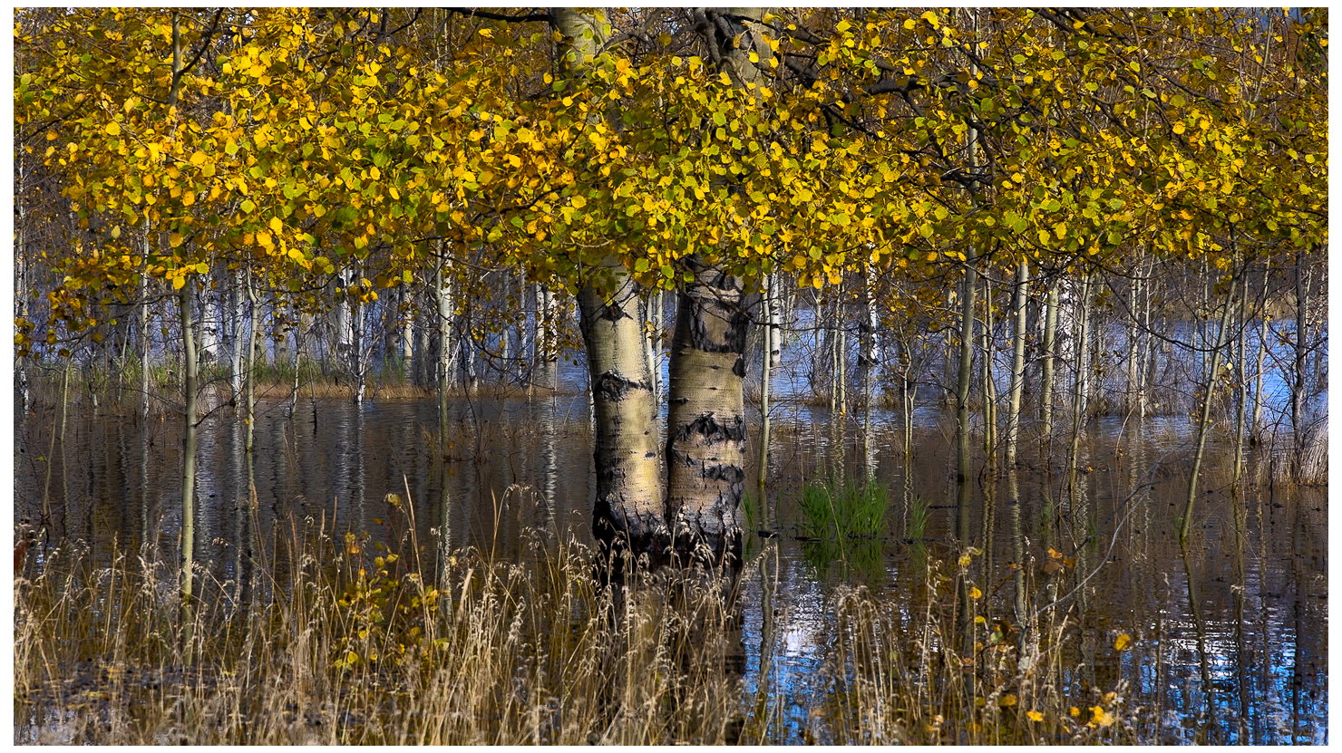
Thanks @Youssef_Ismail and @Preston_Birdwell for your suggestions. They are very helpful. I went back and re-edited the photo, cropping in from the LRC to eliminate that awkward space. I also raised the luminosity and cloned out the green grass to the right of the Aspen trunks. Let me know what you think. Thanks.
Ted: You had a really good scene to begin with and I was OK with the original but the rework is a significant improvement. I very much like the unusual comp and think it works great. Nicely seen and presented. >=))>
Ted, add me to those who like the redo. It does a fine job of focusing on the two main trunks, the overhead leaves with just a “touch” of the foreground grasses. The size contrast with all the smaller trunks works well.
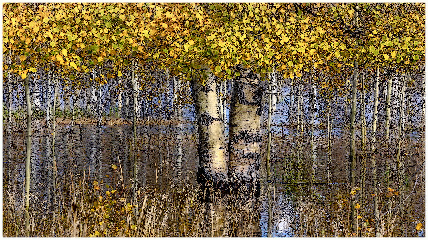
Very cool composition. Your cropped version works really well. One thing that strikes me is a sort of harsh feel to this. I think part of that is what @Youssef_Ismail and @Preston_Birdwell pointed out, a lack of luminosity and the darkness of the yellow leaves. I brought this into ACR and fiddled a bit - lightened and desaturated the yellows at the top (with a linear gradient) a bit and brought up just the “darks” with the parametric curve. The latter adjustment brought out more detail in the water reflections, which are delightfully painterly. My adjustments may reflect my personal preference for lower contrast images, so YMMV.
The painterly effect in the water that @Bonnie_Lampley accidentally brought out with her adjustments I think really adds a great dimension to this photo. The only side effect that I did not like was losing some of the saturation in the yellows of the leaves. Yes they are brighter, but less intense in color. If only both could be achieved.
Thank you @Bill_Fach@Bonnie_Lampley@Mark_Seaver@Youssef_Ismail@Preston_Birdwell for all your suggestions and comments. It’s always interesting to have your images seen by other photographer’s eyes, and a great learning experience for me. One thing that I think about is how any one image appears to each person looking at it, since we all have different displays to view it. Color saturation and luminosity might very well vary because of this. Does anyone agree with that?
All the suggestions have been good. Personally, I would crop it slightly more. A little from the right and enough from the left to take away the first tree in the background that is a little distracting. Then the 2 main trees would be more centered and the symmetry of the composition would be enhanced. Loved the overall feel of it.