The photographer is looking for generalized feedback about the aesthetic and technical qualities of their image.
Description
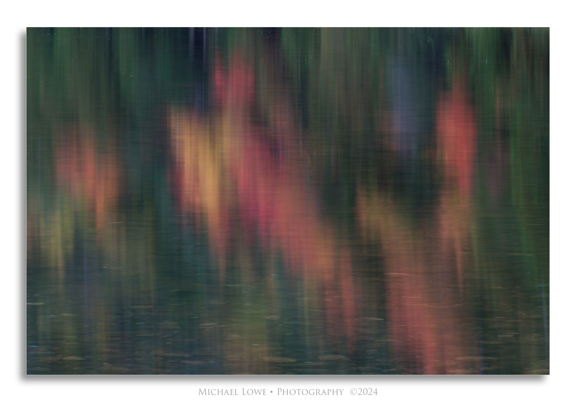
Autumn reflections in Bubble Pond, Acadia National Park, ME.
Specific Feedback
Any and all comments, suggestions or critiques welcome.
Should I clone out the light blueish (leafless tree) section in the UR? I didn’t notice it til I was done with the jpeg.
Technical Details
4 sec @ f/22, ISO 100, 150mm
Critique Template
Use of the template is optional, but it can help spark ideas.
A great abstract reflection. I like a lot the out-of-focus effect that the ripples make. I have no problem with the bluish tree. However, I would have tried to include a green strip in LRC to have the red/orange/yellow parts framed by green areas all around.
Hi Michael, What a lovely reflection you have shared with us. The brilliance of the reflected leaves are balanced nicely by the pebble bottom of the pond visible in the shadows. The couple of blueish trees fit quite nicely. Well seen and processed.
This splash of autumn color turned out beautifully Mike! I love the range of colors across the frame and no I would not clone out the blueish tree toward the URC. I also find the colors very believable without being overblown. What separates this from a lot of reflection images are the rocks strewn oalong the bottom of the pond.
Wonderful colors, Mike. I think the foreground with all of those bubbles/patties and texture. The title fits well with this image. At first I thought that the blue/purple in the upper right section was too much of an eye grabber but I kind of like it the more I look at this image. I have to say that I do prefer @Diane_Miller’s edit on this one as it brings out more of the texture in the water which I like. I also love the drop shadow. The composition works well and I find it very balanced.
This is a really enjoyable vision of color Michael. With all the aurora images from the past year, this evokes the Northern Lights for me; I love it. The rocks are a nice anchor to provide perspective too.
I would have loved it if that red hadn’t quite reached the bottom edge, but I assume that wasn’t an option?
I prefer Save for Web too, but it looks like the embed profile box got unchecked somehow, and it is sticky – it will stay that way until checked again.
You probably couldn’t have come up with a better name for this, @Michael_Lowe. What an outstanding photograph! The various colors all harmonize perfectly and are vibrant but not excessively so. Perfectly composed and processed. I bet it would look great printed on aluminum.
Michael, it does resemble some of the aurora shots that I got last spring in Montana. It’s a beautiful abstract with a fine mix of shapes and colors. Seeing the rocks below the water adds a fun touch of reality. I see some blues in the lower left also, just not as bright.