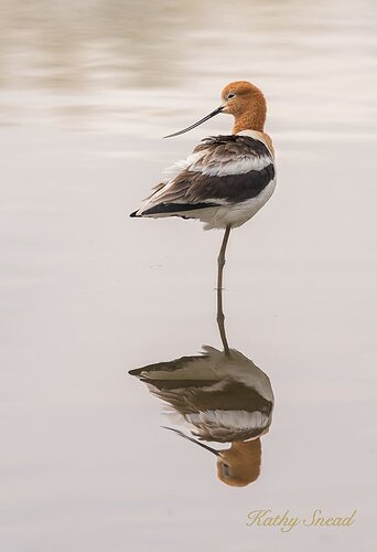
I’m glad to see Im not the only one who has pictures from the spring that I have not gotten to. Just started on this one. I had it rated lower than my other ones, now I like it better. It’s amazing how one’s artistic opinion changes on the second and third look at a group of photos.
D800, 300 mm f4 with TC (420 mm), handheld, ISO 400, 1/800 second at f6.3
Any artistic or technical commentary is fair game.
Oh I really like this, Kathy, especially the head turn. I think you have handled the exposure really well. I think there is a little bit of a greenish color cast to this. Have you considered removing it, Kathy?
Adhika
Oh gosh. That wasn’t there on my monitor but I can sure see it on my phone! And I just used the Spyder last week. Will get back to this
Thanks Adhika
Adhika
Went back to the monitor and I could see it when I adjusted it. I have a little trouble with detecting slight green tones. Thanks for picking it up. Is this one better?
1 Like
Kathy, the repost works better IMO with bringing out some subtle detail the cast was hiding. Only other thought for change is to bring the highlights down slightly…but not a big deal there at all, just a thought…
Kathy, I love his pose. That one foot stance, and the head turn. Nice reflection as well.
Hi Paul
Thank you for that comment and the suggestion about the highlights. I did not think I could pull them back anymore but sure enough, I did , and I think it does improve it. See here :
Kathy, I almost never download images for processing thoughts. However, this was quick and simple for me if you like the look here. If not it is always about personal tastes in the end.
All I did was take your last posted image and use a Auto Curve layer. Nothing special there but it gave the image immediate “pop”. By placing a level marker on the whitest point and a level marker on the blackest point. I set the white to 242-242-242 and the black to 10-10-10. On my monitor it seemed about right for me. I did add a Vibrance layer too. That was it. Oh yes, I did play with exposure to bring down the Gamma 2 points, and then adjusted Exposure back all to 242 and Offset all to 10.
Once you capture a fine image like this there are numerous ways and ideas to play with. It’s a gorgeous scene…
Kathy, from better to “betterer”. I like your last change and I think you can get somewhere in between yours and Paul’s last edit on the contrast. But yes, it’s to your taste at this point I think.
1 Like
Very nice look at the stilt. Superb reflection and had position. The repost is much better with respect to color and light. I’d like to see it larger although I understand your concerns about image theft.
Hi again Paul
I really appreciate you doing these changes and taking the time to explain them. I am a long time LR user, only recently venturing into PS for any in depth work. Everyone of the things you mentioned, I did not know about , nor had I done before. Baby steps!
So, I recreated what you did as best I could. The first thing - the curves. I made those changes but I utilized them at about a 75% opacity. Then the second one, vibrance. I was able to do that. The third one - exposure. I dialed it down a bit but did not really understand what I was doing. Definitely need to hit the books on that one, which I will do.
I have attached the result. I am super happy with it and plan to try these things in my workflow on other projects.
Thanks again!
Kathy, no matter how it’s presented or cropped, this over the shoulder pose is delightful! Excellent work and good for you.
1 Like
Kathy, good for you on the willingness to experiment. You’ve got one up on me. Although you’ve maybe not used PS much, I’ve never had or used LR. Anyway, your redo is closer IMO. At this point it is best you work the scene to your own liking, but always keep an open mind to the experimental side of things.
So far as the white point and black point I use that to maintain a bit of true color and help with contrast to a point. My eyes are the worst and have been for years. So, I’ve had to find ways to work images beyond just visual. Although there is no guarantee white point being 242-242-242 and black being 10-10-10 is perfect. But, it helps me get my wild Velvia 50 film close enough to finalize my images…
1 Like
Lovely reflection shot of this Avocet, Kathy. I really like the pose and the lighting and the water is perfect for it.
Very pleasing scene as presented, Kathy. Avocets are very elegant birds especially in their breeding colors, and you got an excellent pose and a fine reflection to boot. The final version looks very good, but the others were also excellent. Congrats on a fine image.


