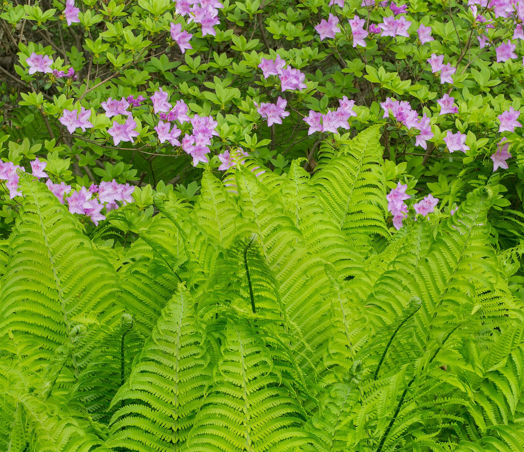
This image was taken last year and is from an area where I just let the ferns and azaleas co mingle near the woods behind my home. I was able to come away with several compositions that I liked from that blooming cycle. However this year I got skunked as the ferns did not unfurl until after the azaleas lost their bloom. So much for best laid plans.
As always thanks for taking a moment to leave a thought.
What technical feedback would you like if any?
All C&C welcome
What artistic feedback would you like if any?
All C&C welcome
Pertinent technical details or techniques:
(If this is a composite, etc. please be honest with your techniques to help others learn)
Nikon D800, Nikon 35-70 @ 62mm, f 13 @ 1/13 sec, ISO 800, CPL, cable release & tripod, three images stacked for DOF
If you would like your image to be eligible for a feature on the NPN Instagram (@NaturePhotoNet), add the tag ‘ig’ and leave your Instagram username below.
Oooh, beautiful! The ferns are the choir singing the praises of the azaleas. I could see cropping a tad off the right, to just right of the last fern that pokes up. It would make it feel a bit more vertical and emphasize the energy of the ferns. But it’s lovely as is, too.
Beautiful shot, Ed. You have a gift that keeps on giving right in your backyard. The colors and processing look great. I think I would crop a bit from the right.
Such soft light. I do like the crop from the right as it eliminates the ferns sort of falling off towards the LRC but I like the original almost as much. The colors look just about right and you attained great depth of field here with your stacking of the images. Love your backyard Ed! Sorry to hear that you got skunked this year.
Lovely image, with complimentary light magenta and light green. To my eye the ferns are quite atonal. I tried to burn a bit, but with tablet software. I hope it conveys my idea.
Ed, I wish that I had something like this in my back yard, I’m jealous
The green / magenta color combination just sings here, it’s simply gorgeous. I think the crop from the right by @Michael_Lowe does help, it subtle but effective. This image really needs to be viewed large to be fully appreciated. Only then did I really notice the uncurled fern heads, which add a nice touch. Really nice bit of seeing on your part to extract this intimate scene.
I do agree with @Dick_Knudson that the ferns are somewhat atonal , and I like the direction he took with his rework. I’ve shot many of these ferns in spring and have noticed that the color of them is very uniform, creating this atonal effect. I think adding some more shadow contrast like Dick has done helps create more texture and definition. Since these greens have a lot of yellow in them, I’ve also found it helps to to a Lightroom HSL Hue adjustment to shift green slightly more green, which creates a bit more color separation between yellow and green. you may want to give that whirl too.
This is a real beauty, Ed. I like Michael’s crop a bit better. I didn’t think I did at first but after looking at them larger I think the crop does help. I also think Dick’s suggestion is a good one. The colors are just drop dead gorgeous!
Check out my final rework of my recent post “Spring Woodland Tapestry 2”
I used the Green HSL adjustment to tweak that. I think it might help here too, we both are dealing with a very similar issue with yellow/green colors of vegetation.
This is beautiful Ed! The two subjects compliment one another nicely in the frame. There is a nice contrast between the shape of the ferns and the azaleas. The flowers provide nice color contrast as well. Beautifully composed!