The photographer is looking for generalized feedback about the aesthetic and technical qualities of their image.
Description
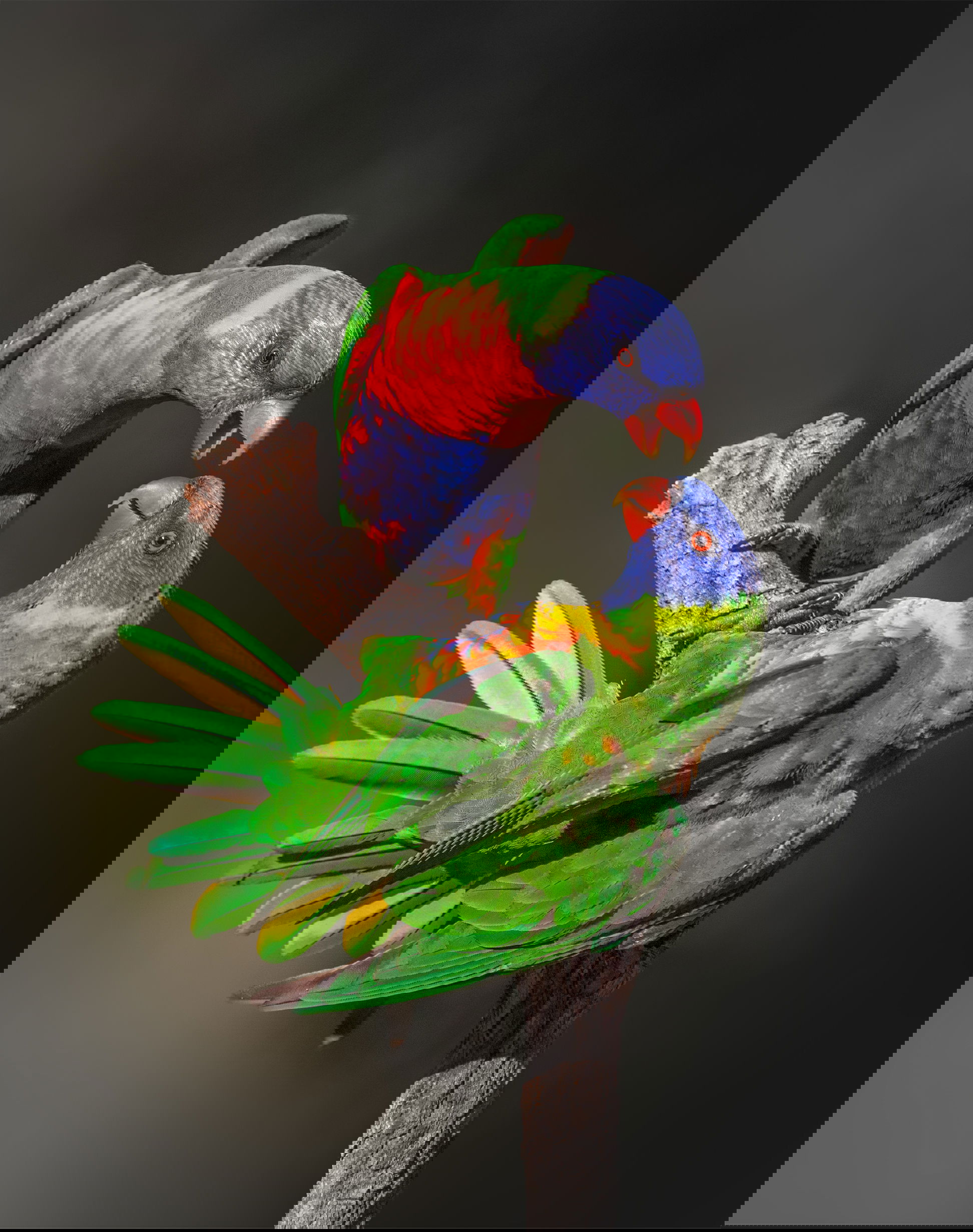
Rainbow lorikeets are mostly comical, clownlike birds that frequent my place every day. Now and then their true colours show. Hierarchy and communal disputes over partners are a constant source of friction.
Specific Feedback
I have shied away from publishing this image (and hundreds more like this) because of the blown highlights in the reds and yellows. They are like flying paintboxes.
In editing, I have lowered highlights and exposure. I have masked the subjects and lowered highlights again and added a bit of texture.
Are the yellows and reds troublesome?
This is a great photo of the relationship these two beautiful birds have to each other. The colors have been handled very well in post, and I have no problem with the red and yellow intensity. I think the gradient of the background tone from lighter on the left side to darker on the right works very well. Superb image Glenys.
Zooming to the largest image, I can see a few areas where the reds and yellows have limited texture, Glennie, but I don’t think it influences the image at all. Only photo geeks would look that close. I certainly wouldn’t if you hadn’t asked the question. As photographers we sometimes have to admit that some natural colors are exxentailly fully saturated and there’s very little we can do about it.
It’s nice to have such incredibly colorful subjects handy. We saw these once when we visited Queensland in 2013, but they were harvesting fruit in some palm trees in a park and all the shots were straight up-not ideal for compositions.
The interaction in this image is wonderful and the colors in the birds are awesome.
What a great moment you have captured Glenys! Love the interaction and the story. Image quality looks great to me. Fine details where it matters. Reds and yellows look fine to me. Well done.
I think this is a superb image in all respects. The colors look fine to me, too, but the ultimate test is for you to conduct. Perhaps you should do a test print and see if you still have concerns.
What beautiful birds, Glenys, and as far as I can tell you’ve captured them quite well showing their interaction and colors. I must admit, though, I’m not crazy about the background; it doesn’t say “Australia” to me. I do envy you having these beautiful birds in your backyard.
So cool!! All the good stuff said above. Reds and yellows are problems with digital capture. Lowering saturation is the common approach, but it has limits. Lowering Highlights is a better solution, and I think you have a good result here. Have you tried starting with a linear profile? The image stars out very flat and processing is a little different but can yield very good results.
This is a wonderful picture. Not only does it show an interesting interaction between the birds, but it does so in a compositionally interesting way. I love the circular shape they form. The focus is great, the colors are gorgeous, and the background is very nicely blurred and does not distract at all. I think the yellows and reds look totally fine to me.
Wow Glenys, this is an amazing image. I love the interaction between the two. I’m not sure if it’s love or hate or something all together different but I love it. I also love the fanned out tail and lifted wings of the nearest bird. The colors are amazing. Yes, reds and yellows tend to blow out easily but these two look pretty good to me. Both of the birds heads are in focus which is great and you have a great look at both sets of eyes. The background is nicely blurred out. I don’t have much to critique about this image. I can’t see a way to make this any better. Terrific job!
Thank you everyone!! I must admit, I didn’t think too many people would like it. So a complete surprise at the comments.
@Allen_Brooks I’ll look for some backgrounds that say “Australia”. @Diane_Miller I did start with a Linear profile and decided against it. I went with Adobe Colour. And now, I’m thinking I should be using Adobe Standard as a starting point.
Wow, love this image. Thought the colours very aptly vivid for the action. Love how the subjects form a closed composed shape propped on the perch. The gradient certainly helps break the background a bit instead of a filmy solid background.
A profile is just a starting place, and different images (with different contrast and colors) will easier to process with different profiles. The main thing to look for when choosing a profile is how well the histogram is tamed. Colors and contrast should be contained, or even look flat, as it’s easy to increase them but decreasing will generally come at a cost of losing something.
And I didn’t think to mention, but it’s easy to overlook the changes Temp and Tint can make to the histogram. They can add a bit of taming to the profiles and sometimes help corral saturation.
Thanks again Diane! Profiles are mostly overlooked by myself. And, they do make differences; sometimes very subtle. I never think to look at Temp and Hint.
When I was poking around in “profiles” I found the Adobe Raw Profiles, but also “camera matching”. Subtle changes there also.