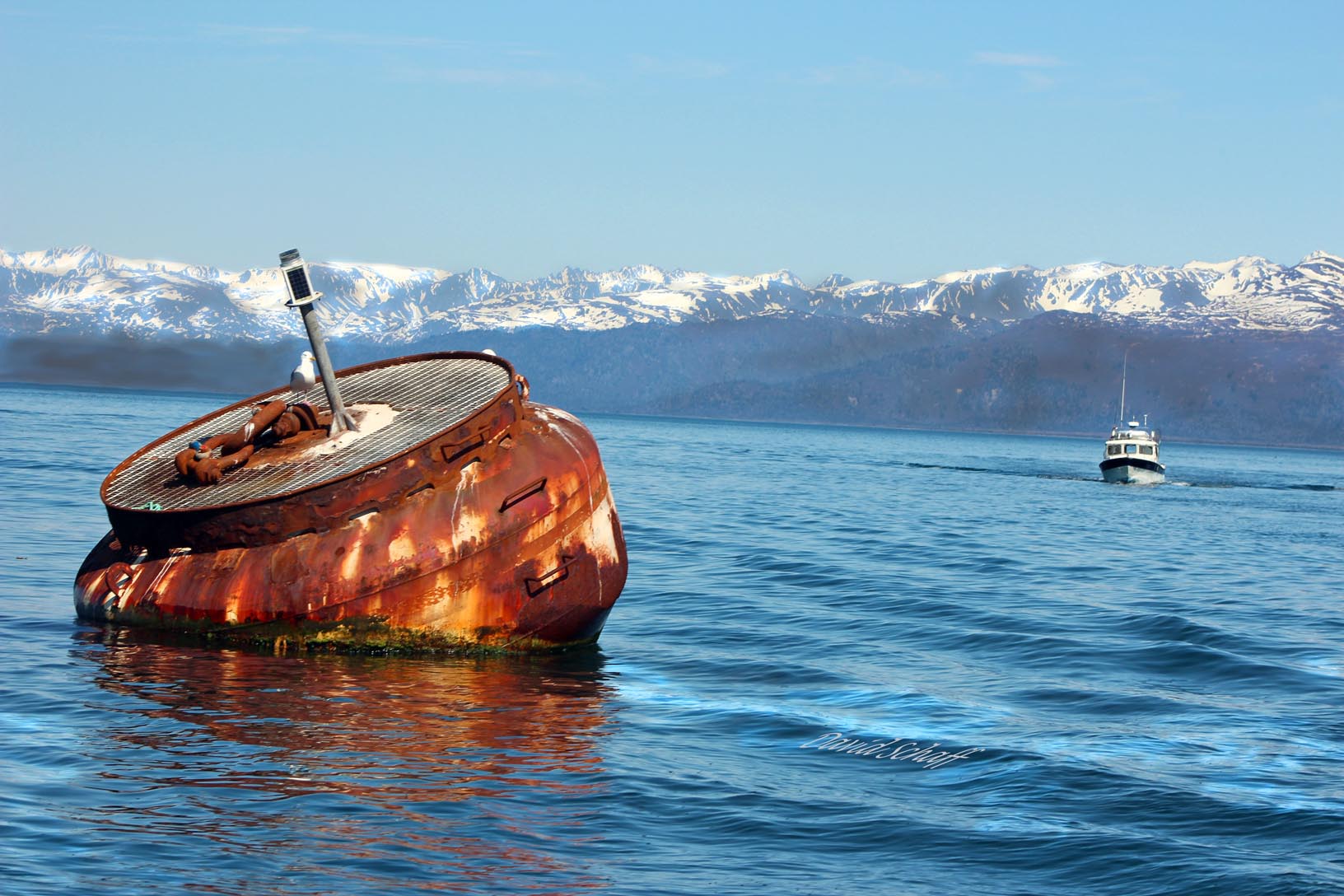
The buoy/beacon’s size, color and tilt caught my attention and seemed to be a contrast in multiple ways to the background boat and mountains: not only in the size it takes w/i the picture, but in the vividness of color, the sharpness of the buoy compared to the rest of the pucture, a surprise right up close to the more distant and standard shot of a boat and mountains, and maybe a comment on the age of the beacon shown by its rusting to that of the boat. I also like how my name is floating along with the picture w/o taking too much away.
Specific Feedback Requested
Does this photo catch your attention? If so, in what way? Does it seem to have a subtle message about environment? Or aging? What if anything does it evoke? And if there is any such message, how successful is it and what could be done to bring it out in the picture? Maybe cropping part of the bottom of the picture?
Technical Details
f/10, ISO 100, 75 mm. Processed in photoshop only to add tone, contrast and my name. It is not a panorama grouping and not a composite.
This is a nice maritime scene, with well contrasting elements. The horizon tilt of the shoreline is not working for me, though. I would much prefer to see that level.
Yes, the extremely tilted horizon significantly detracts from what otherwise is an interesting image. Maybe you tilted the horizon for creative effect, but it doesn’t work for me, instead It makes me feel seasick…
I get the feeling of aging, but not of a message about the environment (too much visual weight on the man made elements to achieve that). The watermark floating on the waves is pretty cutesy, but subtle enough so as not to be overly intrusive. I would straighten the horizon, all you really need here for the story is the tilt of the buoy. I am fine with the amount of space below the buoy, but you definitely need to add more breathing room to the left, especially with the horizon corrected.
Processing looks fine overall, nice colors and contrast.
The very first thing my eyes saw on this image was the tilted horizon. I read your description and tried to figure out if it was intentional. If so, it doesn’t work. It just looks like a mistake that wasn’t dealt with.
I think with a straight horizon, the image has some potential.
David,
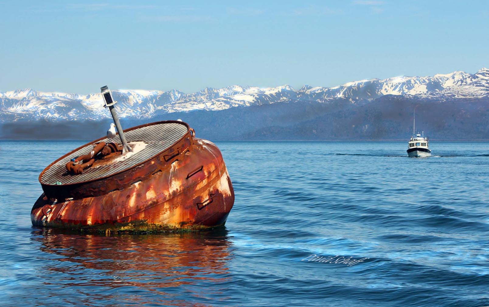
Your repost with the horizon straightened works much better; although it looks like it could use maybe 0.2 degrees more of CCW rotation. The aging message could work with the rusted buoy although I could see a theme of man against the elements working also. I think your diagonal placement of the buoy and that of the boat compliment one another beautifully. Nicely done.
Thanks. I’ll try the rotation. However, I saw that the mountain background was heading in the opposite direction and tried to split the difference so to say. Does changing .2 degrees affect the mountain angle too much?
I think the repost is better but as Ed noted, it is still tilted to the right. Your question on the more rotation affecting the mountain angle. I wouldn’t worry about the mountains, they can be a nearly every possible angle in nature, but water needs to be level in a lake scene.