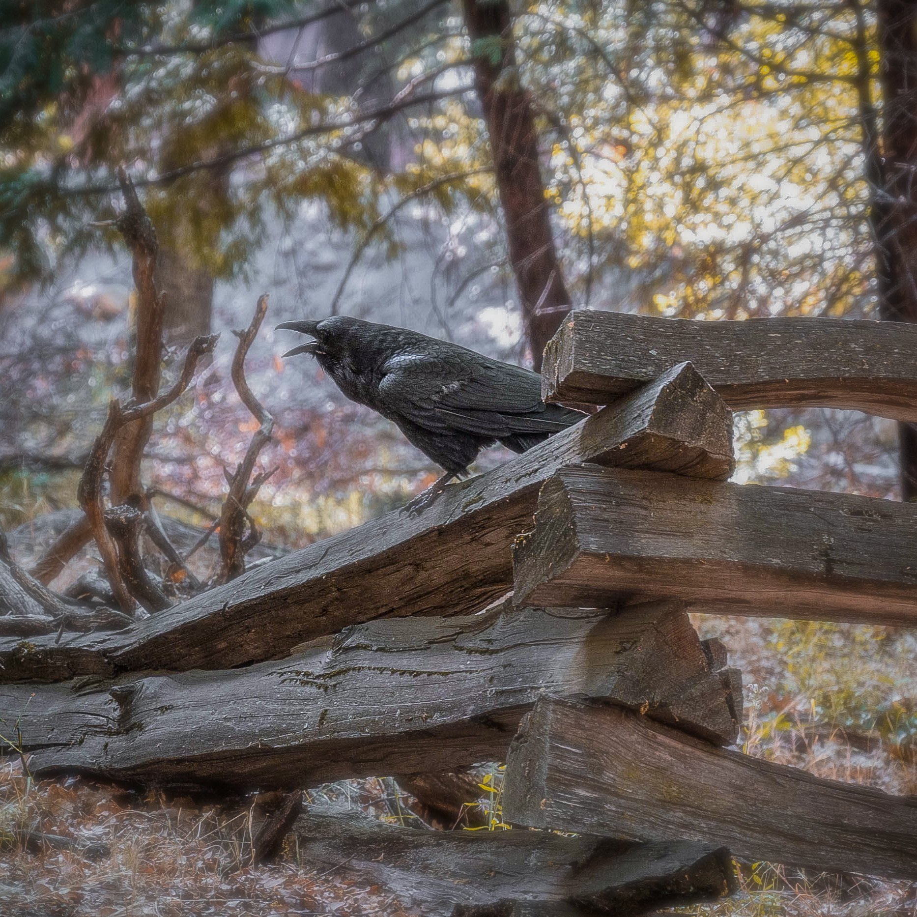
This fella accompanied me for a portion of my hike and then decided he wanted his picture taken.
Specific Feedback Requested
I definitely feel like I blew out the top right of the image at-least partially. I will take any feedback though.
This fella accompanied me for a portion of my hike and then decided he wanted his picture taken.
I definitely feel like I blew out the top right of the image at-least partially. I will take any feedback though.
@Kevin_Dougan LOVE this classic pose, no doubt telling someone off somewhere! The TR doesn’t bother me but I wonder what it might look like with the fence on the right side cropped to nearer the bird? I found my eyes went to that part of the fence when they really wanted to looking right at the bird. Just a thought.
Looks like this is your first post on NPN. Glad that you shared this image and are asking for feedback.
Technically, this image is pretty well done. Getting details in a black bird is not always easy and you had a contrasty situation to deal with. The old wood fence adds interest.
You mentioned that the top right of the image is pretty hot. While not completely blown out, it is hot. My question is why is it there in the first place? It doesn’t add to the image, and it’s inclusion has created a composition with the bird nearly centered which makes the image fairly static. I’d much prefer to see far less of the top part of the frame and more on the left since that is the implied motion/visual flow in the image.
We’ll continue to look for your images and your participation providing input the other work on NPN.
Hi Kevin and welcome to NPN.
I like the pose of this black bird and it appears to be like John said “Telling someone off somewhere” ![]()
The fence by itself is composed really well with the way it leads in from the right horizontally and exits the frame on the left at an angle.
However, the bird does seem a bit too far to the left of center for a good visual flow (as Keith put it).
The star of the show is the bird so a crop seems like a good move to make because it’s all about the bird, right?
There’s a blown out spot between the bird’s back and the tree that seems more of an issue than the URC, in the example below I selected an area just above the bird, copied that selection, then moved it over the hot spot, hot spots are difficult to fix without looking bad so copying another area or even careful cloning can be helpful.
I suggest something more drastic like the example below.
At first glance it appears that you’ve used some small amount of diffuse glow? It’s a nice effect even if it’s just what happened when you took the shot.
I think it’s a fine image, especially the story about the bird being upset or excited about something. ![]()
And of course, if you decide to crop it, crop it to whatever you feel is right, my crop is just an example.
Again, welcome to NPN ![]()
I look forward to seeing more of your work!
Welcome to NPN, Kevin. I’ve learned a lot by being a member and I’m sure you will as well. I think I’d like this image even without the bird: the old fence and the colors and light of the background make for an attractive image. The bird adds interest. Everyone’s going to have their own thoughts on an image, but ultimately it’s what pleases the photographer. I like the fence, so would hate to see too much of it removed. I could see a crop from the top to accentuate the movement of the fence through the frame. I agree with others that the bird is a bit centered, but would wonder if there is more in the original to the left, rather than cropping from the right. An enjoyable first post, keep them coming. And, critique others as well. I found that studying the work of others and commenting on why I liked their work, helped me better understand what I wanted in my bird photos.
Welcome, Kevin. this is a really cool first post. I love your eye to make the fence such a prominent part of the image, though I think Merv’s rework is a significant improvement. The one thing I would do is to bring down the exposure on the bird a little bit. To me, it looks a little too gray instead of black.
Welcome again, and I look forward to seeing your future posts and your comments on other’s work.
First of all I want to thank everyone for the critiques/advice and opinions.
I do think after looking at it some more that it should be reworked just a tad. I brought down the exposure a tad to make him a bit more black instead of gray, also I recropped the image to give it a tad more flow while still leaving in the fence since it is one of my favorite parts of the image. I definitely think I like this a bit more!
I will definitely have to spend some time looking through others images and give some critique/opinions as well!
Kevin, your rework is rocking. Excellent work and excellent image.
Excellent job on the reworked image, Kevin.
Good job on the rework, Kevin!
Keeping as much fence as you did was a good choice, the composition of the fence alone was great, so this version makes both work very well. ![]()
Thanks for posting the reworked image and for the detailed response that come with it. ![]()
Welcome to NPN, Kevin. Your re-edit is really very strong. I especially like the angle you captured the bird. That lower angle accentuates the fence and bird’s size. You did not include any technical information on the image, but I am curious whether you were using a wide-angle lens. I am curious because I love the strong perspective creative from the low angle of the photo.
That hot spot that @Merv mentioned in his reply is a distraction. You would really make this image much stronger by eliminating the hot spot. It distracts and moves our eyes way from the bird.
The crop in the re-edit is also great. It gives the image more breathing room on the left side, where the bird seems to be paying some attention to.
Please be sure to visit other areas that interest you in NPN and take a moment to comment on other people’s work. You can (and should) read the article about the art of image critique or see the infographic about how to critique. That contains a wealth of useful information. Feel free to contact any of us if you need help navigating NPN. Welcome, again!
@Egídio I do like the re-edit quite a bit. I do see the spot that you and @Merv mentioned. I will have to work on getting that to be less distracting.
Also, this was shot with the Nikon 24-70 F4 S at 70mm.
@Merv said he used a copied section to replace the blown-up spot. You can also experiment with a radial mask or even a brush to change the luminosity and highlights in that one spot. However, if the highlights are totally blown-out, your best solution will be Mervin’s approach.
I do love how the bird stands out with the surrounding elements creating a tight frame around it and that lighter gray background contrasting with the bird’s dark gray color. It certainly was a friendly bird. Thanks for sharing the technical aspects of the lens and camera.
Also, this was shot with the Nikon 24-70 F4 S at 70mm.
[/quote]
Welcome to NPN. Thanks for sharing an excellent image. Looks like you had plenty of good feedback.
Interesting bokeh you are getting from that lens. I usually associate that type of donut bokeh with catadioptric (mirror) lenses. I will have to play with one of those lenses this week to see if I get the same effect. I haven’t heard any complaints from Nikon users.

