Blue Ice

Critique Style Requested: In-depth

The photographer has shared comprehensive information about their intent and creative vision for this image. Please examine the details and offer feedback on how they can most effectively realize their vision.

Self Critique

The deep blue of the ice that has calved from the glacier spoke to me. I wanted to capture the light reflecting through the ice.

Creative direction

I am challenged to make the photos of ice I took into something of artistic interest. Your observations and suggestions would be much appreciated.

Specific Feedback

The aesthetic and emotional impact of this image, as well as the technical aspects, are of particular interest.

Technical Details

Sony Cyber-shot ISO 100, f/11, 1/125 sec. Handheld and taken from a boat.

Description

This is my first experience photographing ice. It was taken during a photo workshop with Don Smith.

Hi Barbara, first of all wow, I am really drawn to the top half of the image that features the dark cracks in the glaciers. I think you are right on track with your artistic vision, because there is something special here. I think the main thing holding this image back is the composition. To me, the water in the foreground adds nothing and I’d probably crop it out entirely. Without any other changes, I think you have a nice panoramic image here if you do that.

1 Like

Hi Barbara, Welcome. Isn’t Perito Moreno wonderful? Patagonia has got to be among the most beautiful displays of nature in the world. My wife and I were there in 2008. I do not agree about cropping the foreground. There is a nice texture here and a diagonal line that for me adds to the image. The foreground looks a bit noisy to me. If you are using Lightroom Classic, you might try the new denoise button in the Detail Panel. One of the many cormorants there would be nice in the water, but I think you have a nice image here as is. Again, welcome to NPN.

1 Like

Hi Barbara, What a fantastic scene and beautiful place to be! My bucket list includes capturing this kind of image. I think you’re right to highlight the light reflecting through the ice and giving it the vibrant blue color. I’m drawn to the top portion of the image with the blue ice contrasted against the darker, gray ice. I’d suggest cropping out much of the foreground as I don’t feel it adds much. You might try a more panoramic crop (16x9, say) to remove some of the foreground. That would make the brighter ice more prominent. I’d also suggest a vignette and would use the masking in LR to reduce the whites just in the lighter colored ice at the very top of the frame, so that the viewer’s eye stay connected to the vibrant block of ice. You could also use an object mask on the illuminated block of ice to slightly push the exposure and contrast up, further drawing attention to its beauty. Thanks for sharing the image!

Hi Barbara,
first of all, welcome to NPN! This is a beautiful first image. There are so many textures and patterns on the ice… I love it.

I agree with the other about cropping the image.

When I view your image in the browser it has a cyan cast and the blue tones are heavily saturated.
I downloaded your image and opened it in PS and realized that your image looked completely different and natural. You included a color profile named “coated FOGRA27”. Maybe you printed the image using this ICC profile.
It seems that this color profile is not supported by web browsers. It is better if you use the sRGB when exporting images for the web.

I can’t wait to see more of your work from this trip. Well done!

Hello Barbara and welcome to NPN!

I like your image and the fact that you have succeeded in capturing the blue light reflecting between the cracks in the ice.

The crop is a tough call. I think it’s quite a nice image as is, as the foreground provides context and some sense of scale. The water texture is interesting and there is a nice diagonal line that breaks any possible monotony.

The blues/cyans in the image are oversaturated and some whites are blown out (on the flat ice floe just to the left of the centre in particular) due to the “coated FOGRA27” colour profile. When I view your image without it, it is perfectly exposed and the colours very much more subtle.

Lastly, it would seem to me that the horizon could be levelled a tiny wee bit (I used the straighten ruler in the crop tool in PS and eyeballed it to 0.5 degrees, I think).

It is altogether a well-composed, well-exposed image, with the main subject being very clear and interesting to look at. I look forward to seeing more of your work!

1 Like

Thank you Paul for your very helpful suggestions. They are much appreciated.

Thanks, Larry, for taking the time to comment. It is much appreciated.

Aaron, thanks for your comments and suggestion. I value them.

Hi Barbara and Welcome to NPN :slight_smile:

This must have been a very exciting scene to view in person, I’ve only seen such sights in documentaries and it makes me want to experience it myself.

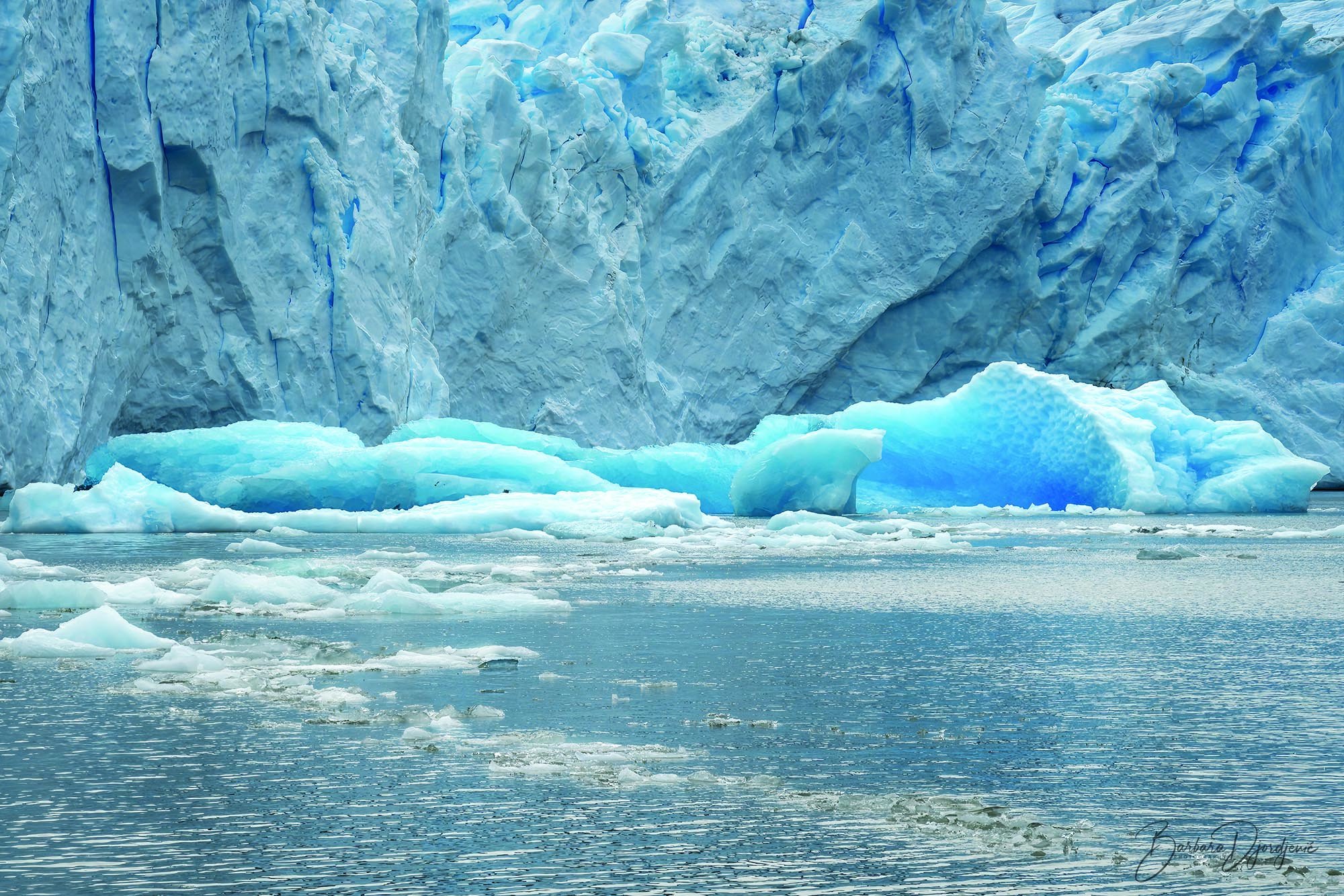
Personally, I like the amount of FG water and ice shown, somehow it gives me the feeling of being at a safe distance.
Those vertical crevices give me the feeling that those slabs of ice could break off and slide into the water at any moment and that adds to the desire to keep a safe distance, it also creates a certain tension that feels dynamic.
Also, the diagonal line of floating ice in the FG is a nice feature that adds to the overall depth IMHO.

Glaciers like this are a fascinating part of nature and I like the way you have framed a slice of it to share with us.

Well done IMHO!! :slight_smile:

I am curious about your workflow in regards to your choice of color space and how you export for sharing on the internet.
When opened in Ps, this comes up as CMYK rather than RGB, sRGB is the standard for insuring that everyone sees the same colors when viewed on the internet.
At the bottom left corner of the Ps window, it indicates “Untagged CMYK (8bpc)”, that means that a color profile hasn’t been assigned to the image but it does indicate that it is CMYK.
Most people recommend using “ProPhoto RGB” because that profile uses the most colors, and that can assigned by going to “Edit>Convert to Profile” (near the bottom), then in the pop-up window, select “ProPhoto RGB” in the drop down list under “Destination Space” and click “OK”.
After that, Ps will indicate that the color profile “ProPhoto RGB” has been assigned (as seen at the bottom left of the Ps window), it will change from “Untagged CMYK” to “ProPhoto RGB”
Then when ready to export for web use, go to “File>Export As”, then in the pop-up window, check the “Convert to sRGB” and if you want, check “Embed Color Profile” at the lower right corner of the window under “Color Space” (just above the “Cancel / Export” buttons).

Here’s a great video about this very subject (from an expert at all thing Ps): Link>>>Does Your Color Change After Export in Photoshop?<<<Link
The channel is called “PIXimperfect”, he has over 4.5 Million subscribers. I’ve learned a lot about Ps from this guy!

Anyway, I hope this helps! :slight_smile:

Again, Welcome to NPN, I think most people grow as photographers and all things photography here, I know I’ve learned a lot from NPN members since I joined a few months ago!

Mervin, this has been most helpful. I thought I was working with sRGB. Your explanation and the great video help clarify the process. I am not sure just how I ended up with CMYK. It is not a color space in which I would work if I knew what I was doing! I will say that the drop down box in PS that wants to know the color space when I open a picture confuses me. You have taken considerable time to help a newbie. I greatly appreciate it.

You are most helpful,

Barbara Djordjevic

Laura, thanks for your kind comments. I did push the saturation on the blues/cyans. It is helpful to know that did not translate as excessive when you viewed it without the “coated FOGRA27” profile.

Hi Barbara,

I’m happy to know that I am being helpful! :slight_smile:

There’s a setting in the color settings dialogue window in Ps that prompts Ps to ask for the color space you want to use if the image color space is different from the working color space previously set in Ps.

I’m including yet another video link, this guy explains color space even better, toward the end of the video he shows how to setup Lr, Ps and Acr for “ProPhoto RGB”, then he shows how to setup exporting in sRGB for web use.
He also shows where Ps prompts you to verify which color profile you want when opening a new image if the color profile is different from your preset workspace.
Link>>>Color Spaces Explained! sRGB, Adobe RGB (1998), ProPhoto RGB<<<Link.

Here’s a webpage that explains the different color profiles in writing, it’s a good read.
Link>>>Essential Photoshop Color Settings<<<Link

Another item is the color space setting in your camera, the Sony RX100M6 has two settings, “Adobe RGB” and “sRGB”, I would use “Adobe RGB” for a larger color range but keep in mind that this profile is only assigned to JPEG.
Sony’s RAW files are named ARW, and with ARW files, there is no color profile assigned in the camera, that will be done in Lr or ACR (again, using ARW). I do recommend using ARW (Sony’s version of RAW), ARW files aren’t compressed like JPEG and you’ll have a lot more control over quality, color and dynamic range (which is basically the ability to retain details in shadows).
As mentioned, ARW files are uncompressed and if I have this right, your Sony RX100M6 only records in 8 bit per channel which means that the file size for each ARW image will be roughly 20MB, if it does record in 16 bit, the file size will be roughly 40MB but IMHO, it’s worth recording in ARW just for the quality.
Of course you may already have your camera set for recording in ARW but I wanted to mention it in case you weren’t using that option.
I have my cameras set to record ARW + JPEG so I can scan through my images in the windows photo viewer before transferring them into Lr or ACR, this is just my way of filtering which images are keepers but that’s just my way of doing it.
Note: Windows photo viewer can’t read ARW (RAW) files.

I hope this helps as well! :slight_smile:

Have a great day, Barbara! :slight_smile:

1 Like

Mervin, are you a teacher? You are so precise with the concepts. The video link is really helpful. I do think I understand what PS is doing. By the way, I do shoot in ARW. My photos viewer will open them, so I don’t have to worry about JPEGs. Thank you so very much for your patience with my learning curve.

1 Like

No, at least not a bona fide teacher. But thanks for the head swelling compliment! :slight_smile:

And you just taught me something, I tried to install a RAW image driver for the windows photo viewer app a while back but it said it wasn’t applicable to my system (Windows 10), it stated that I’d have to download an editor. I certainly didn’t need another editor so I just forgot about it, well…I just tried again and it worked this time! Thanks to your comment I’m now able to open ARW files in my viewer.
Now I can quit saving JPEG copies in my cameras! Thanks!! :slight_smile:

Edit: I realize there’s an editor of sorts in the Windows Photo Viewer App, the one I referred to from an earlier attempt was a much different editor, maybe it was some weird ad that I didn’t fall for :smiley:

And thank you for the kind words as well! It helps to keep me motivated to help others when I see the need. :slight_smile:

Feel free to ask for anything else anytime, we always try to be helpful (myself and many others here).

Thanks for the feedback. I am glad I have joined this group.