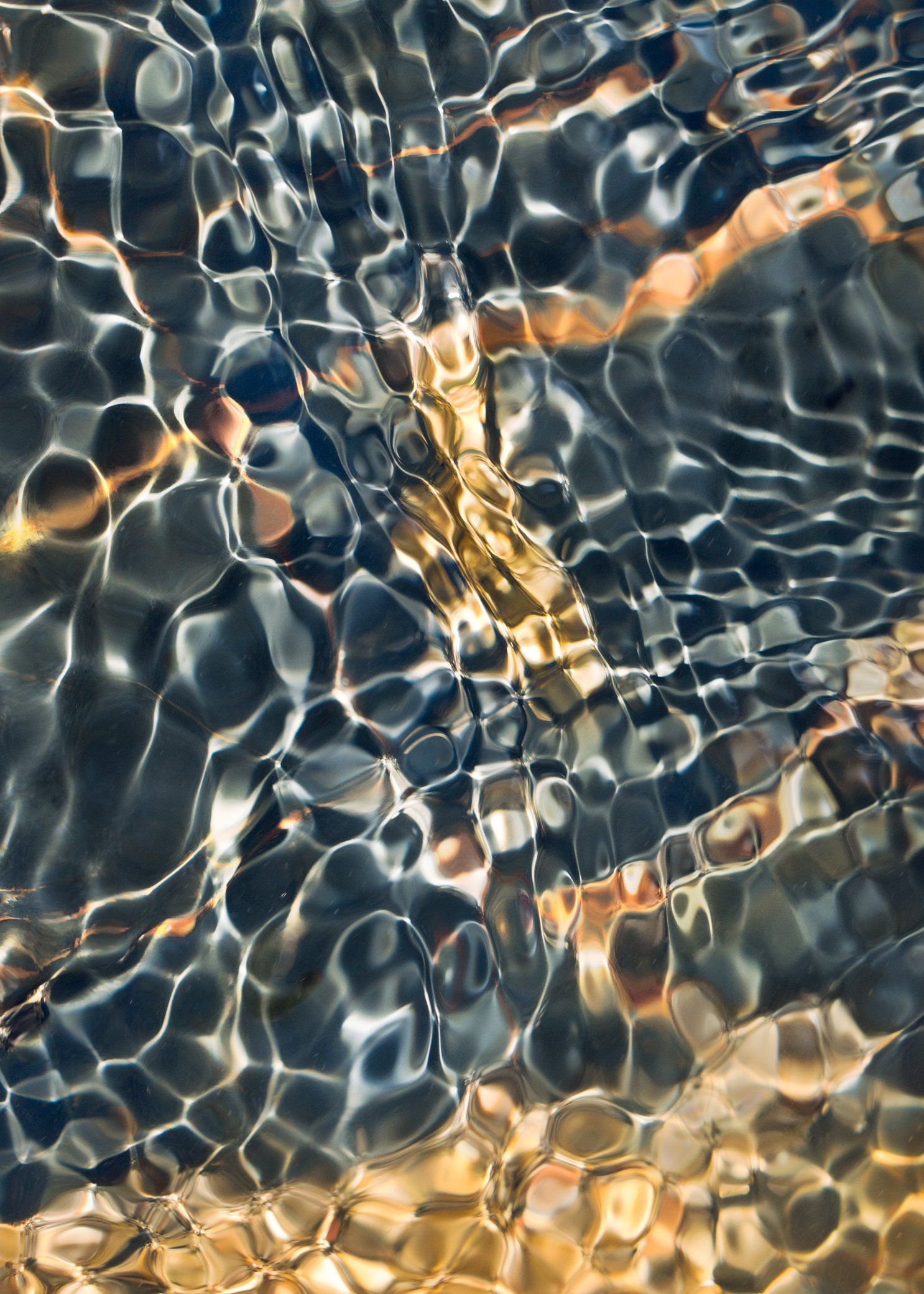
Wow this is really quite nice, Bonnie! It almost looks like Alligator skin! I think the gold section at right adds a lot even though some may find it a distraction - I find that it helps show there’s something ‘more’ going on here. Really lovely.
This is so awesome Bonnie! Love the patterns and colors. There is a lovely shimmer to the whole image which would look great printed on acrylic or metal. I was going to suggest cropping off the gold section on the right but I do like how it ties in with the ribbons of gold in the scene. Great job!
Not sure where Whiskeytown is but I’d love to come stand in the water with you! My kind of location and photograph. BTW, I often take both regular and polarized sunglasses in situations like this as both views are often important; and, of course, a polarizer for the lens as needed.
It looks like a warped dimension of reality. I also feel as though I’m looking through a net although the warped dimension feels stronger in this image. I might do a square crop of the left side but I have a feeling you’ve already considered that.
Gorgeous!! Gold and gray works as well as gold and blue. There is leeway to play with any abstraction but I think you’ve hit a good spot here. The gold on the right demands some attention but the subtle oval shape in the gray area pulls my eye back there, and the gold is repeated subtly there.
A needed dose of cool with your hot summer weather up there!
Thanks, @Shirley_Freeman, @JohnSnell, @Diane_Miller, @Igor_Doncov, @Matt_Payne, @Steve_Kennedy, and @Alfredo_Mora for your thoughts. Seems like there is a bit of a consensus that the gold part doesn’t work. My thinking was that the light part in the middle was leading to the gold. Considering that, I did a rework to make the white light part more golden and then rotated it vertical to accentuate that “flow”. Posting that for comparison.
OK!! Even better! I like the added gold in the middle. Maybe even a 180 to put the gold on the bottom? It feels a bit heavier and might make a good base?
Well, I do believe that is a great idea. That gold, even though it’s brighter, has more visual weight. So, the bottom it is - posted rework 2. Now the impression is that the “flow” in the middle is moving upward. I like it.
Oh, how I hope to find something like this soon! This is wonderful! “Bejeweled” comes to mind and also reminds me of Nancy Lea Sandy’s images that we posted a few years back - I wonder if she’s still around.
Anyway, the mosaics here are fascinating. I almost think by suggesting this that it might be considered heresey! But I think I might like this best without the original gold on the right. I get the connection and your 2nd repost I do think works the best out of the 3 - in fact with the “gold” at the bottom it actually conjurs up the notion of gold settling the bottom of a gold pan - or something like that.
But again, I’m mesmerized by the mosaic patterns of the jewels and that 2/3 of the image is most fascinating for me.
They all look pretty nice to me but I suppose I like the image that Igor commented on the most. This has truly fascinating patterns, colors, and water textures. Well seen!
That’s why I’m hesitant in giving suggestions to experienced photographers. Anything I write you have likely thought of before and rejected. These are pretty major alterations. Each time you crop the ‘mesh’ gets wider and I’m not sure that’s a good thing. That affects the composition.
Gorgeous image. I like the vertical flip. I’m back and forth between the gold on the bottom vs the top. I think Whiskeytown is going to have an influx of Photography Imbibers