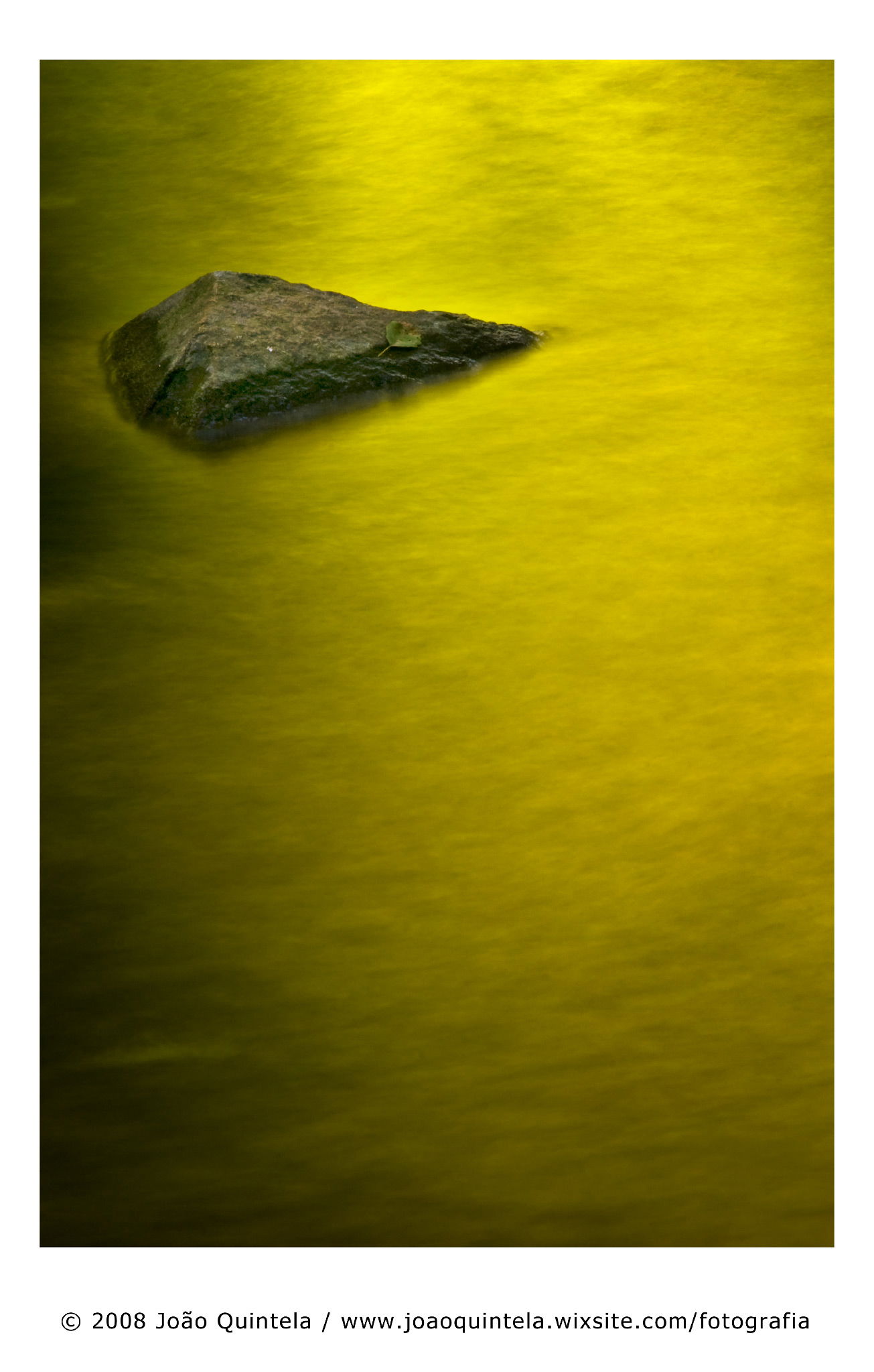
Wow. I absolutely love this image. How did you hide it for so long? It’s so rich and yet so simple. I love the odd composition of the rock on the far upper left. For some reason it feels so right even though it breaks the ‘rules’. The simple color palette is part of it’s impact. The tonal gradient is a really big part of it because there is separate texture within that gradient. It’s not really gold like Ed’s but a sort of greenish gold. The gradient sort of circles around to a source of light. It’s quite a creation.
Joao I’m glad that I inspired you to resurrect this image, it was certainly worth digging it out of your archives. Our images start with a similar concept, but it’s interesting to contrast and compare such different executions and moods created. By placing the rock where you have, I think it makes your image more about the light and shadow in the water (whereas mine is more about the rocks, I think). I also like how you have the shadows in the LLC, it nicely balances the rock.
It took me a moment to notice the small leaf on the rock, but it adds a nice small touch too.
I do feel the same,(although I’m not sure if breaking any “rule”, or even if I think/care about that - those “rules” most of the time are just a creative “blocker”).
I think this image is about the color of the light and texture. Yeah, it’s not super sharp but it doesn’t matter with this image. It’s not about sharp details. It’s about the soft, glowing, radiant like color and the wavy textures in the water. The rock adds a different dimension but I don’t think this is about the rock so much as it is about everything else. Not sure I can put my finger on it but the rock plays a lesser roll than everything else. I do like where you placed the rock and as Ed pointed out, I like the leaf resting on the edge of the rock. I don’t think this would have the same impact if the colors were more orange. It’s the colors you’ve captured that really make this interesting. Is this a woodland scene with lots of green reflecting? Just curious. Great find on the hard drive by the way.
Gorgeous. Looking quickly at the thumbnail, my first thought was that this was another version of @Ed_McGuirk 's earlier posting. But as he points out, yours is a wholly different approach. I think that it is soft actually enhances the abstract quality of this picture and highlights the lovely texture and light. The shadow along the left side that sweeps down around the bottom of the frame does a beautiful job of containing this image. Wonderfully meditative, a picture I could spend long hours with.
As everyone has said, the softness is no problem - it adds to the atmosphere. That greenish-gold water is lovely. That little leaf really adds a lot, I think.