The photographer is looking for generalized feedback about the aesthetic and technical qualities of their image.
Description
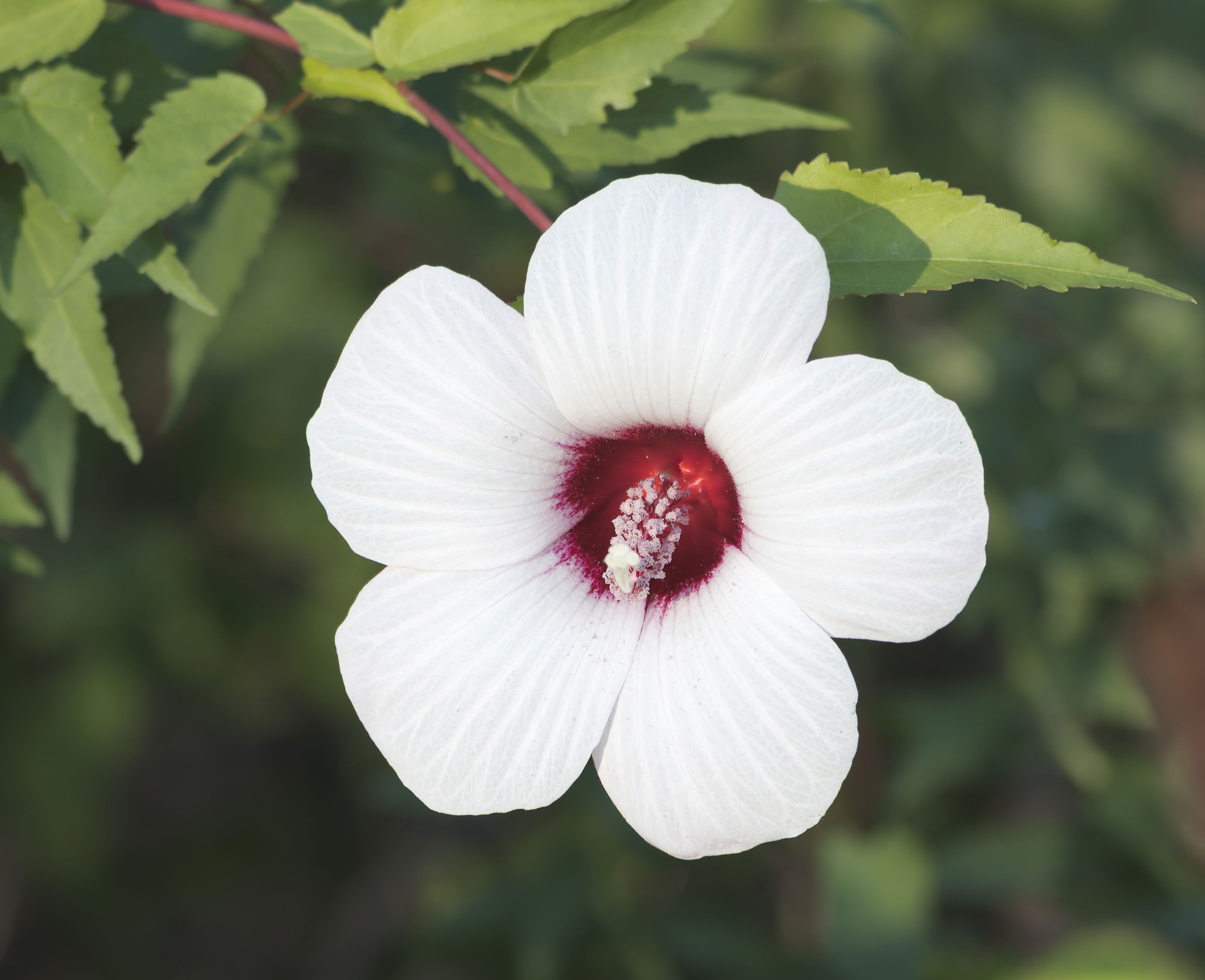
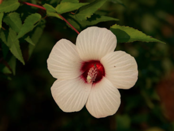
I caught this flower next to a hiking path at a local state park and couldn’t help but stop. The lighting was not great, but I tried to calm it down a little.
Specific Feedback
I really struggle editing white subjects (flowers, birds, etc.). It either feels blown out or grey. Any advice on the best way to edit white subjects would be appreciated.
Technical Details
Sony A7RV
Sony 100-400 @ 116mm
ISO 100
f5.6
1/400 sec
Critique Template
Use of the template is optional, but it can help spark ideas.
Vision and Purpose:
Conceptual:
Emotional Impact and Mood:
Composition:
Balance and Visual Weight:
Depth and Dimension:
Color:
Lighting:
Processing:
Technical:
This is a very nice find but the whites are without detail. First thing is bracket exposures so you have one with whites not blown. Then in LR or ACR, or probably any raw converter, balance the Highlights sliders (usually way down), Shadows and Exposure. Different import profiles give different contrast, so choose the lowest contrast one. If that’s not enough, use a Tony Kuyper linear profile. Then in PS you can bring out a bit more detail with Nik SEP’s Detail Extractor. (Several sliders and choices to balance there.) Always well worth the trouble to capture highlight detail!
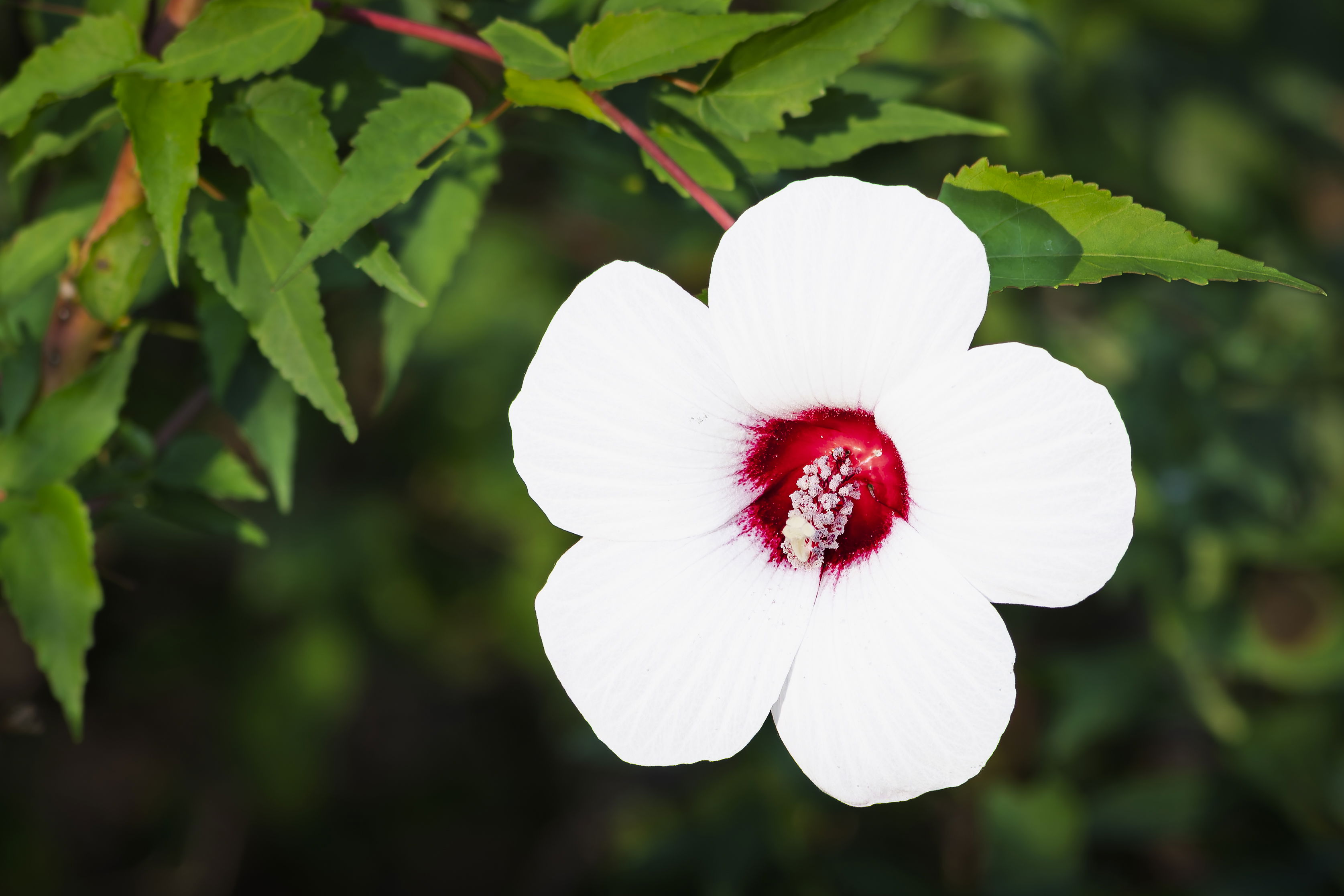
Gary: I too like your subject; I have a bush with this variety in our garden. My initial observation was that not just the whites but the rest of the image is overexposed. Simply dropping the exposure half a stop tames things a lot and some of the petal detail starts to come through.
One of the best ways to manage your whites is to expose them properly with the capture. Something that can help is to activate the Zebra feature on your camera. I shoot an A7rIII so I don’t know exactly where you would find the Zebra settings on your rV menu but I set mine at 100% which will show which parts of the image will have clipped highlights and then you can compensate in camera. I find that if I decrease the exposure to make the Zebras go away and then open back up 1/3 stop I get a pretty clean and usable histogram. Tweaking like @Diane_Miller mentions is then much easier and less needed. One other change I would make with this shot is to crop it tighter. The stem on the left doesn’t add much so isolating the flower a bit more focuses attention better on it. >=))>
Bill has some great advice on activating the Zebra feature, Gary. Since the zebras are based on a jpeg version of the image the camera is seeing, you still have room in the raw file if you go just a bit above where they start showing up. It’s one of the wonders of mirrorless, as there’s no real excuse for overexposure if you have them turned on and the dynamic range of the raw file is so much larger than any way we have of displaying an image that there’s plenty of room for tweaking in post processing.
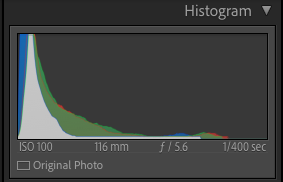
Study the histogram when shooting. Strong peaks at the RH side of histogram reveals the presence of clipping which are the featureless whites caused by over-exposure. I set my camera to show what the exposure is like in the viewfinder which also shows the histogram. I adjust the ISO until the brightest whites contain details. Bill’s edits shows that detail is still present in over-exposed areas so pulling back the highlights is a perfect way to resurrect details in bright areas of the image…Jim
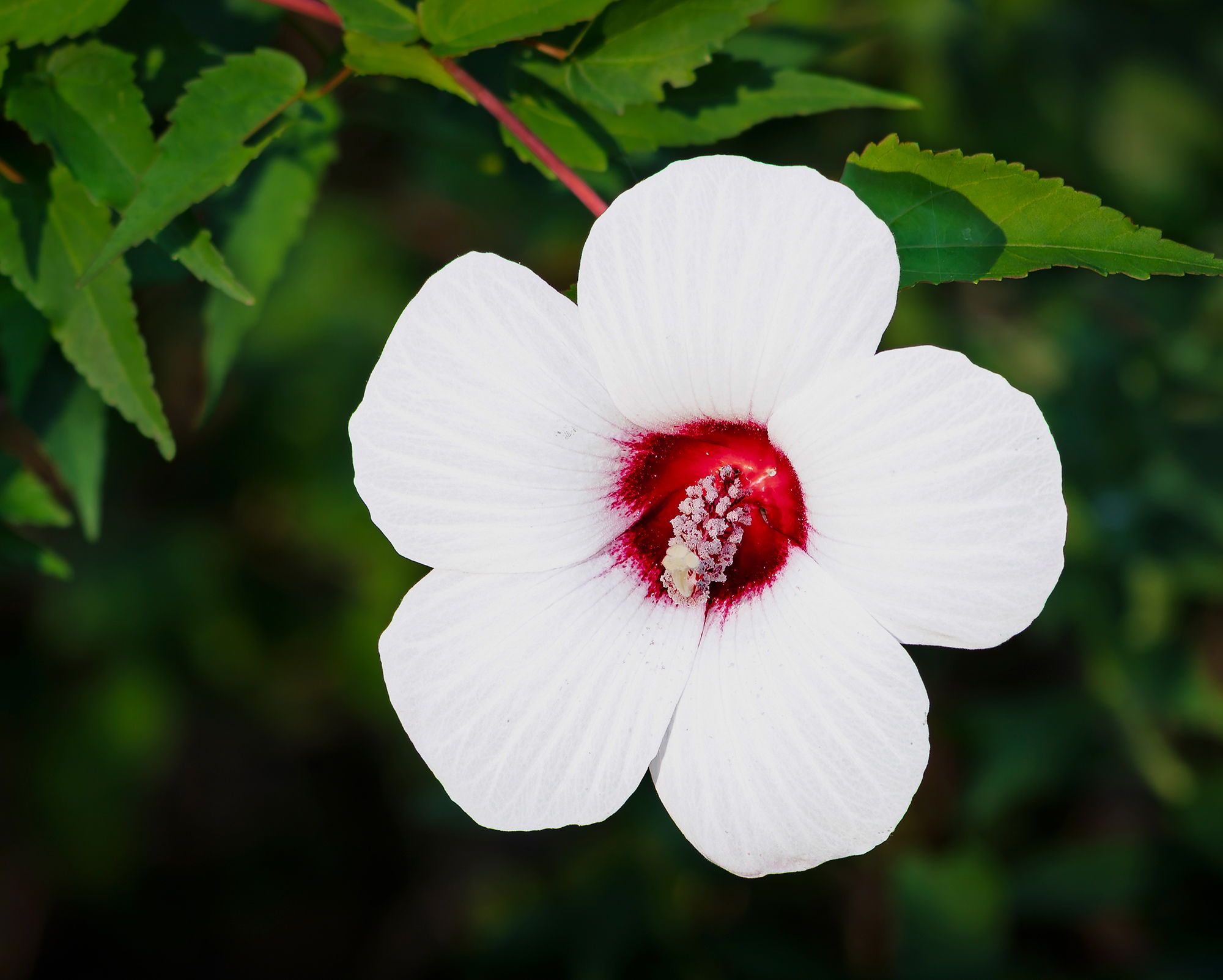
OK, the raw file is perfect!! The most basic LR editing course is in the layout of the screen. Don’t do any auto stuff. Start at the top with the 4 basic sliders for exposure, highlights, shadows and whites, and watch the histogram, which is more accurate than your monitor. Avoid the contrast and blacks sliders until you are more experienced. Looking at this screen and histogram, I would squeak up whites a tiny bit, just so the tip is at about the last 0 in 1/400 sec. That will give a little more detail in the whites. Sometimes I then bring down the highlights slider. Then I usually bring shadows up (slider to the right) but here maybe they are OK. Just tweak those 4 to get good detail.
Two sliders I never ever use are contrast and saturation. The other sliders do the same things better. Even better is to use the curves panel, but honestly, I rarely feel the need for it. I would caution you about online tutorials. Some are good and some are not. Learn the basic sliders first and then you will have a basis to judge them. You have a lovely capture here and I think you could pull out even a bit more detail in the whites, but that will quickly become a matter of individual taste, and affected by monitor calibration and room lighting.
Next bit of advice, be careful with auto white balance. It can be good if there is a range of colors in the image, as here, but the more monochromatic the range the less accurate it is. I always compare tweaking the temp and tint sliders, with tint being frustratingly sensitive.
Processing is a journey but a delightful one as you begin to put just a couple of concepts together.
@Diane_Miller I calibrated my monitors today with my brother’s Spyder. Man were they out of whack. I can really see a difference now! Thank you for the great advice!
Oh the re-work looks so much more natural. Good thing you went back and checked the calibration, too.
Since you use Lightroom, you could try using a linear profile created by Tony Kuyper. What that does is completely flatten your tone curve which is not what typical RAW editing profiles do. Instead those will often boost highlights and reduce shadows for immediate contrast which makes people happy. I find that with photos that have a big dynamic range, I often see that what I thought were blocked blacks and blown whites are indeed ok, and it was the Adobe or other camera profile that was creating the problems.
You can find Linear Profiles on Tony’s web page as well as more technical information about how they work and how to use and install them -
They are free and if you don’t see your camera, Tony will make one for you. He did for me!
Thank you @Kris_Smith. I was given that suggestion by someone else, so that was where I started with this rework. Thank you though for the kind words and taking the time to make the suggestion! Cheers!