Critique Style Requested: Standard
The photographer is looking for generalized feedback about the aesthetic and technical qualities of their image.
Description
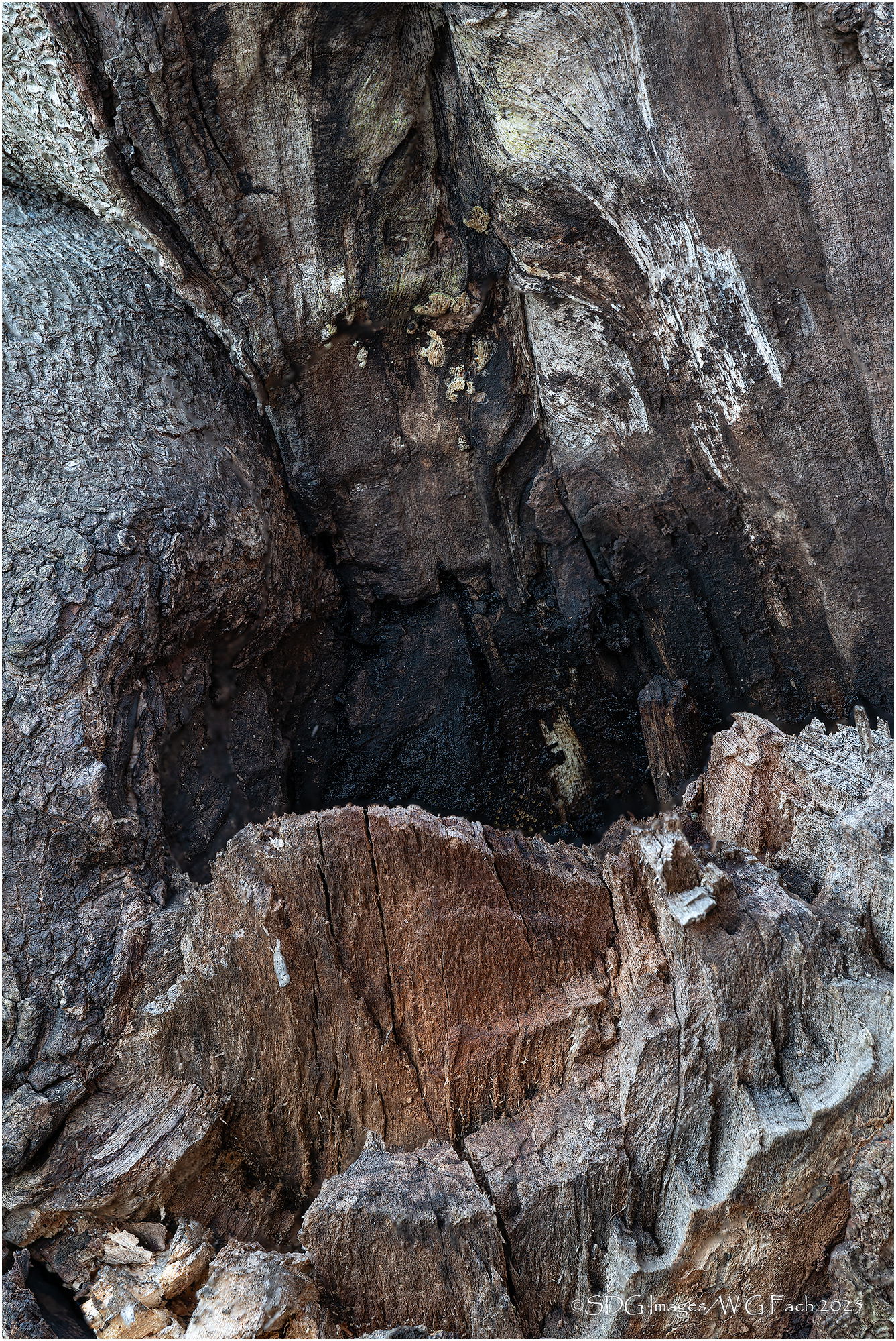
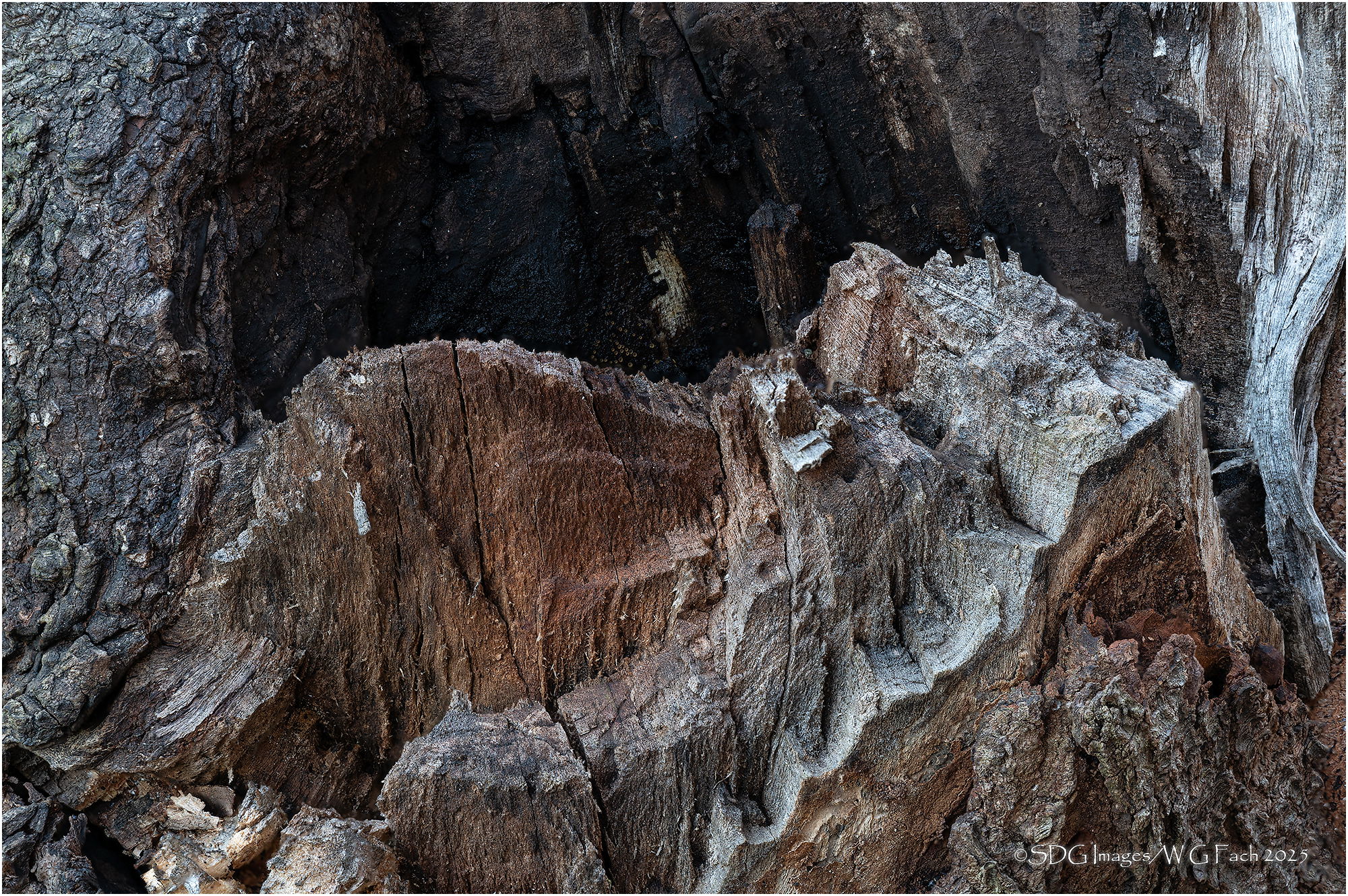
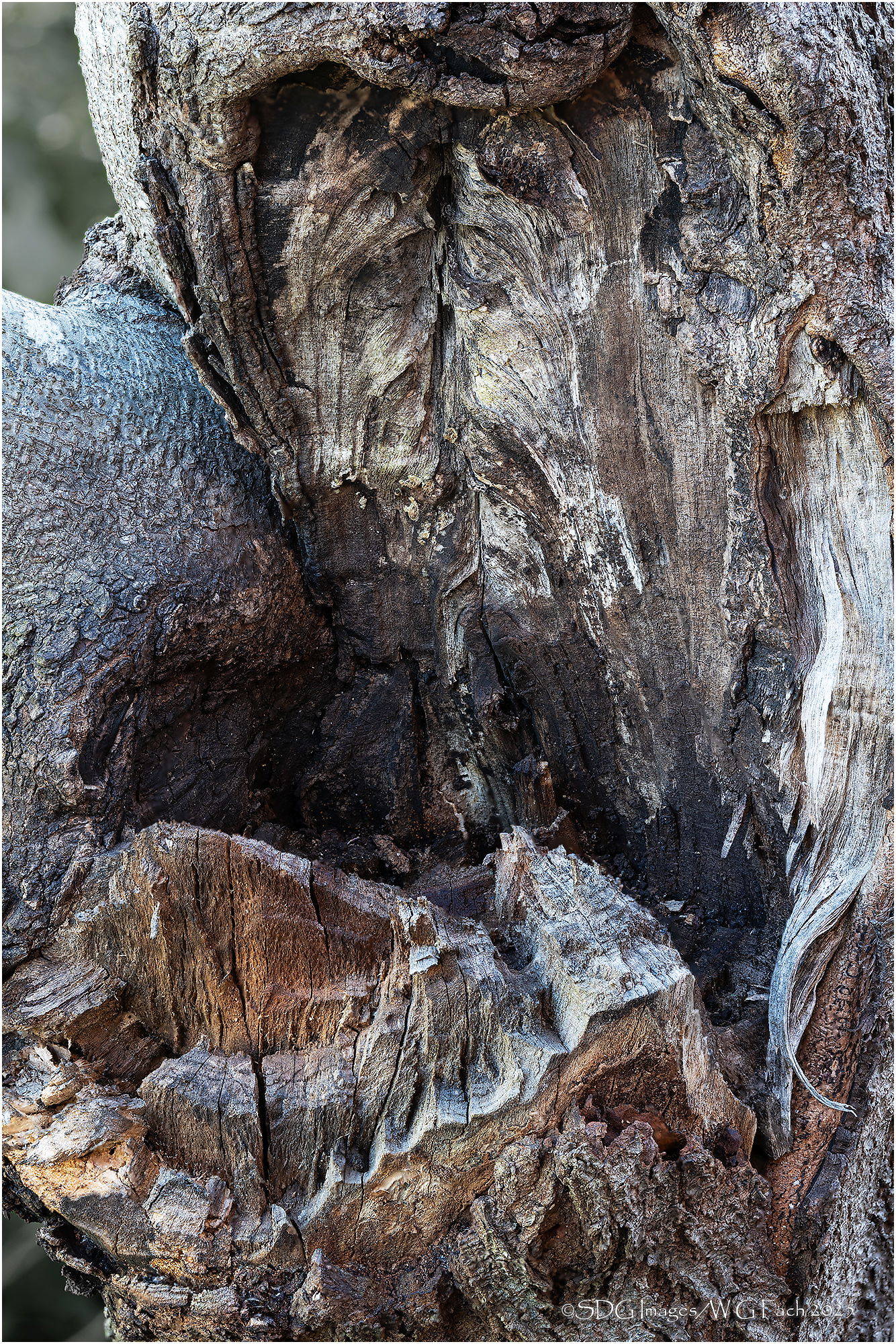
Hurricane Beryl was fairly rough on a few of our trees and this is some of the damage to our Rising Sun Redbud, one of our favorite trees. This was a main branch so we lost about 30% of the tree but the rest seemed to do well through the rest of the summer. Spring will tell the tale. I’ve walked past it all year on the way to scout the garden but stopped and looked a bit more carefully last week and decided it might make an interesting subject. I shot it initially at f22 thinking a single capture would work but either the DOF wasn’t sufficient or I had a bad plane of focus. I went back this evening and did a stack and was more pleased.
Specific Feedback
Any preference for one orientation over the other? Compelling subject or meh?
Technical Details
Sony A7r3
Sony FE 70-200 f2.8 GM-II @ 200mm
ISO 400, 1/3 sec @ f11, 15 shot stacks in Helicon Focus
Tried to address Dennis wish for a wider view. I like to fill the frame with most subjects so to include the best features of both images I did have to include some BG in the ULC and LLC. I selected those areas and desaturated them (they were relatively bright green).
Critique Template
Use of the template is optional, but it can help spark ideas.
- Vision and Purpose:
- Conceptual:
- Emotional Impact and Mood:
- Composition:
- Balance and Visual Weight:
- Depth and Dimension:
- Color:
- Lighting:
- Processing:
- Technical: